Dialog
A dialog is a temporary window that draws the user’s attention to confirm an action, collect input, or present important information.
A dialog supports short, focused interactions that require attention before the user continues. It can be presented in 2 ways:
- Modal: Prevents the user from interacting with the page until the dialog is addressed.
- Non-modal: Allows the user to continue to interact with the page while the dialog is open.
When choosing between a modal and a non-modal, consider:
- How critical is the task?
- Is the user’s acknowledgement required?
- Will the user need access to the underlying page?
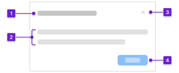
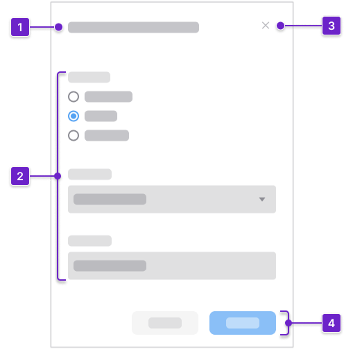
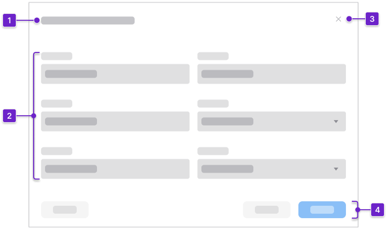
Anatomy
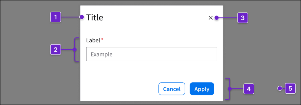
- Title
- Content area
- Close button (optional)
- Button group (optional)
- Overlay background (modal dialogs only)
Dialog Types
Modal
Use a modal dialog when the user must address the dialog before continuing.
When to Use
- For the user to confirm critical or irreversible actions.
- Examples: Deleting an account or canceling a process without saving.
- For the user to complete short, focused tasks without leaving the page.
- Examples: Adding a new contact or creating a calendar event.
- To alert the user about urgent issues that require immediate attention.
- Example: Asking for confirmation to overwrite an existing file.
Potential Components
Common Use Cases
Non-Modal
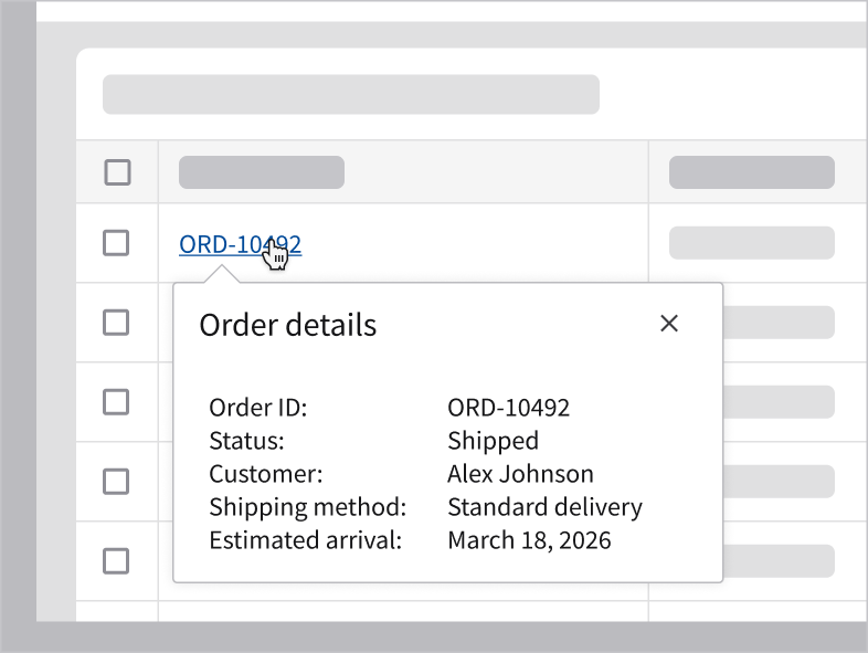
Use a non-modal dialog when the user needs to continue interacting with the page while viewing or adjusting information. For example, use it to display supplemental information after the user clicks on an information icon button.
When to Use
- To display non-critical or additional information.
- Example: Displaying the current data configuration of a widget.
- When access to the page is needed while doing a short task.
- Example: Filtering a table while viewing the results.
- To help the user complete their task without interrupting their current workflow.
- Example: Adding a quick note.
Potential Components
Common Use Cases
When to Use Something Else
- When the action is low risk or reversible, use a tooltip, a notification banner, or a toast with an undo option.
- Examples: Archiving old records that can be restored or adding an item to favorites.
- When the task involves complex data entry, use a full page.
- Examples: Creating a new employee record or filing an expense report.
- When the message is low priority and doesn’t interrupt the workflow, use a toast.
- Example: Informing the user that settings were saved successfully.
Common Components to Use and Avoid
Components to Use
These components are commonly used to support short, focused interactions. Select only the components that are necessary for the specific task.
- Content and messaging components such as image, avatar, and body text.
- Form and input components such as text input, fieldset, button, dropdown, and radio.
Components to Avoid
To keep the user oriented and prevent unnecessary complexity, avoid components that add depth, branching, or long-form navigation. In general, it’s best to avoid:
- Components that hide content.
- Avoid tabs, accordions, expandable panels, or similar components that hide large amounts of content. They introduce multiple layers of interaction and can make the dialog feel like a full page. If these components are necessary, use a full page instead.
- Deep navigation or page-level structures.
- Avoid elements that create separate sections, views, or navigation paths within the dialog.
- Hyperlinks that navigate away from the dialog.
- Avoid hyperlinks that take the user to another page or screen, as this forces them to abandon the task and dismiss the dialog. If supporting hyperlinks are necessary, allow them to open in a new tab or window so the user can return without losing progress.
How It Works
A dialog supports 4 primary use cases. Not every use case applies to both modal dialogs and non-modal dialogs.
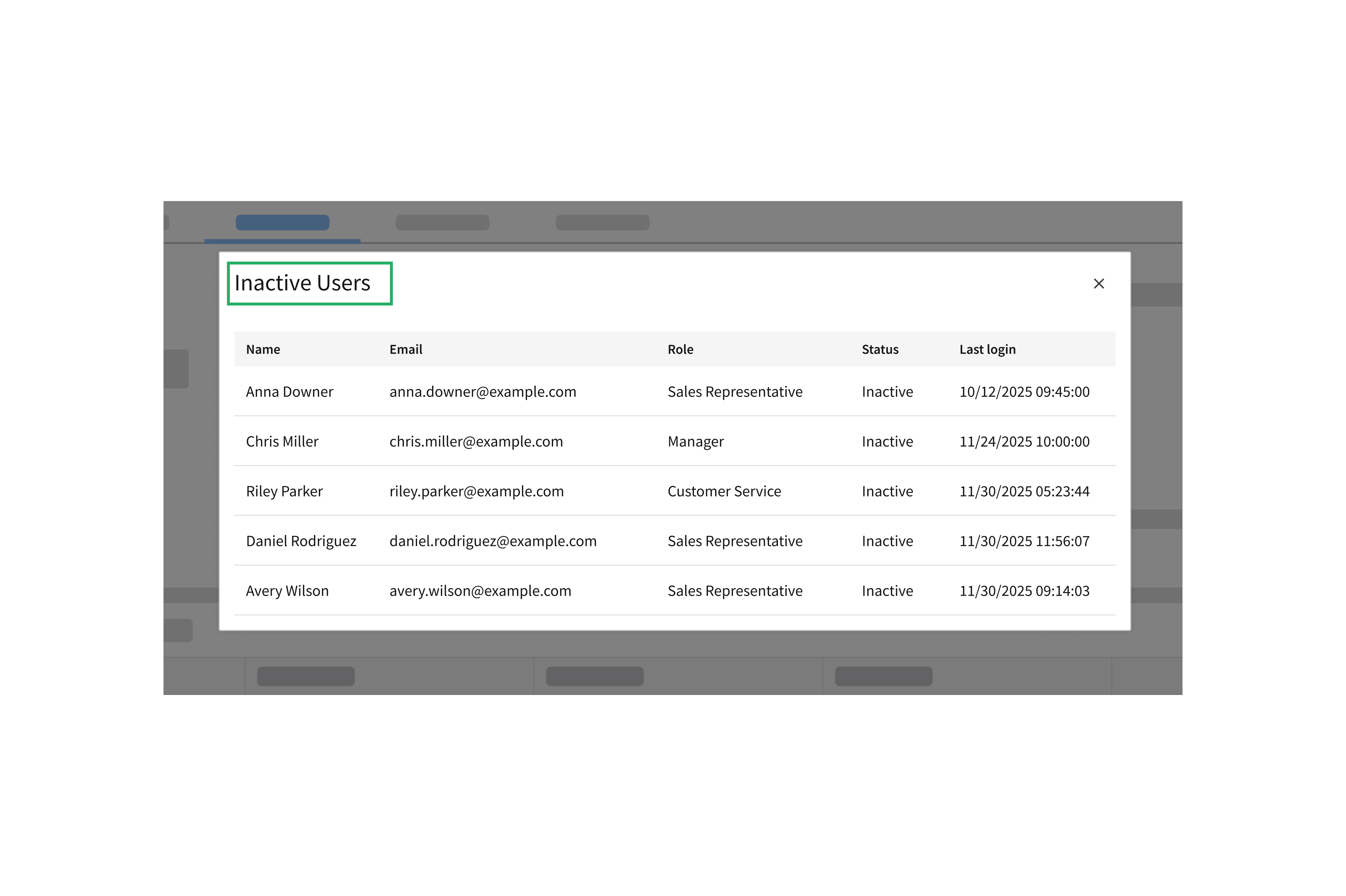
1. Informational
- Displays supporting information related to the user’s current workflow. No user action is required to proceed.
- Applicable to both modal dialogs and non-modal dialogs.
- Utilizes a close button in the top right.
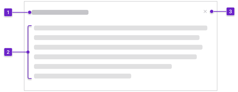
2. Content
3. Close button
Modal Example
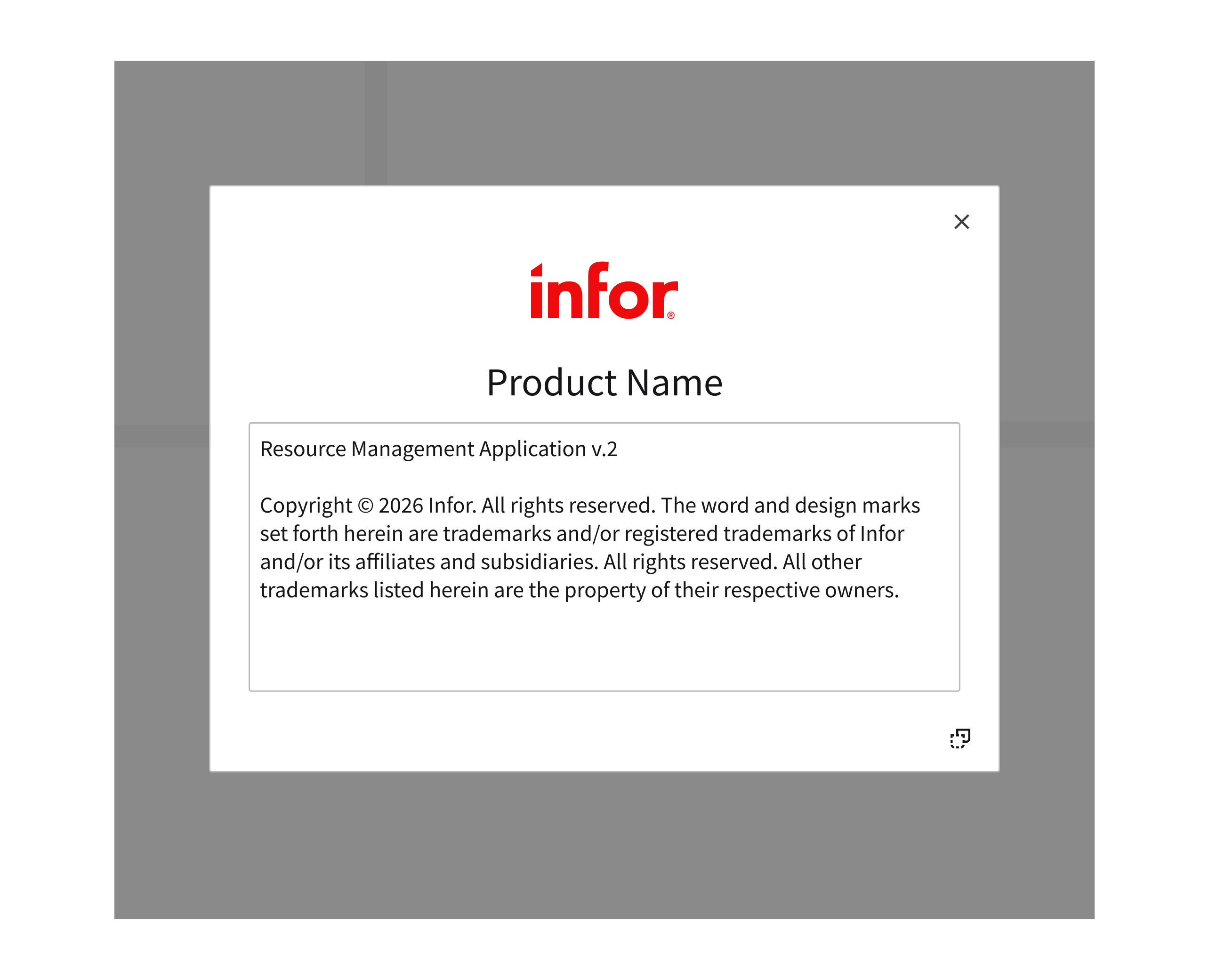
A modal can be displayed to show information about a product.
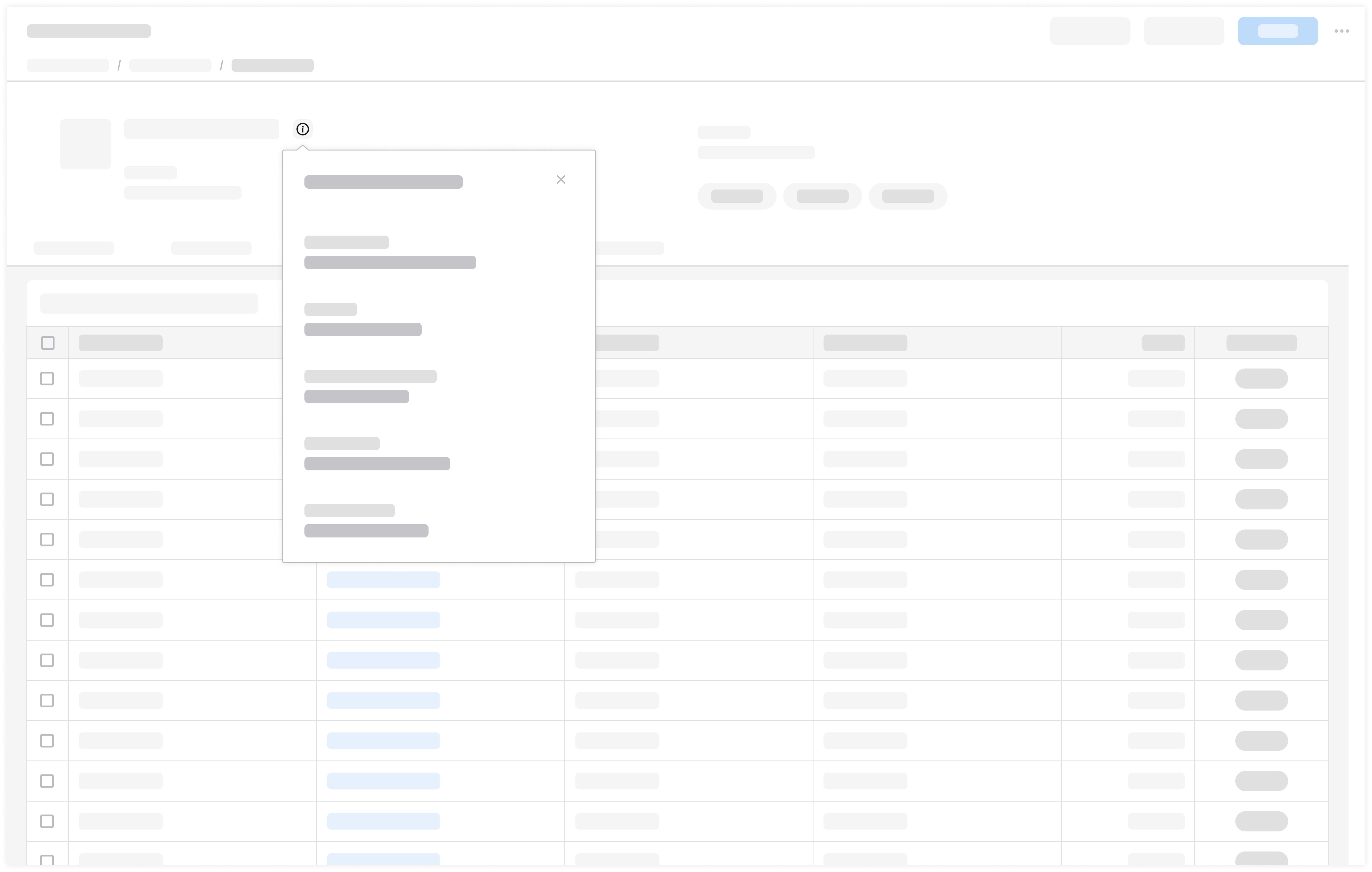
Non-Modal Example
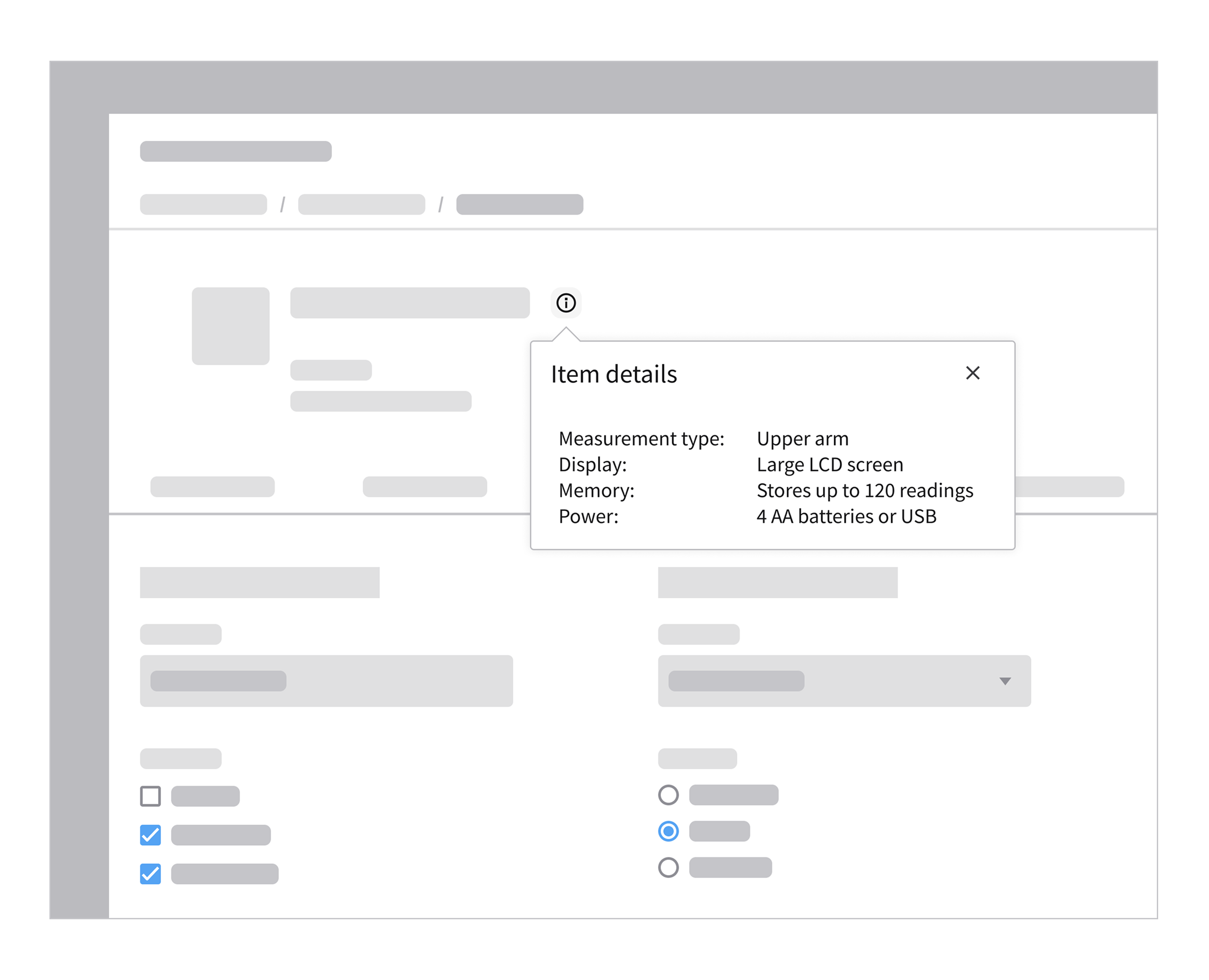
After clicking the information icon, a popup component displays more information about an item. This provides the user with context-specific details without interrupting their workflow.
2. Acknowledgement
- Delivers a message that requires the user’s acknowledgment.
- Applicable to modal dialogs only.
- Utilizes 1 primary button.
2. Content
3. Close button (optional)
4. Button group
Modal Example
System updates that require the user’s acknowledgement before proceeding.
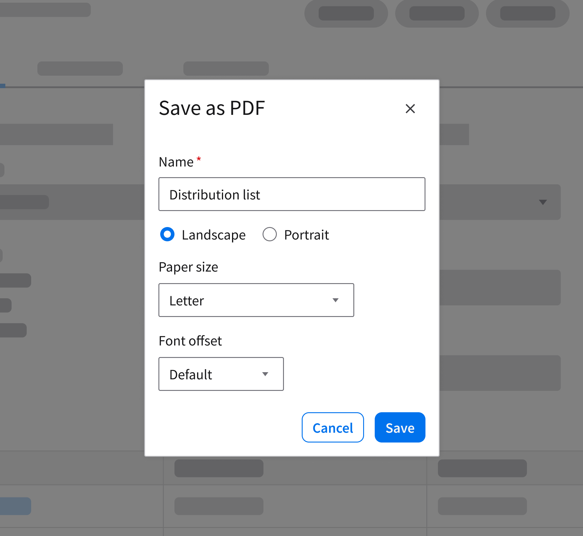
3. Transactional
- Prompts the user to complete a short, focused task before proceeding. It requires an explicit action—such as saving or canceling—for it to close.
- Applicable to both modal dialogs and non-modal dialogs.
- Utilizes 2 buttons in a button group:
- A primary button for completing the task.
- A secondary button for dismissing the dialog.
2. Content
3. Close button
4. Button group
Modal Examples
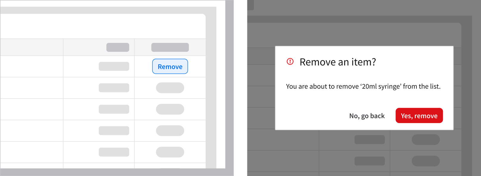
A configuration task that requires the user’s confirmation before the workflow can continue. This example is using the modal component.
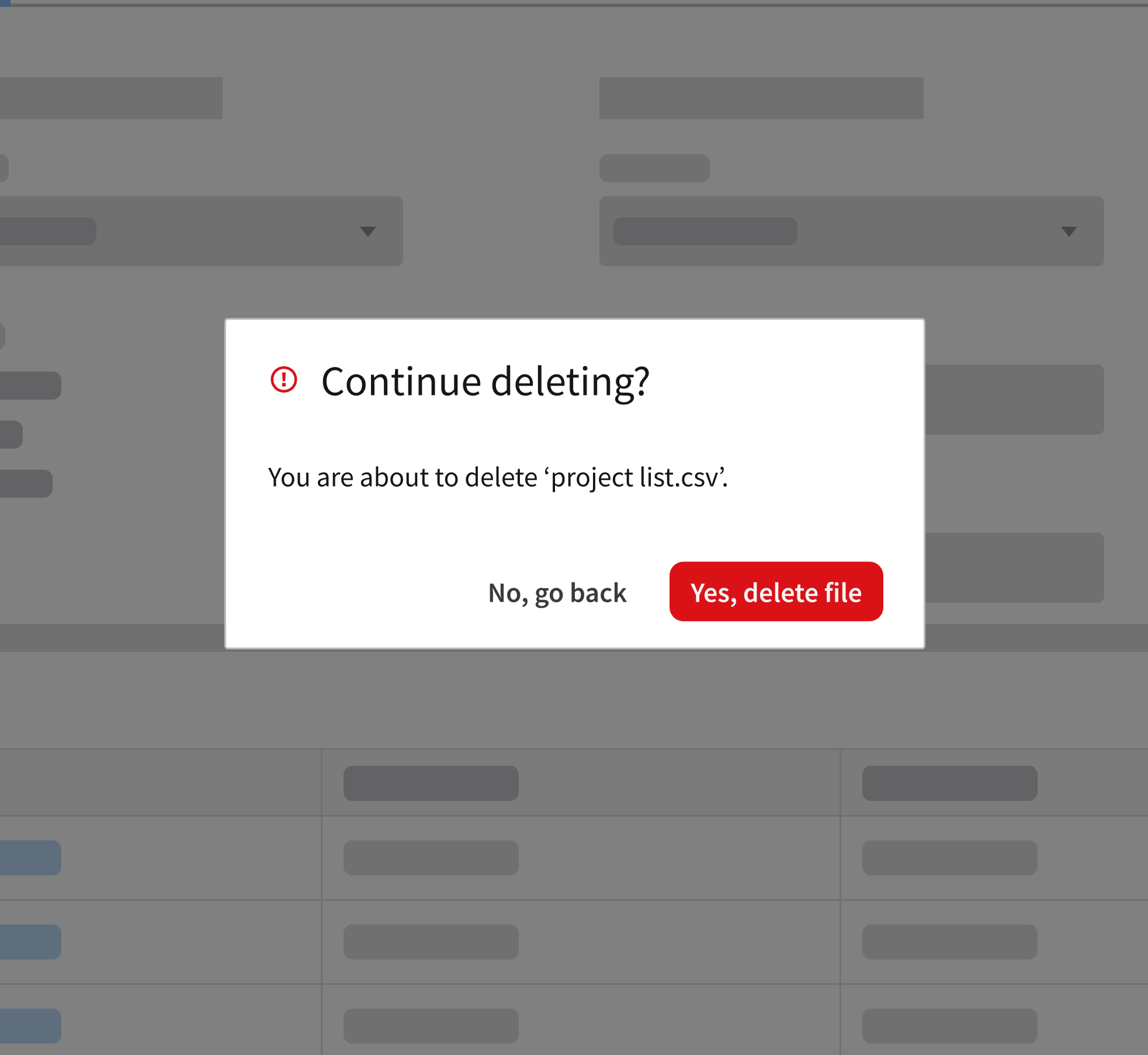
Deleting a record is a destructive action that requires the user’s confirmation. By intentionally interrupting their workflow, it ensures that the user understands the consequences before proceeding. This example is using the message component.
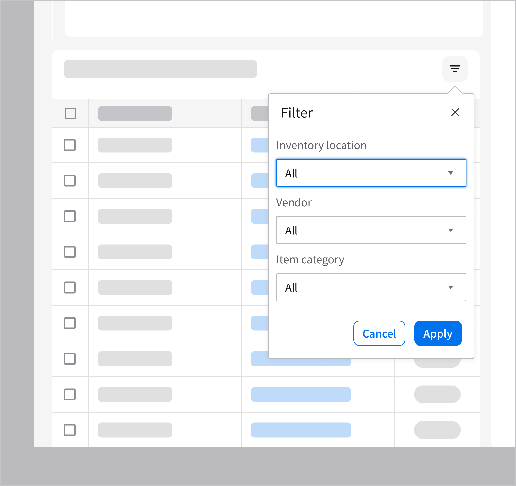
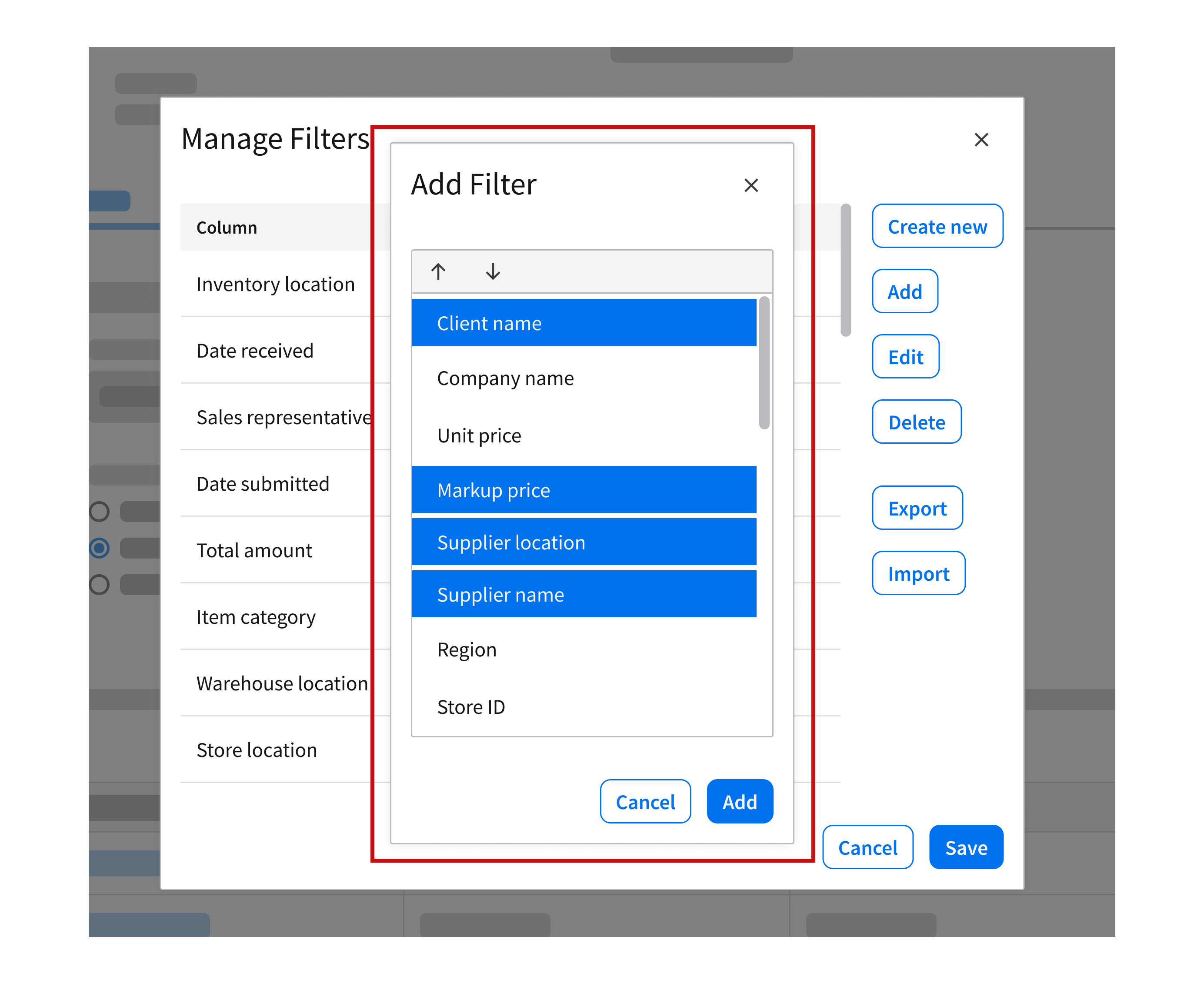
Non-Modal Example
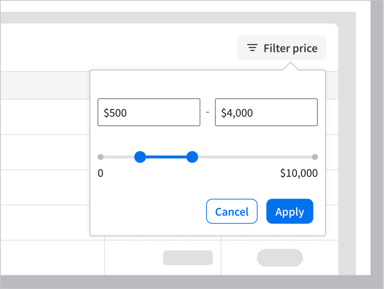
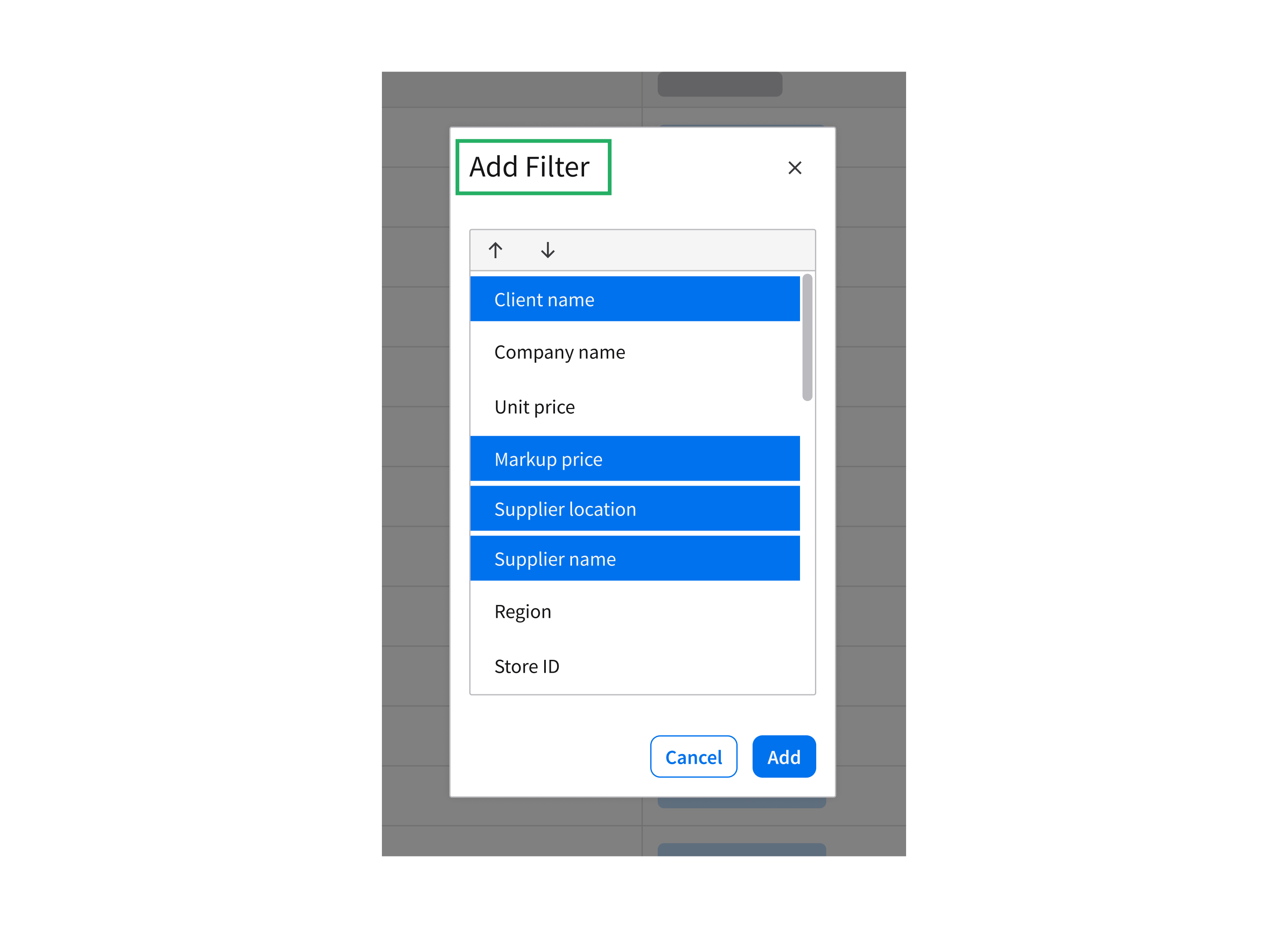
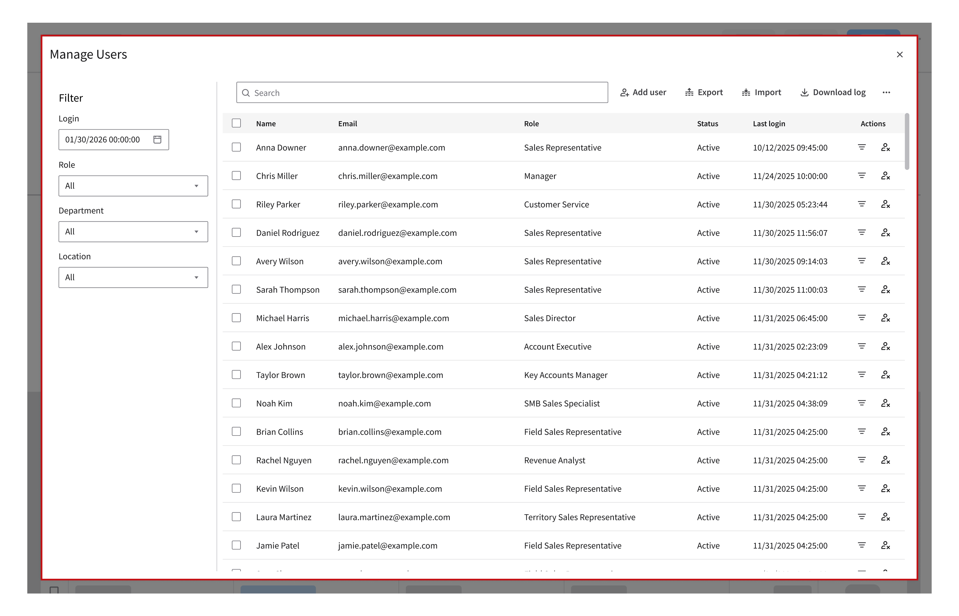
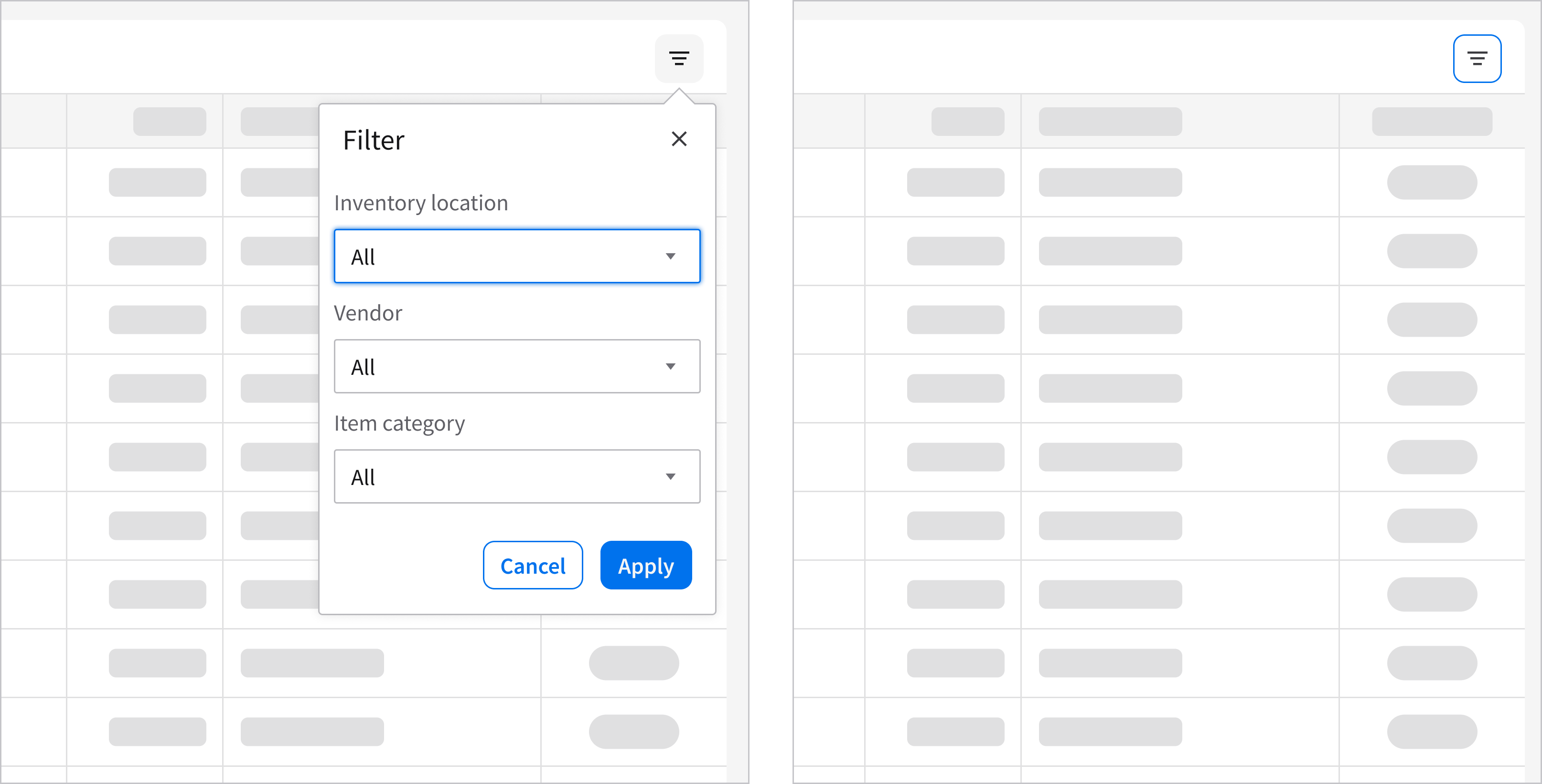
Filtering data grid values is an optional interaction. This allows the user to continue interacting with the underlying content while applying or adjusting filters. This example is using the popup component.

4. Sequential
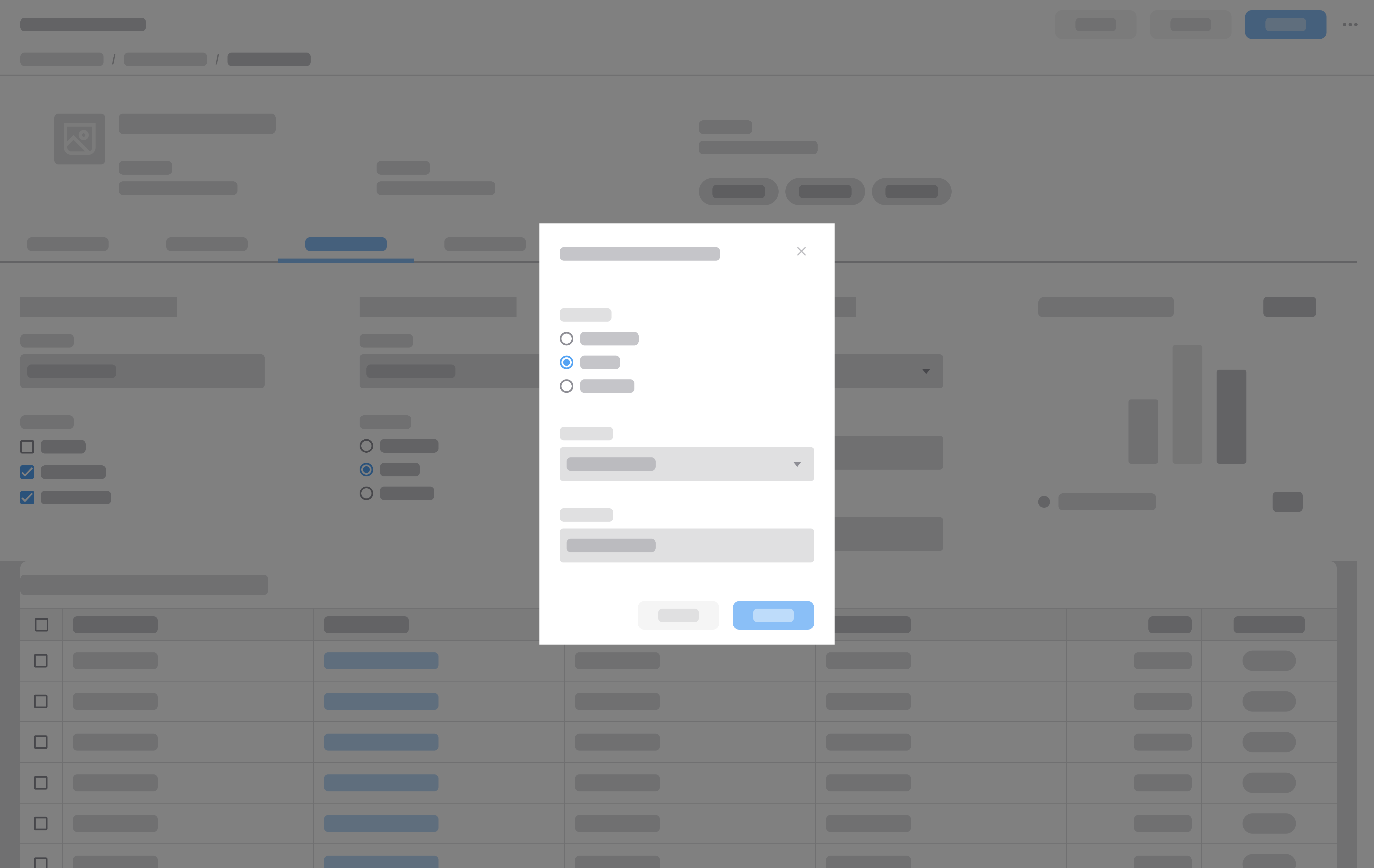
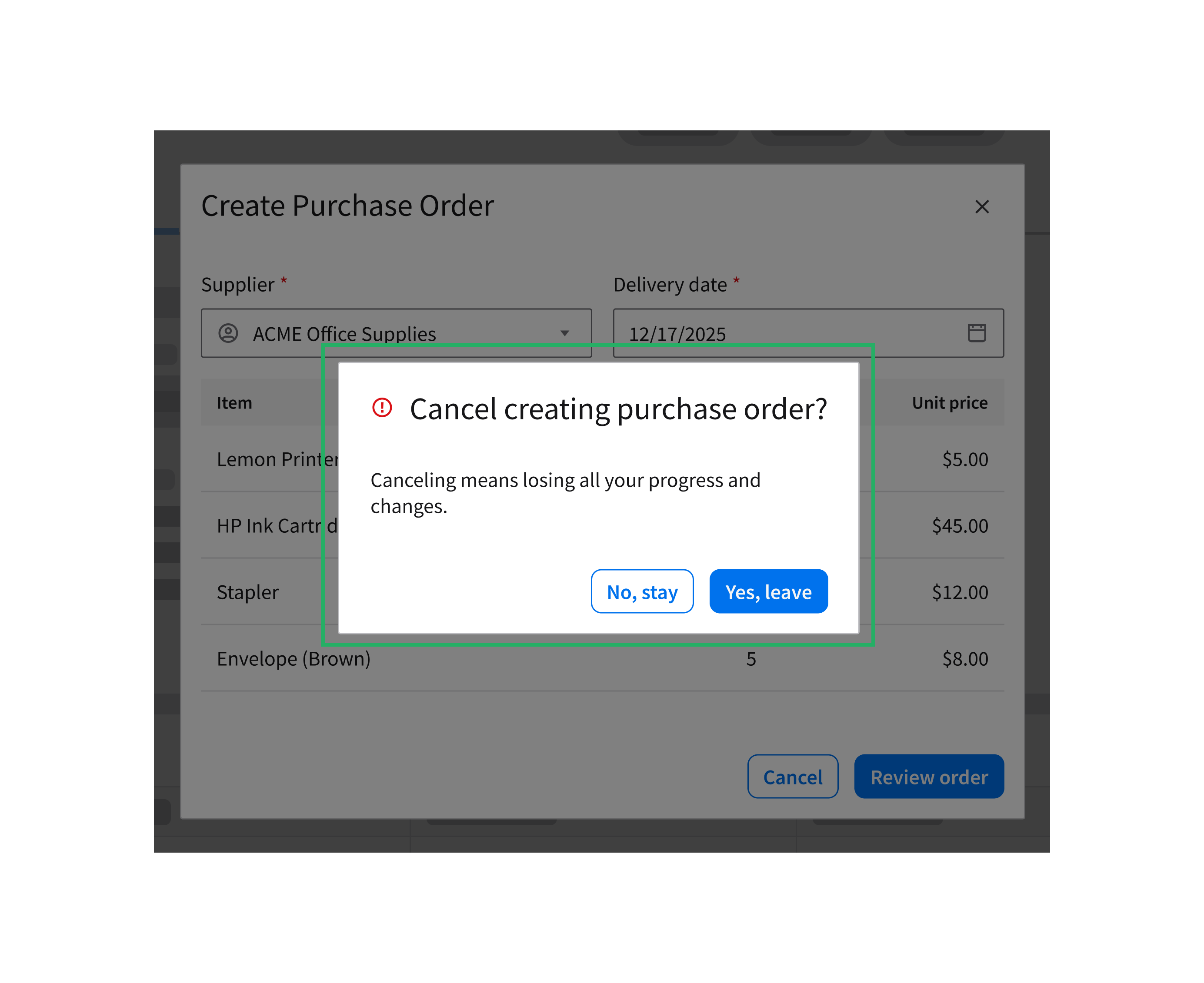
- Requires the user to complete step-by-step tasks before closing.
- Applicable to modal dialogs only.
- Utilizes 2 or 3 buttons such as “Next”, “Back”, and “Cancel”.
2. Content
3. Close button
4. Button group
Modal Examples
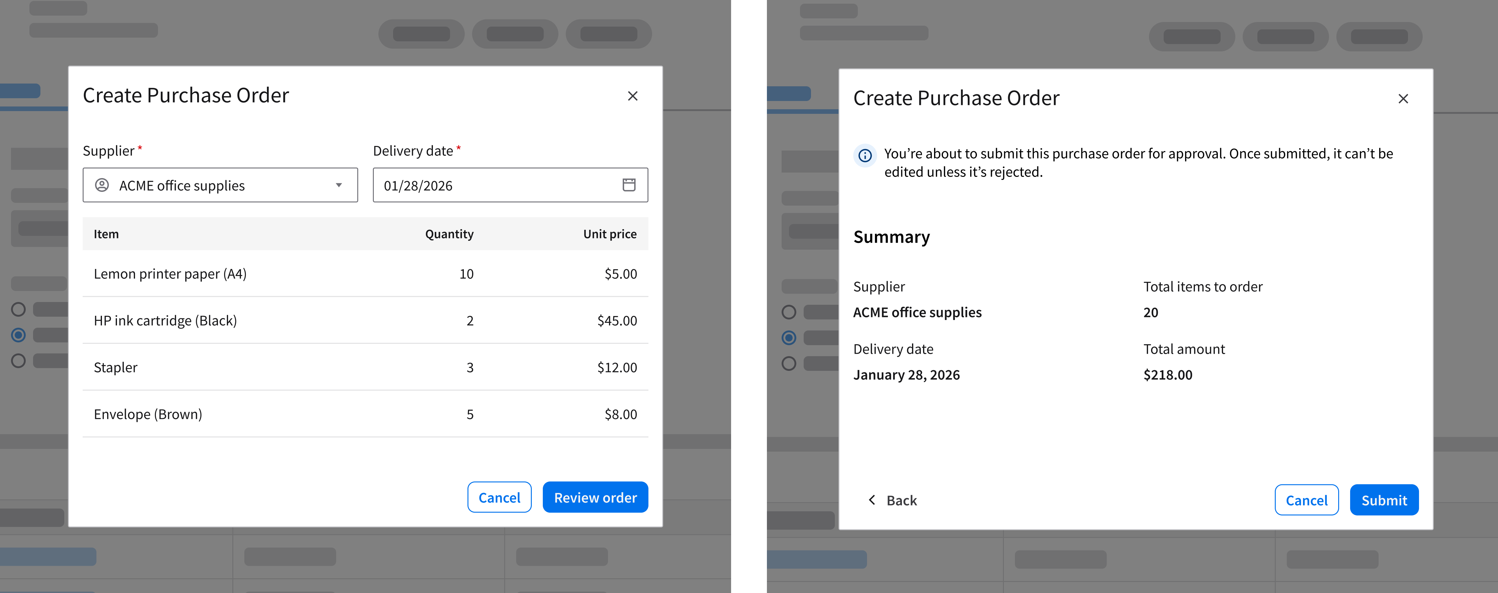
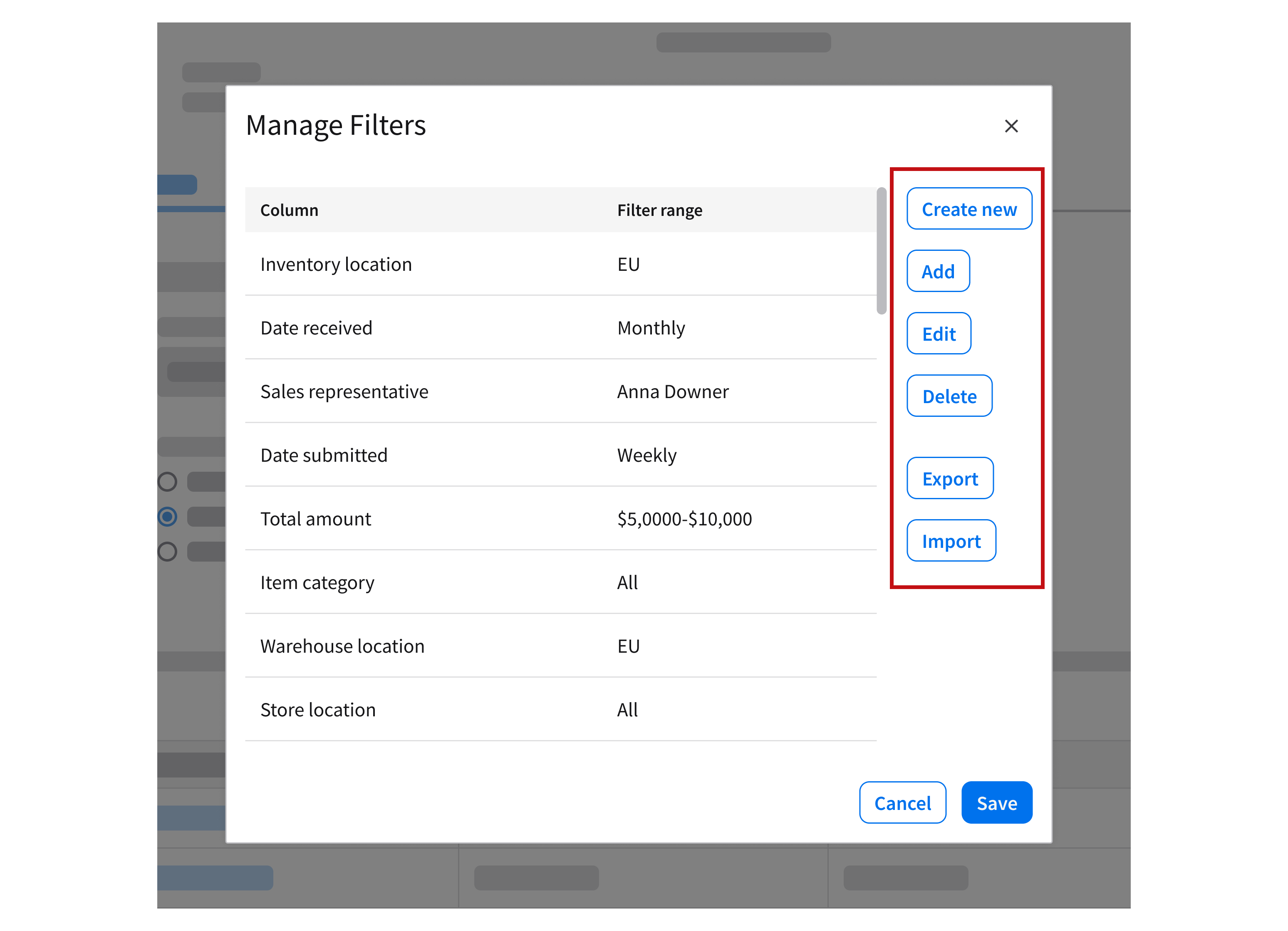
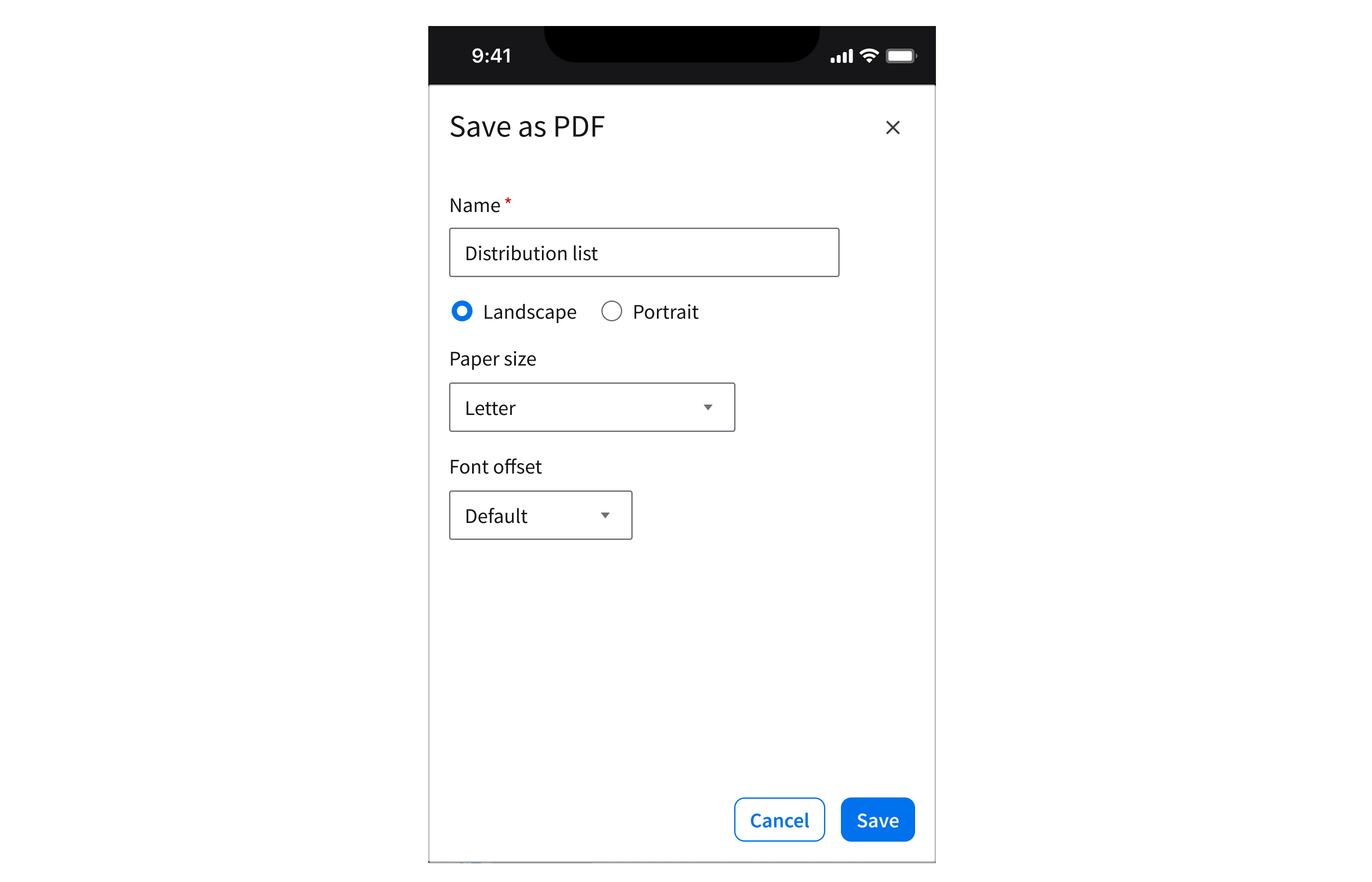
Creating a purchase order requires the user to complete 2 sequential tasks: First, Entering supplier and item details. Second, reviewing the order summary. In second image, note that the 3 buttons have different weights: “Submit” is the primary action button, located on the far right; “Cancel” is the secondary button; and “Back” is a tertiary button.
Behavior and Interaction
Initiating a Dialog
Dialogs open in response to actions initiated by the user. Common components that can trigger dialogs include buttons and hyperlinks.
Using a Button
Initiating a modal dialog that opens after clicking a button.
Initiating a non-modal dialog that opens after clicking a button.
Using a Hyperlink
Initiating a modal dialog that opens after clicking a hyperlink.
Initiating a non-modal dialog that opens after clicking a hyperlink.
Dismissing a Dialog
The user can dismiss a dialog in 3 ways:
- Clicking the [x] button closes the dialog without saving any data.
- Clicking the “Cancel” button (the secondary button) closes the dialog without saving any data. This applies to transactional dialogs and sequential dialogs only.
- Pressing ESC on the keyboard.
Best Practices
Keep Dialogs Focused and Self Contained
Keep the title simple and include only the necessary content. Avoid adding links that navigate users away, open other layers, or distract from the main action.
Do
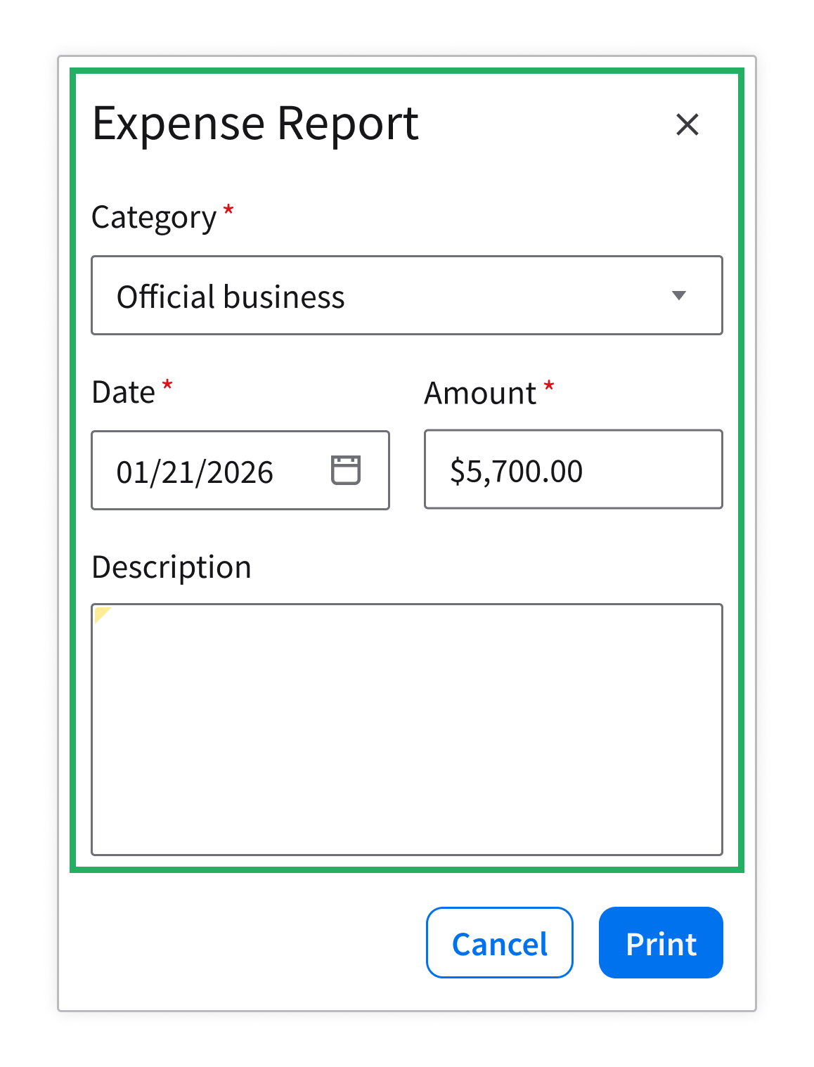
Do: Focus the content on a single purpose.
Don’t
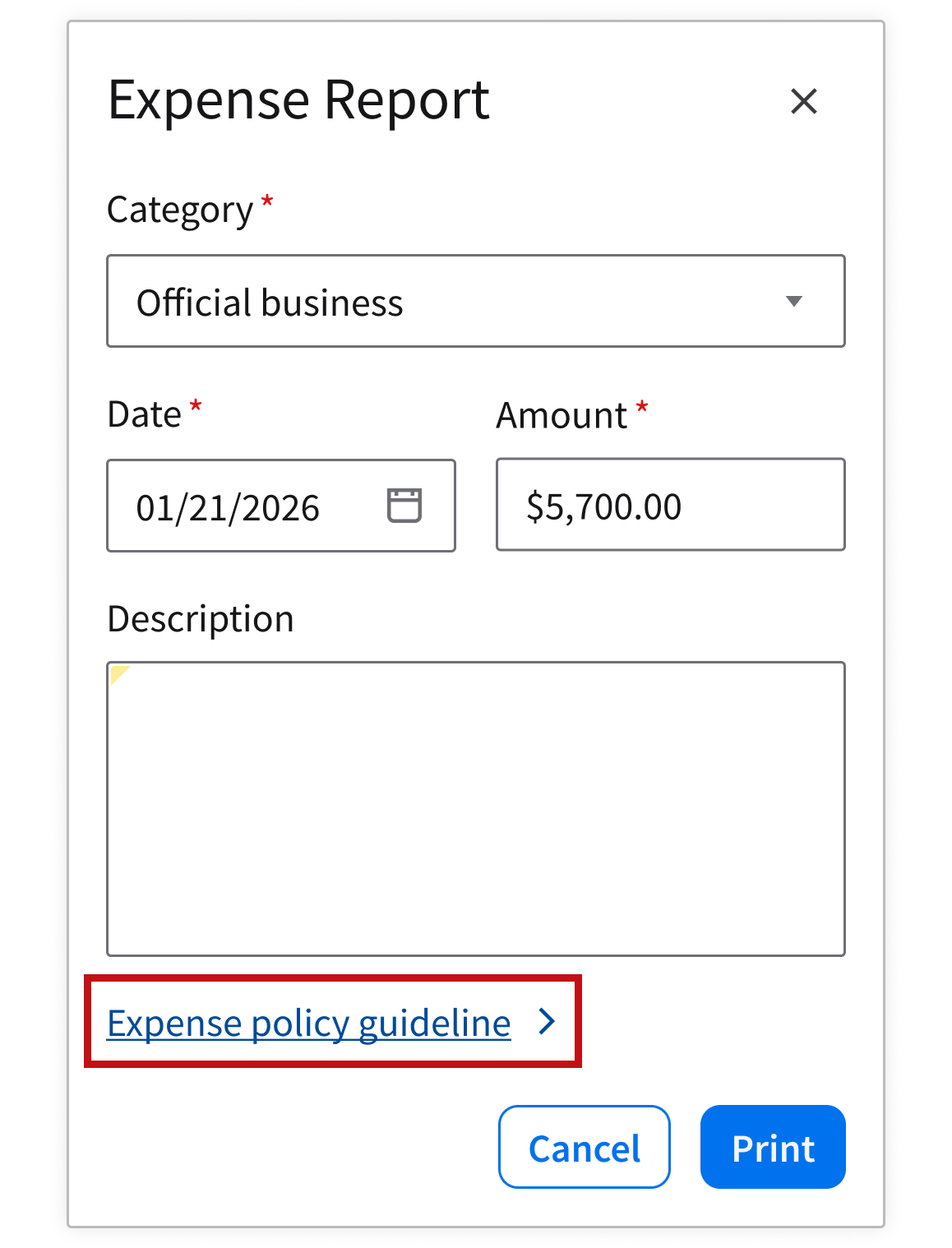
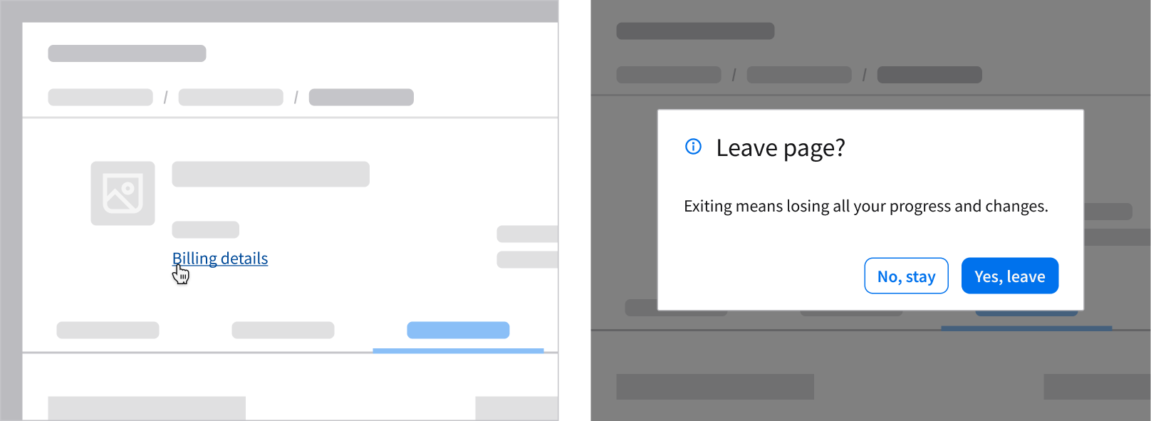
Don’t: Include links that redirect the user away from the current page while the dialog is open. Instead, consider providing the link on the parent page (for example, inline with the related item) so the user can access it before opening the dialog. You can also use a separate tab to open the link.
Use Nested Dialogs Sparingly
Nested dialogs create focus traps, increase cognitive load, and often break accessibility. Use them for critical situations only, limiting your dialog to 2 levels maximum.
Do
Do: Use a secondary dialog to confirm a critical action or to prevent information loss if the user tries to dismiss the primary dialog abruptly.
Don’t
Don’t: Open a dialog on top of another dialog for completing a subtask, as shown above.
Limit Scrolling
When the user has to scroll, they can lose sight of the dialog’s purpose and controls, breaking their focus and the interaction flow.
Do
Do: Keep content within a comfortable viewport. If scrolling is necessary, ensure that the header and footer remain fixed so actions are always visible. Use a separator to distinguish the footer. For example, display a pre-filtered, narrowed down list that better provides what the user needs.
Don’t
Don’t: Overload the dialog with multiple sections or content so long that it feels like a full page. Instead, consider using pagination for long data grids or switch to a full page if the content requires accordions or tabs to fit.
Keep Interactions Linear
Use dialogs for single, linear tasks that interrupt the flow only briefly. Examples include confirming, editing, or acknowledging information.
Do
Do: Use dialogs for simple and focused tasks that are directly related to the current context. For example, adding a quick note or comment.
Don’t
Don’t: Use dialogs for complex multistep or branching workflows. Instead, consider using a full page if the task requires more space or complex navigation.
Use Full-Screen Modals Thoughtfully
Full-screen modals can be jarring on large screens, but they’re often necessary for mobile devices in order to maximize the real estate of a smaller screen.
Do
Do: Use full-screen modals on mobile devices when space is limited and the task requires the user’s full attention. Examples include filling a form, editing profile details, or reviewing a long list.
Don’t
Don’t: Use full-screen modals on desktop. This breaks visual continuity with the parent page. Instead, consider using a full page if a larger space is needed to display the content.
Accessibility
When a dialog opens, it immediately guides the user to the first action that they can take. A visible focus state helps users who utilize keyboard and assistive technology to begin interacting right away.
If the content is informational, initial focus is set to the first interactive element or the dialog container itself (left). When the dialog closes, focus returns to the original component so the user can continue their task easily (right).