Button Group
The button group organizes a set of actions into a clear and cohesive layout that provides visual hierarchy.
The button group is typically anchored to the bottom of a modal, a card, or a page, enforcing a consistent order and visual hierarchy. By clearly distinguishing the primary goal from secondary, tertiary, or dismissing options, it reduces cognitive load and simplifies the user’s decision-making.
Anatomy
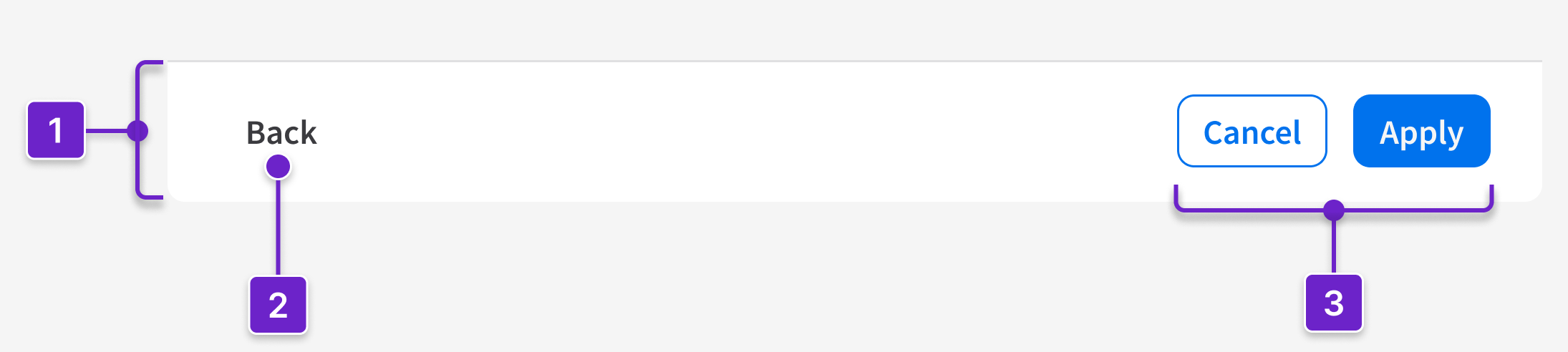
- Container
- Button (optional)
- Button(s)
Anchor the button group to the bottom of a component (like a modal or a card) or a page. Arrange each button horizontally by its importance, from right to left, shown as follows:

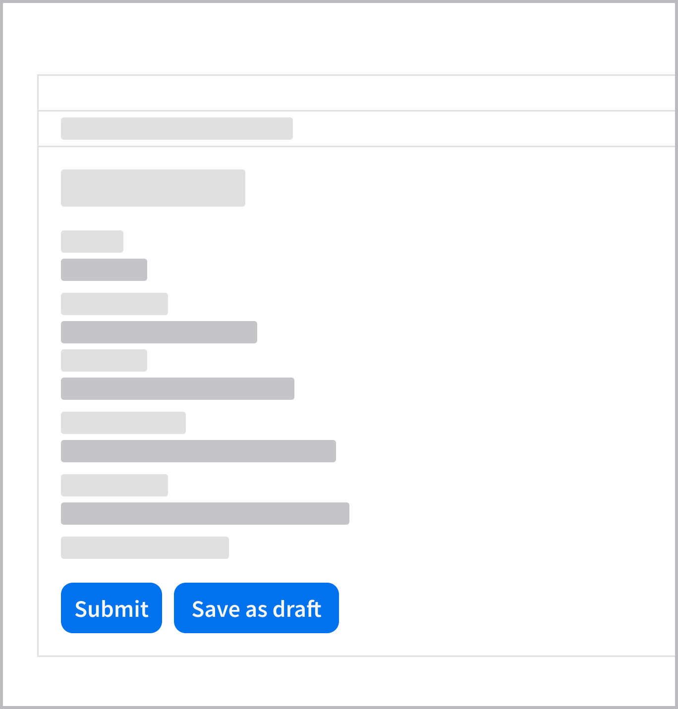
Primary Button
- The primary button represents the main, expected action such as “Apply”, “Next”, or “Submit”. It’s placed on the far right.
Secondary Button
- The secondary button represents an alternative or supporting action such as “Cancel” or “Back”. It’s placed immediately to the left of the primary button.
- Don’t use a secondary button as the only button in a button group.
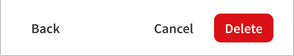
- If the primary action is destructive (“Delete”), use a tertiary button as a lower-priority alternative (“Cancel”). If needed, include another tertiary button (“Back”) that’s placed on the far left.
Tertiary Button
- The tertiary button represents a low-priority task that’s separated visually from the main flow. It’s placed on the far left. Use it for:
- Optional actions that allow the user to defer a decision, such as “Skip”, “Not now”, or “Continue later”.
- Dismissing actions that allow the user to exit the current view without saving changes, such as “Close” or “Back”.
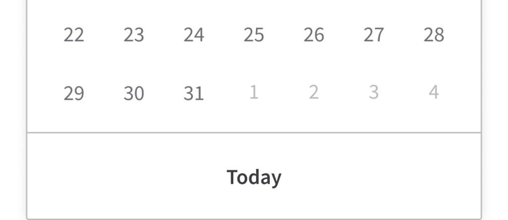
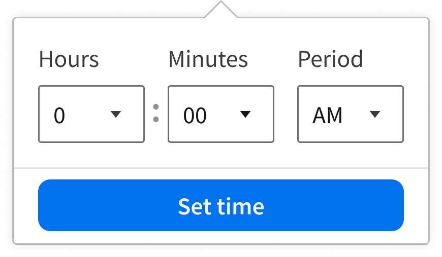
- A tertiary button may appear as the user’s only action if the main task is optional or completed via another interaction (like clicking a date in a calendar or dismissing a popover).
When to Use
- Use the button group for establishing hierarchy and grouping related actions.
- Visually distinguish the primary action (high emphasis) from secondary actions or tertiary actions (lower emphasis) within the same area.
- Give identical visual weight to multiple actions that share the same priority level.
- Example: A set of secondary actions like “Export” and “Print”.
When to Use Something Else
- If only 1 action is required, use a standalone button.
- If there are more than 3 actions, group lower-priority items into a menu button to reduce cognitive load and simplify the interface.
- To provide tools for complex content manipulation, like text formatting, use a toolbar.
- To toggle between related data views, use a segmented control.
- When the user needs to navigate to a different page without performing an action or saving changes, use a hyperlink.
Best Practices
- Limit button groups to a maximum of 3 actions. More actions increase decision time and weaken action hierarchy, making it harder for the user to identify the recommended next step.
- In multistep flows, keep the button order, hierarchy, and labeling consistent across steps. Changing the position or emphasis of actions between steps increases the risk of user error and slows task completion.
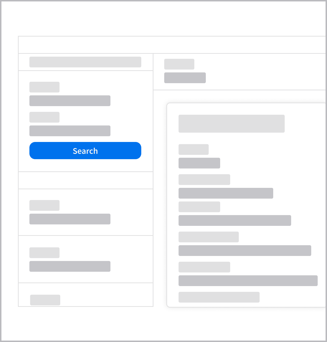
- To provide larger and more accessible targets, a button can expand to fill the available width in fieldsets, modals, and popups. This is used when:
- The container or the viewport is narrow (as it is in mobile devices).
- The action area is anchored to the bottom of a scrollable container.
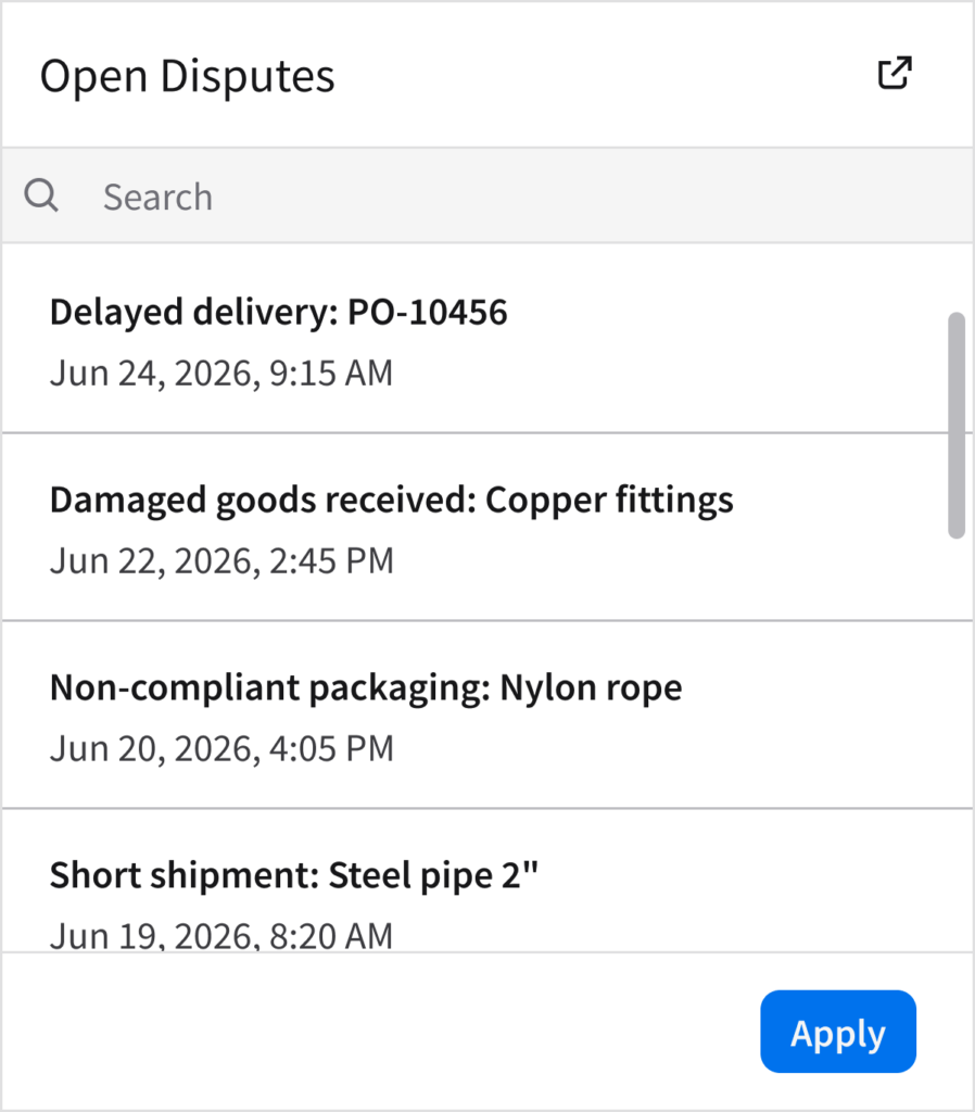
- When a container includes scrollable content, keep the actions accessible by anchoring the button group to the bottom of the container. Use a horizontal separator to visually distinguish this fixed area from the moving content. This helps the user:
- Recognize the button group as persistent.
- Understand that the content area is scrollable.
Primary Actions and Secondary Actions
Do
Do: Use 1 primary button to represent the main task that the user needs to complete.
Don’t
Don’t: Show multiple primary buttons in the same context.
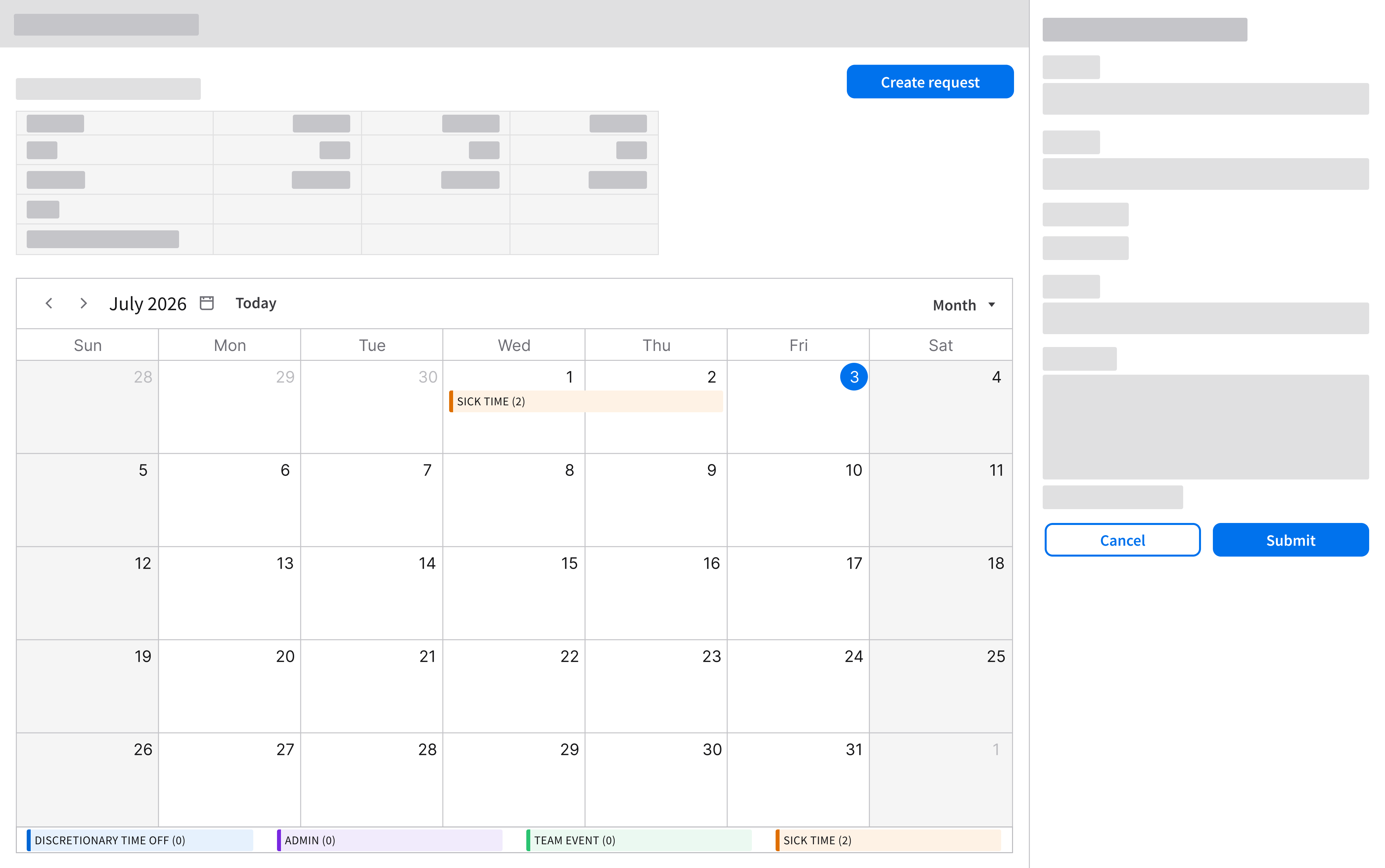
- There’s a rare use case when 2 primary buttons appear on the same page—but only temporarily. It can occur when the user launches a separate task within the same page. As shown below, “Create request” is the main primary action and “Submit” is the temporary primary action. “Submit” is clearly scoped, visually contained to its own task, and will disappear when the user completes the temporary workflow.
Supporting Actions
Do
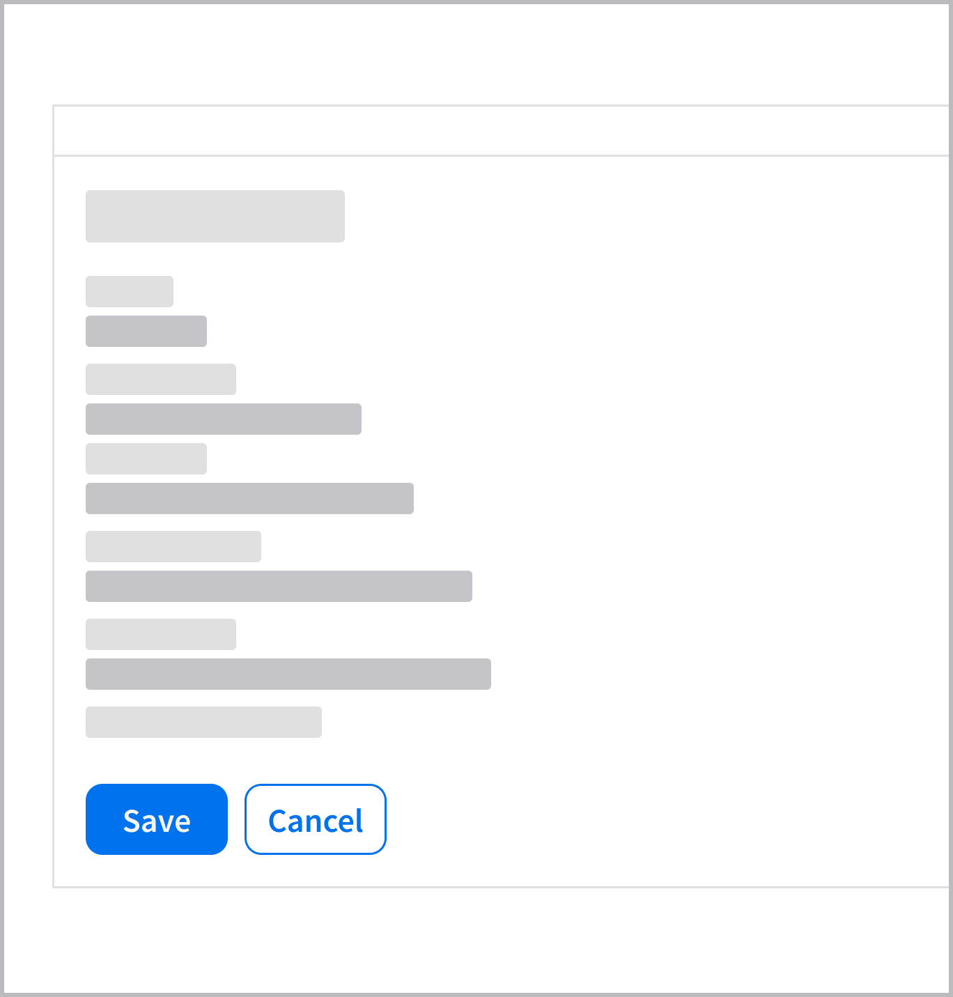
Do: Use a secondary button to support the main user action.
Don’t
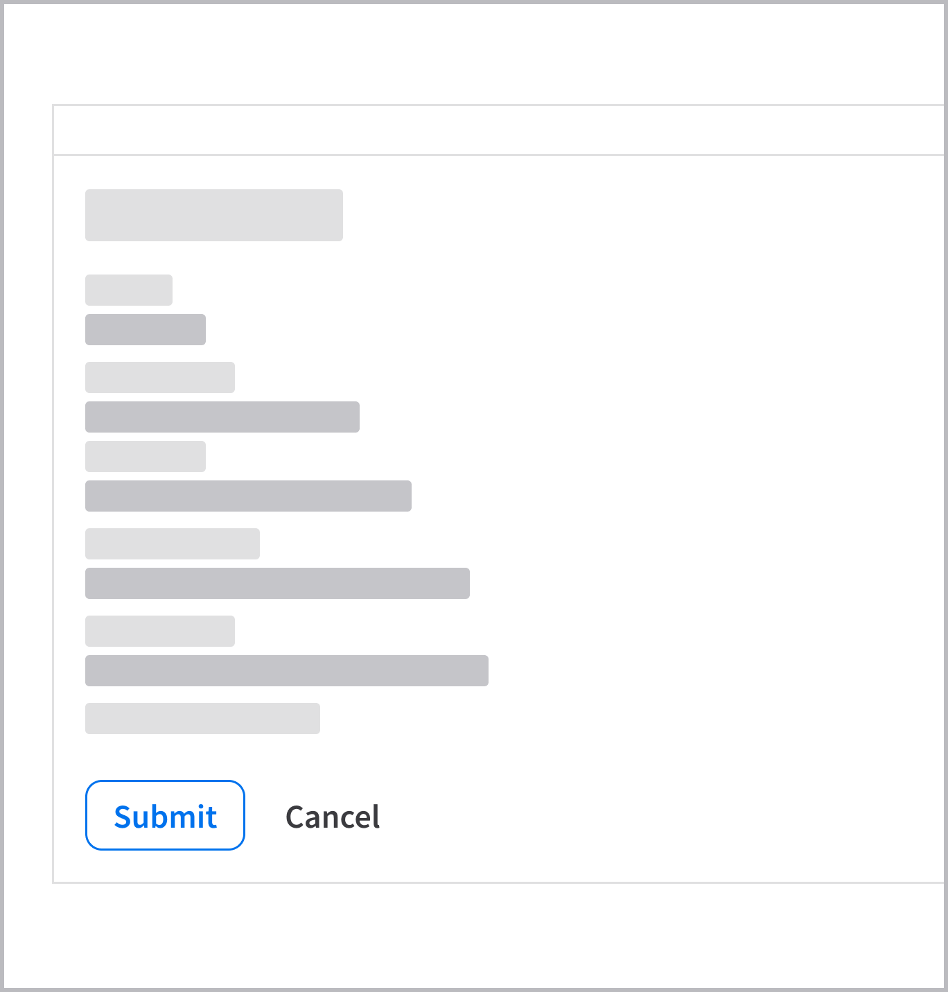
Don’t: Use a secondary button to represent the main user action.
UX Writing
- The button group follows the UX writing style guidelines for the button component.
- Follow these best practices for writing effective button labels.
Accessibility
- All buttons need associated text labels, even if they’re visually hidden.
- Button labels must be descriptive and unique within a page.
Keyboard Interactions
Tab(orShift+Tab) moves focus to the next (or previous) action button.EnterorSpacetriggers the action.