Data Grid View
In a data grid view, large data sets are displayed in a tabular format, streamlining the user’s ability to view, sort, filter, and edit records.
When to Use
Follow the page layout for a data grid view when the user needs to:
- Search, filter, and sort structured data, such as orders or transactions.
- Compare multiple records, such as product quantities across different warehouses.
- Find and act on items that are low in stock.
- Example: The user can filter the grid to quickly find products that need to be reordered.
- Inline edit or bulk update records, such as shipment statuses.
Key Sections
A typical data grid view has 3 sections of content:
- Header area
- Toolbar
- Data grid
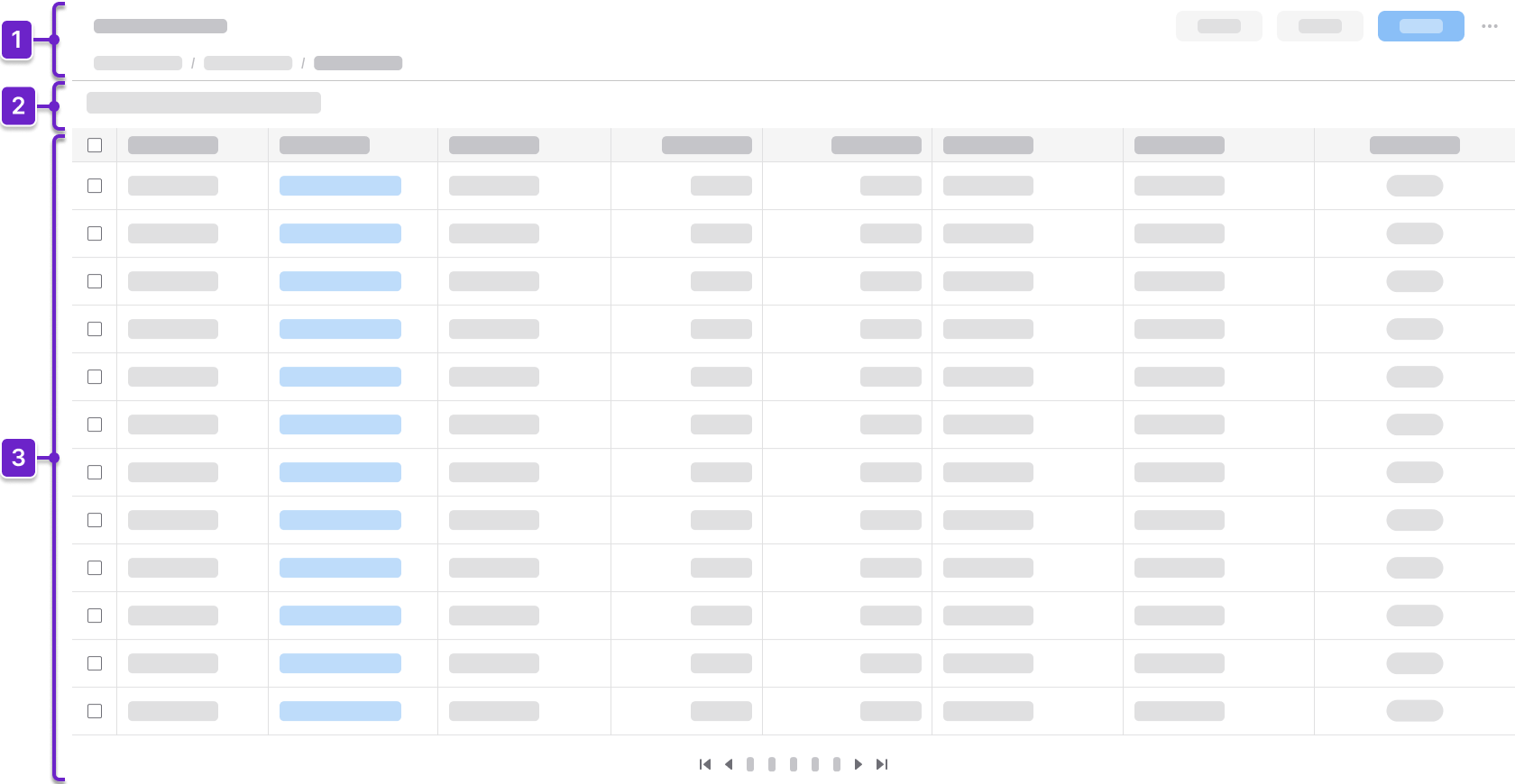
1. Header Area
Tells the user where they are within the application and provides context about what’s on the page. This generally includes the page title and actions. It could also include a breadcrumb.
2. Toolbar
Sits above the data grid. It contains options for the user to search and filter, as well as action buttons that are specific to the data grid.
3. Data Grid
Displays the data set in a table format. It supports actions such as “Create”, “Edit”, “Delete”, “Search”, “Filter”, and “Sort”. It may use a pager or a virtual scroller for handling large data sets.
Components
IDS components can help you build a data grid view. The structure of the page will depend on how much information the user needs to see. Here are some components to consider:
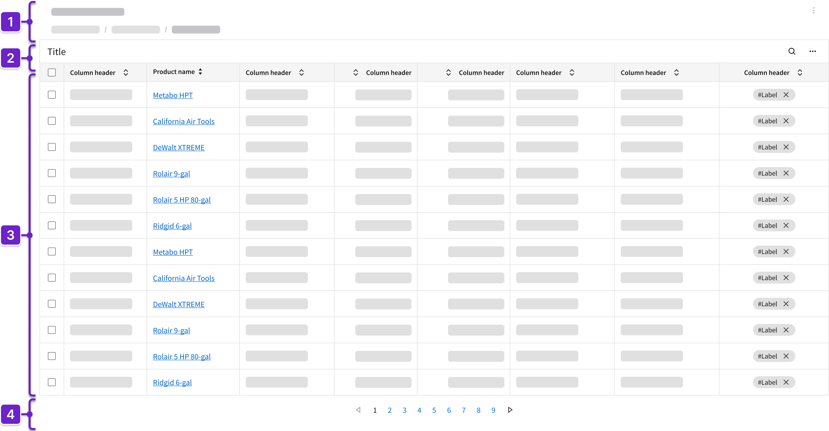
- Header
- Can include breadcrumbs and a toolbar.
- Toolbar
- The title should clearly reflect the content of the data grid.
- Includes action buttons that are specific to the data grid; these may be divided into primary actions for the data grid or for selected rows or columns.
- May include search or filter functionality that highlights the results.
- Data grid
- Displays records in a tabular format.
- May provide the ability to sort and filter columns.
- When rows are selected, additional actions may appear.
- Can support row selection for batch actions.
- Can include inline editing, fieldsets (read only or editable), dropdowns, tags, and icons.
- May show additional information with expandable rows or embedded components.
- Each column must be relevant to the user and follow a logical sequence from left to right, starting with the information that’s most important to the user’s workflow.
- Pager or virtual scroller
- Choosing between a pager or a virtual scroller to help the user navigate through large data sets may depend on backend capabilities and technical restrictions.
- A pager is generally better for larger databases because it loads data in discrete chunks and supports stable, predictable navigation.
- A virtual scroller—also referred to as an infinite scroll—is suitable when seamless, continuous browsing is desired and backend support allows for the incremental loading of data.
- Choosing between a pager or a virtual scroller to help the user navigate through large data sets may depend on backend capabilities and technical restrictions.
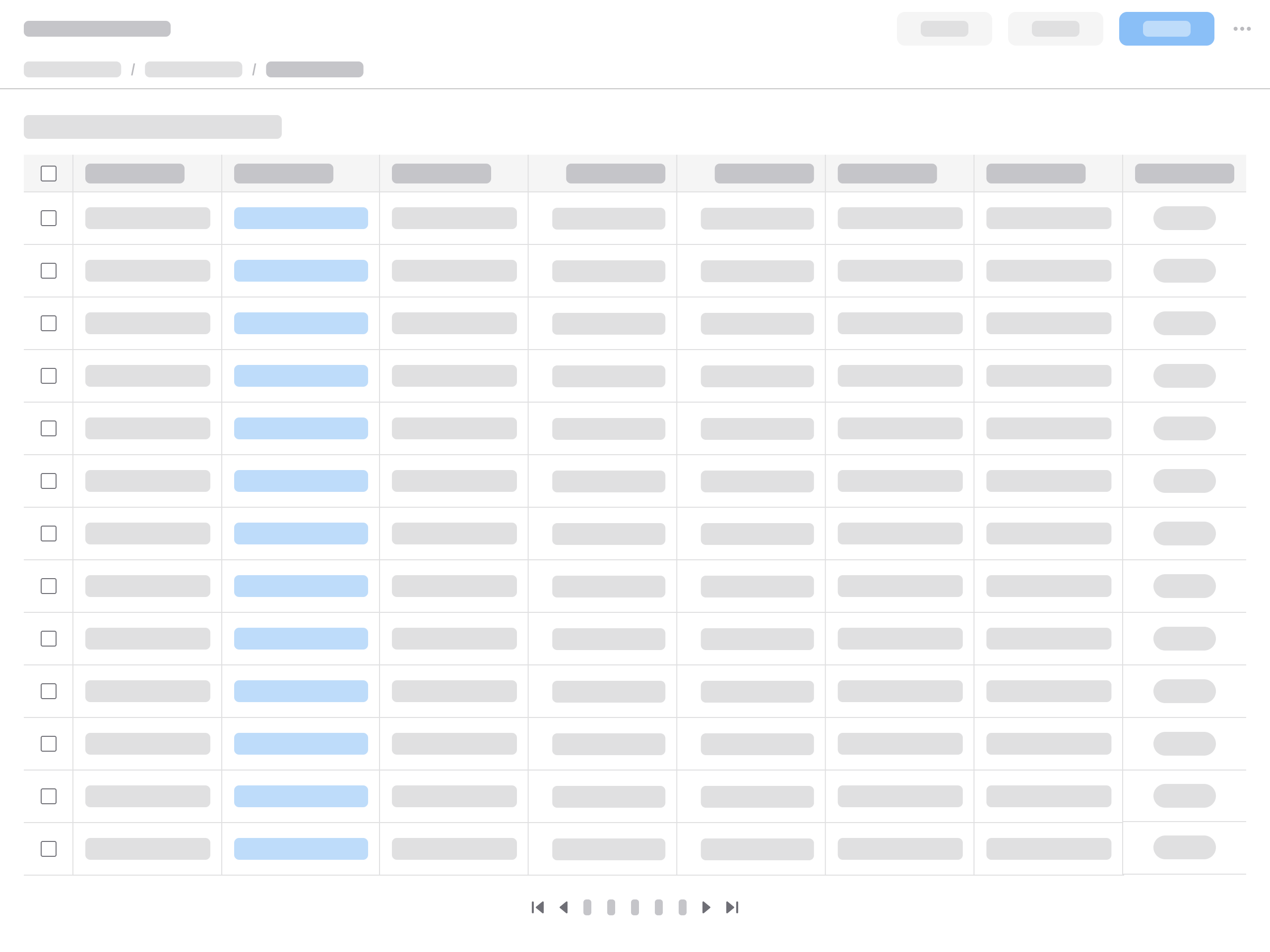
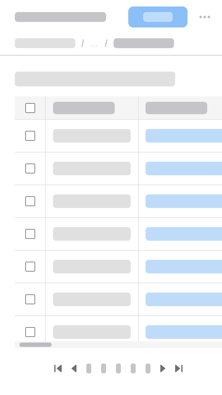
Example
This is a hi-fi example of a data grid view designed using IDS components. Use it as a guide for designing your own page. This layout is available in Figma in the IDS Patterns Library.
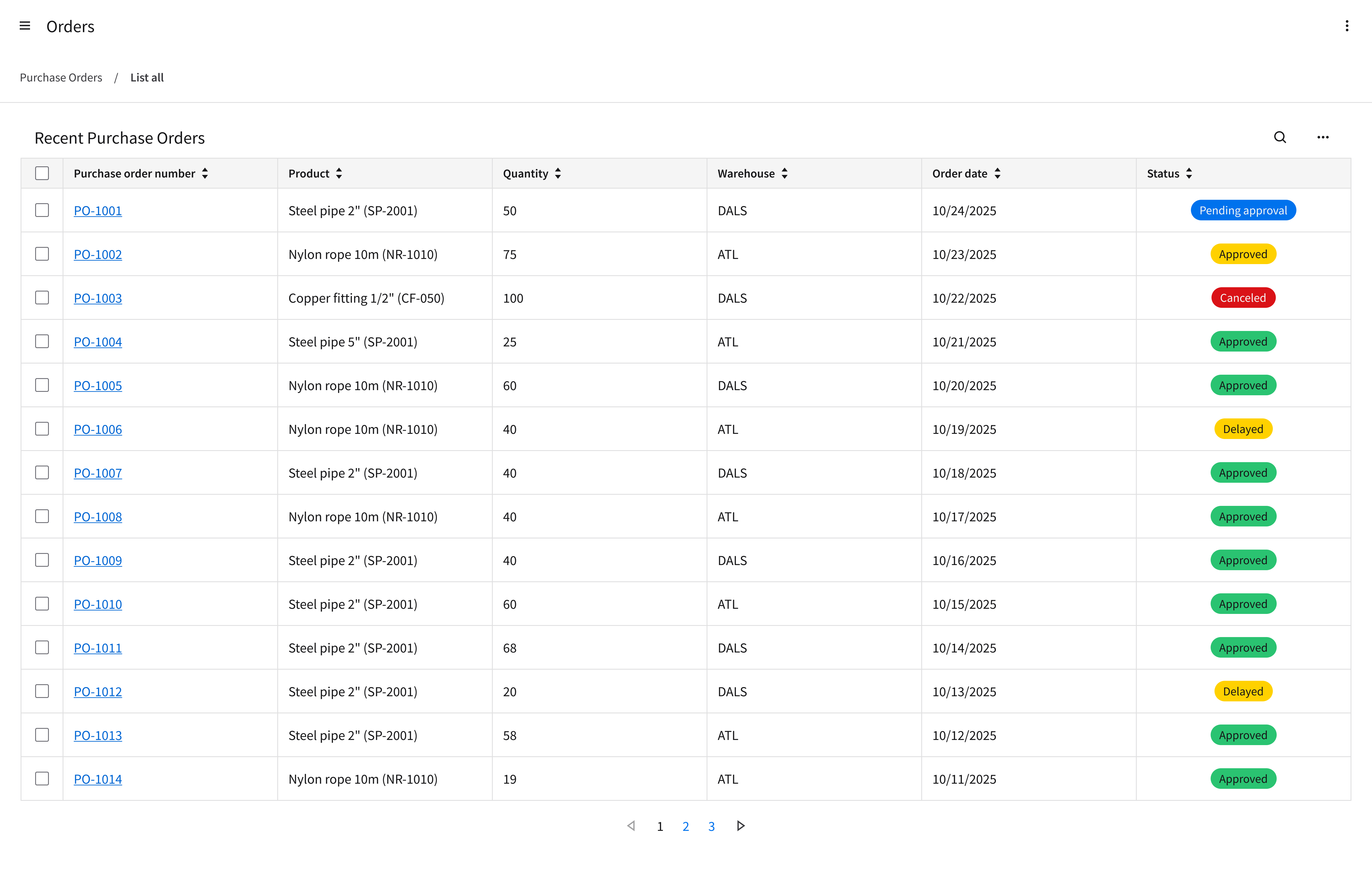
Refer to this library to see examples of data grid views that are being used in the CloudSuites today. (For internal reference only. An Infor SAAM request is required for Wiki access. Updated March 2026.)
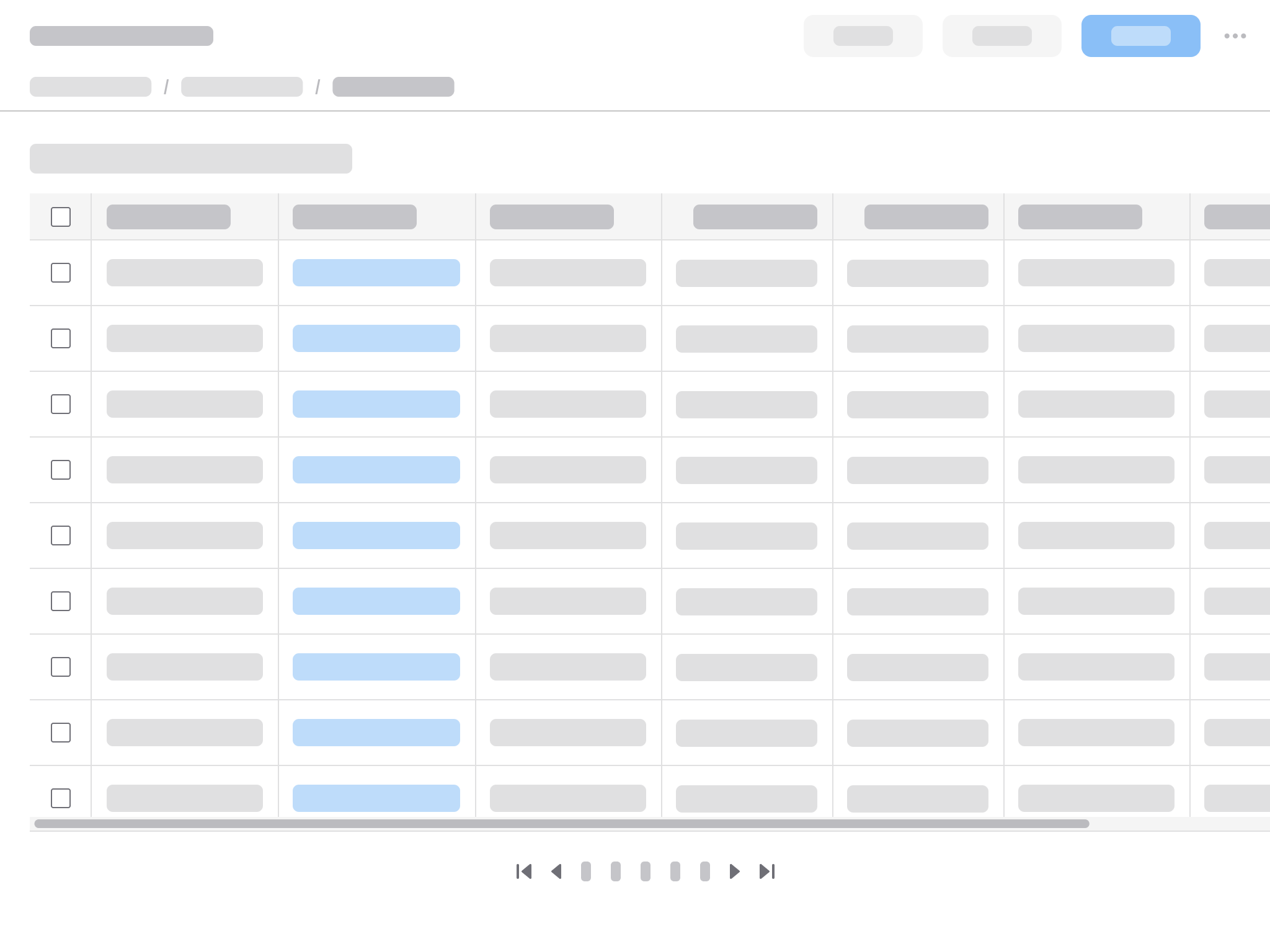
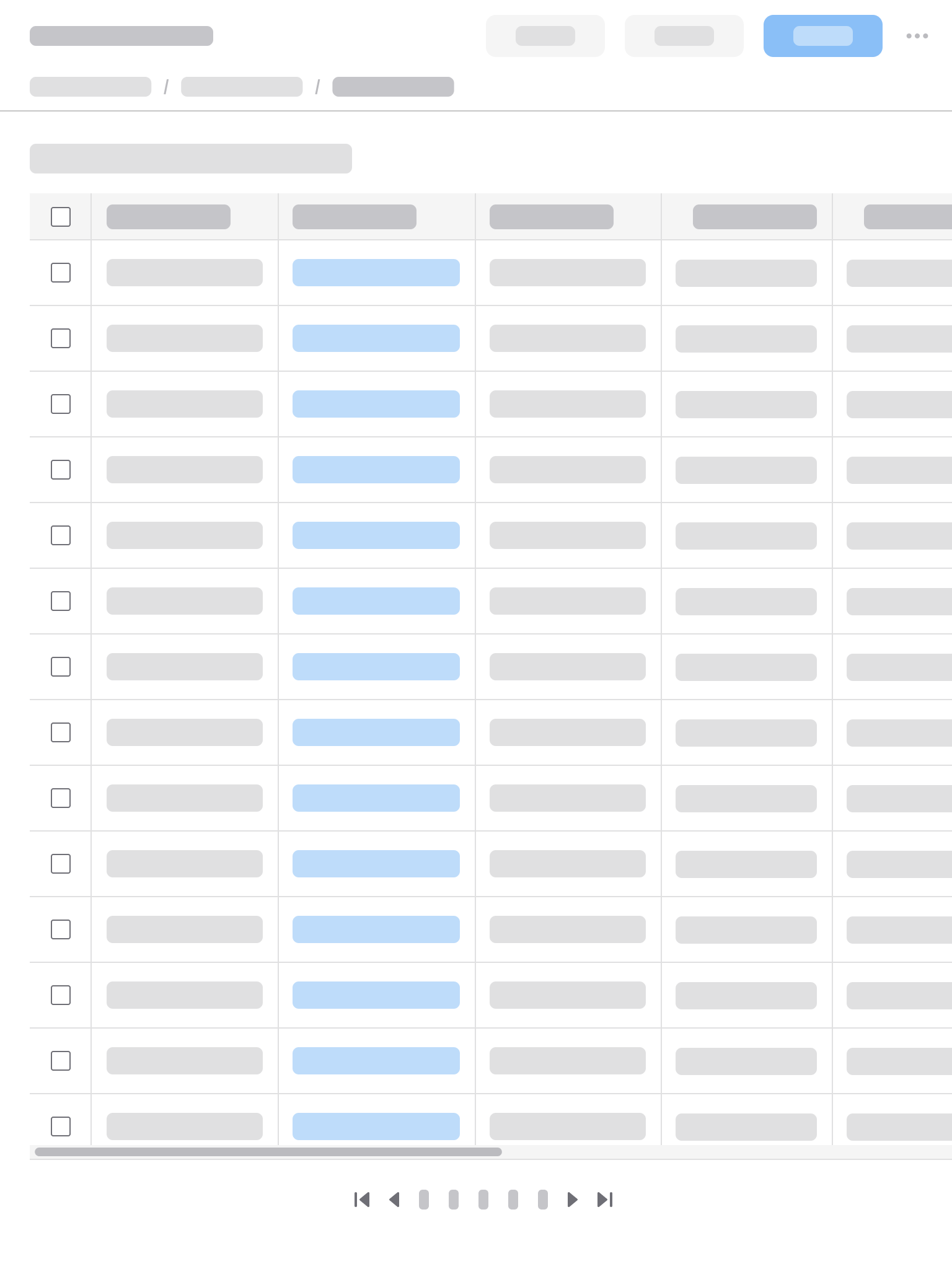
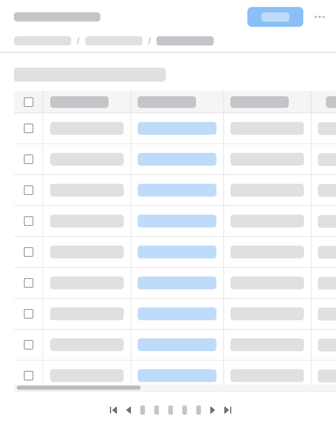
Responsiveness
The page layout for a data grid view is responsive and supports all Infor screen sizes from XXL (>2560 pixels wide) to XS (360–574 pixels). Use a fluid layout that allows the data grid view to dynamically scale its width to the viewport.
A fluid layout has a content area that’s responsive to screen size, with a fixed margin on both the left and the right. This differs from a fixed layout, where the content area stays the same within each breakpoint while the side margin is responsive to screen size. Introduce horizontal scrolling only when the screen size falls below the data grid’s minimum required width.
XXL
>2560 pixels
XXL (>2560 pixels)
XL
1280–2560 pixels
XL (1280–2560 pixels)
L
1024–1279 pixels
L (1024–1279 pixels)
M
768–1023 pixels
M (768–1023 pixels)
S
575–767 pixels
S (575–767 pixels)
XS
360–574 pixels
XS (360–574 pixels)