Dashboard
A dashboard presents only the information that’s relevant to the user’s priorities in a single, consolidated view.
The user can access frequent actions, and quickly spot trends or issues to help them make informed decisions and take action in a timely manner. While the specific content will vary depending on the target audience, the overall structure is widely applicable and supports a consistent user experience in diverse contexts.
When to Use
Follow the page layout for a dashboard when the user needs to:
- Have a consolidated view of the information that matters most to their role, with data that’s aggregated and visualized from multiple sources.
- Examples: Management, operations, and support.
- Have immediate visibility into high-priority tasks, alerts, or recent changes, allowing them to triage issues and focus their attention where it’s needed most—rather than process records one by one.
- Examples: New incidents, escalations, and urgent tickets.
- Detect anomalies such as overdue items or process delays, identify trends, and then drill into more details.
- Examples: Monitoring financial health, tracking operational performance, managing sales, and customer support activities.
Key Sections
A typical dashboard has 2 sections of content:
- Header area
- Main information
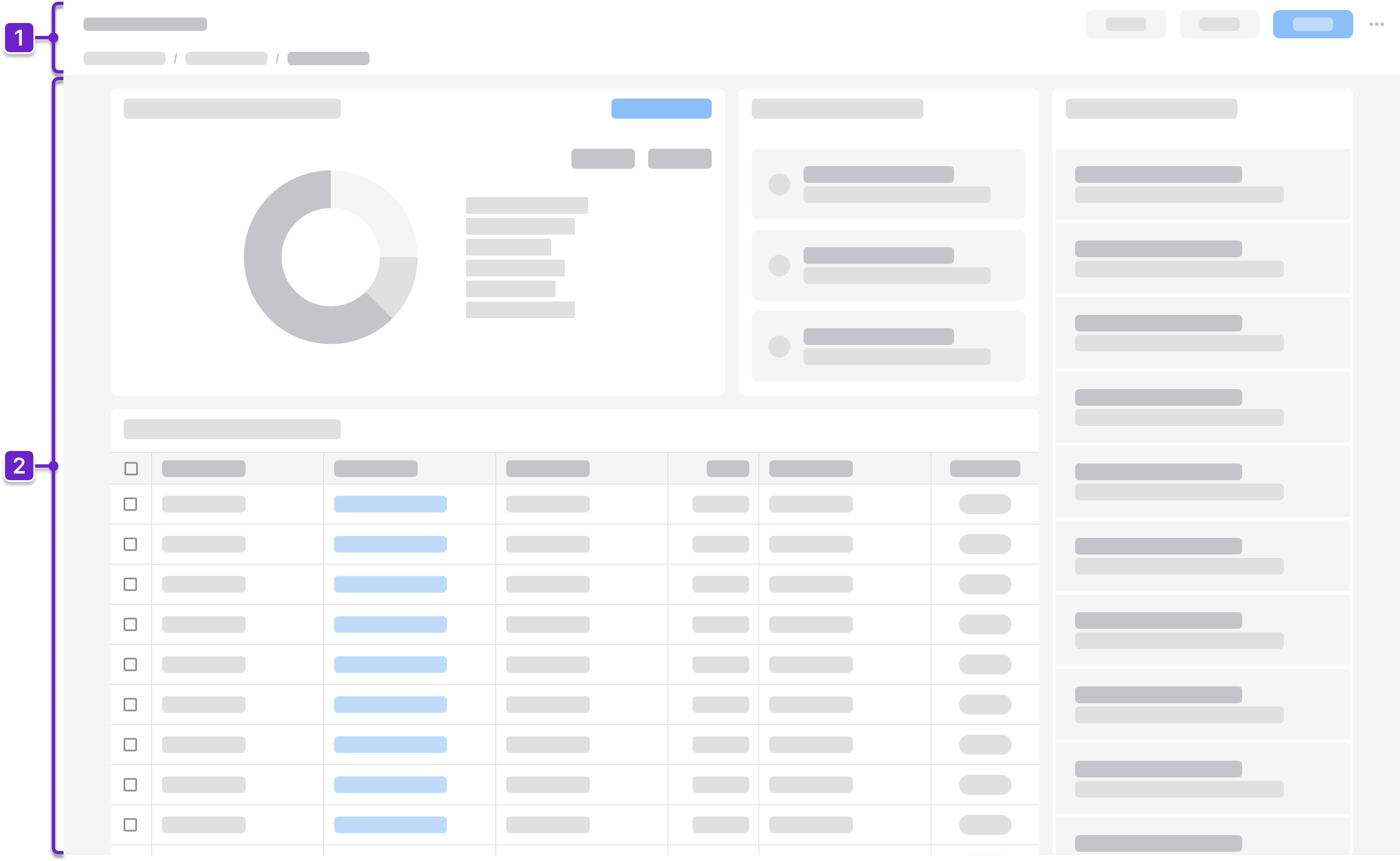
1. Header Area
Tells the user where they are within the application and provides context about what’s on the page. This generally includes the page title and actions. It could also include a breadcrumb.
2. Main Information
Presents supporting details—such as recent activity, alerts, charts, or quick links— that help users understand context, spot trends, and take action.
Components
IDS components can help you build a dashboard. The structure of the page will depend on how much information the user needs to see. Here are some components to consider:
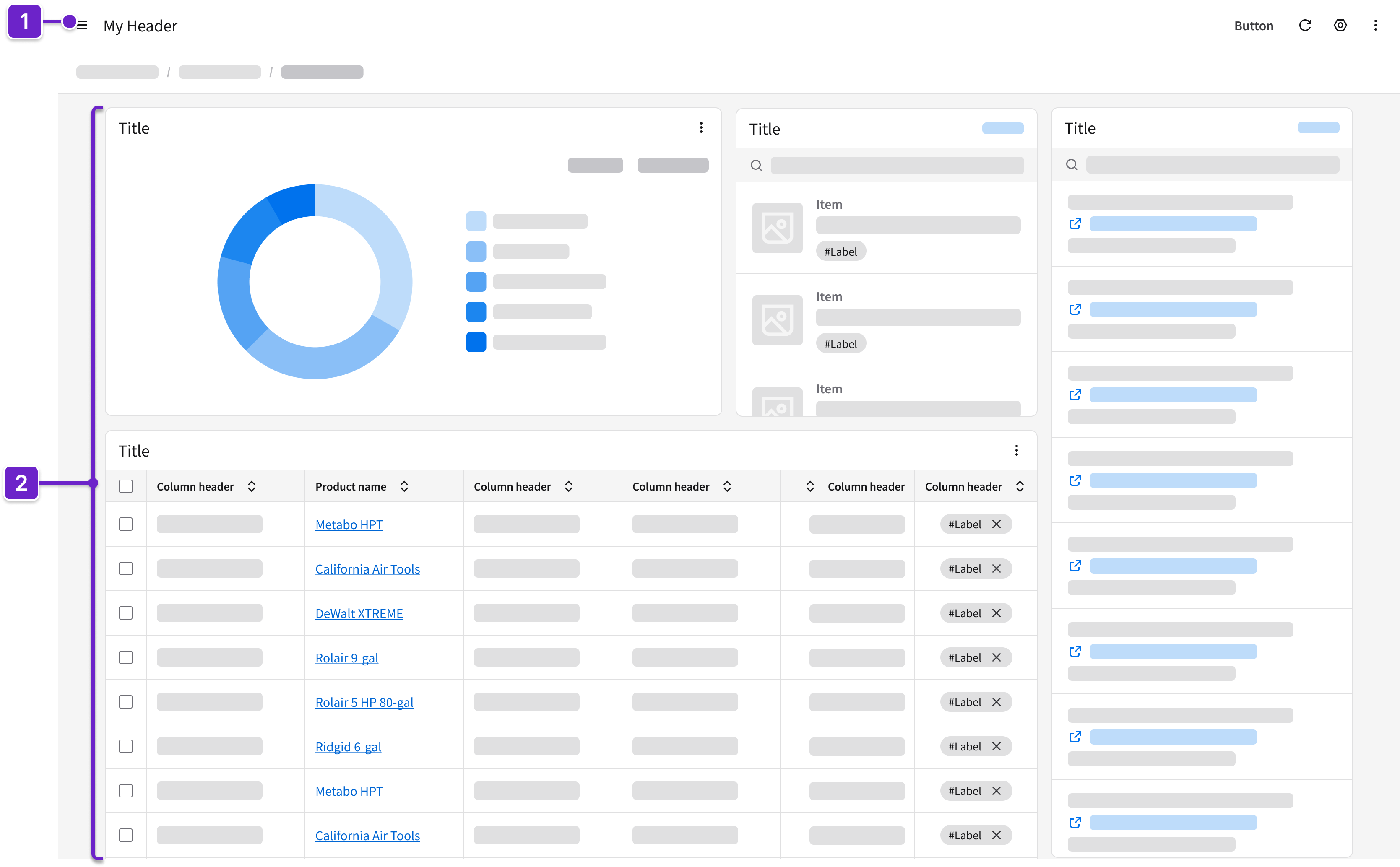
- Header
- Can include breadcrumbs and a toolbar with action buttons that are specific to the page.
- Card*
- Displays information (such as status or key metrics) or quick actions (such as “Edit” or “Delete”) about a selected item.
- Presents skimmable information, actionable alerts, or summaries (such as tasks, messages, or incidents).
- May contain other components such as listviews, icons, fieldsets, charts, and data grids.
* As an alternative to cards, consider using other components that are described in the list and details page layout or the data grid view page layout.
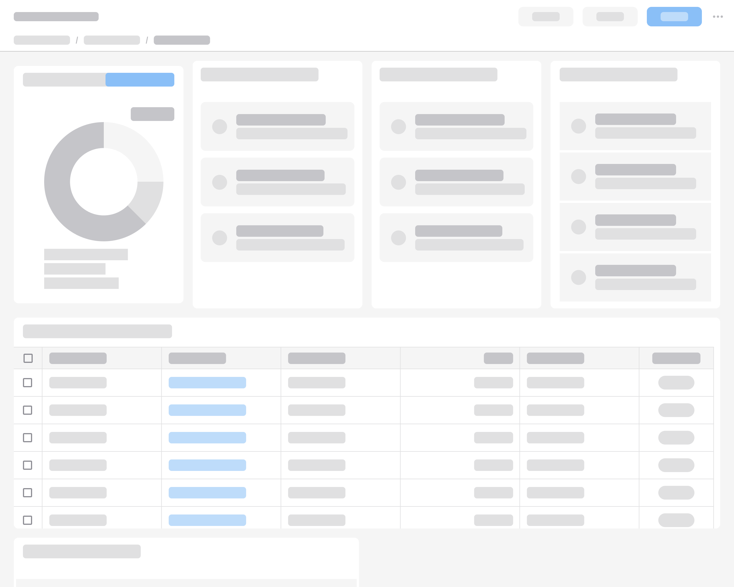
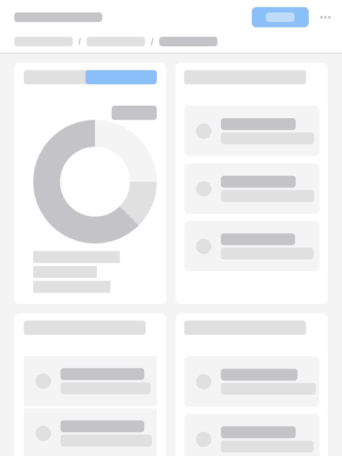
Example
This is a hi-fi example of a dashboard designed using IDS components. Use it as a guide for designing your own page. This layout is available in Figma in the IDS Patterns Library.
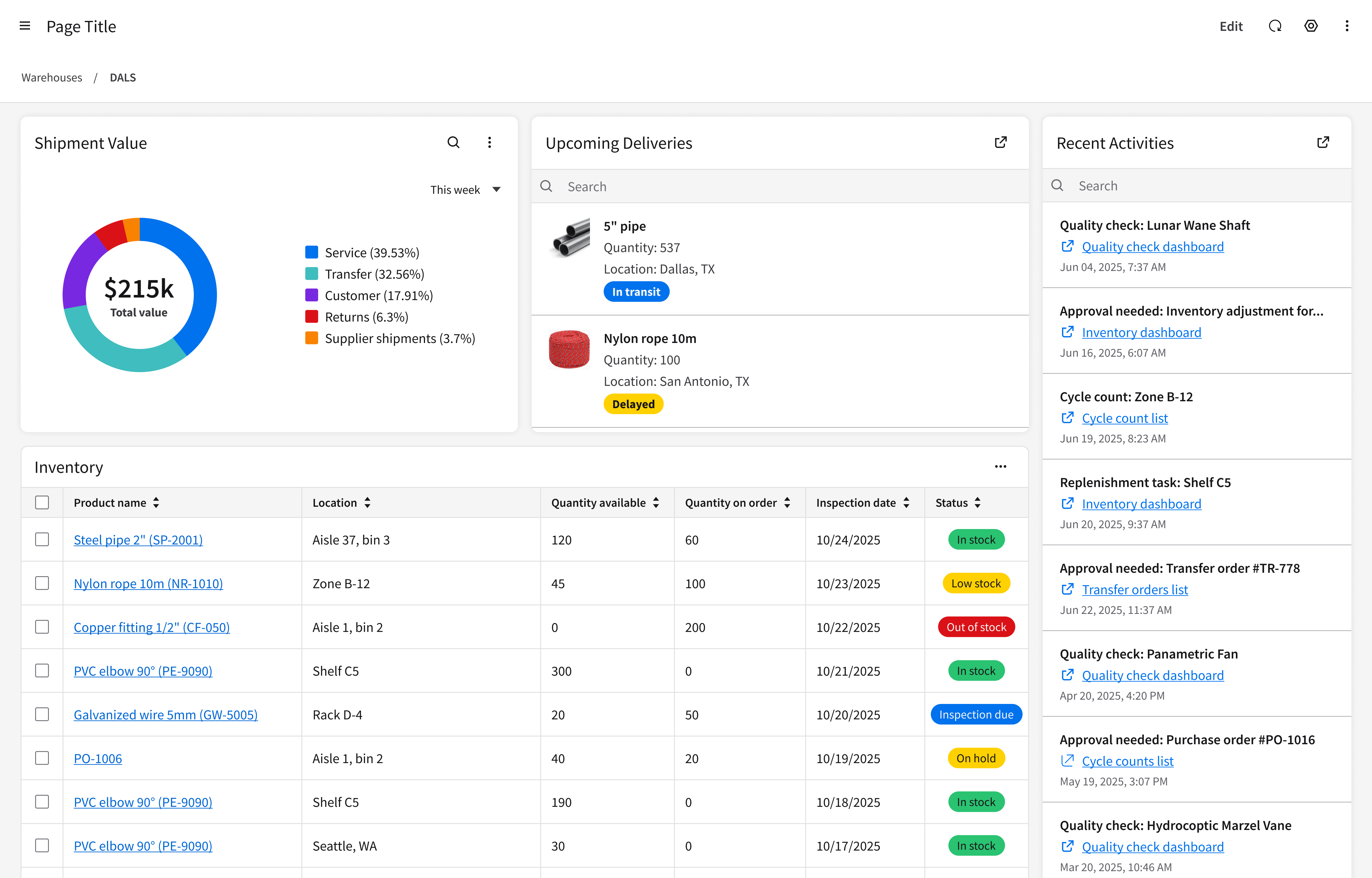
Refer to this library to see examples of dashboards that are being used in the CloudSuites today. (For internal reference only. An Infor SAAM request is required for Wiki access. Updated March 2026.)
Responsiveness
The page layout for a dashboard is responsive and supports all Infor screen sizes from XXL (>2560 pixels wide) to XS (360–574 pixels).
XXL
>2560 pixels
Use a fixed, centered 4-column grid.
XXL with a fixed, centered 4-column grid.
XL
1280–2560 pixels
Use a fluid 4-column grid.
XL with a fluid 4-column grid.
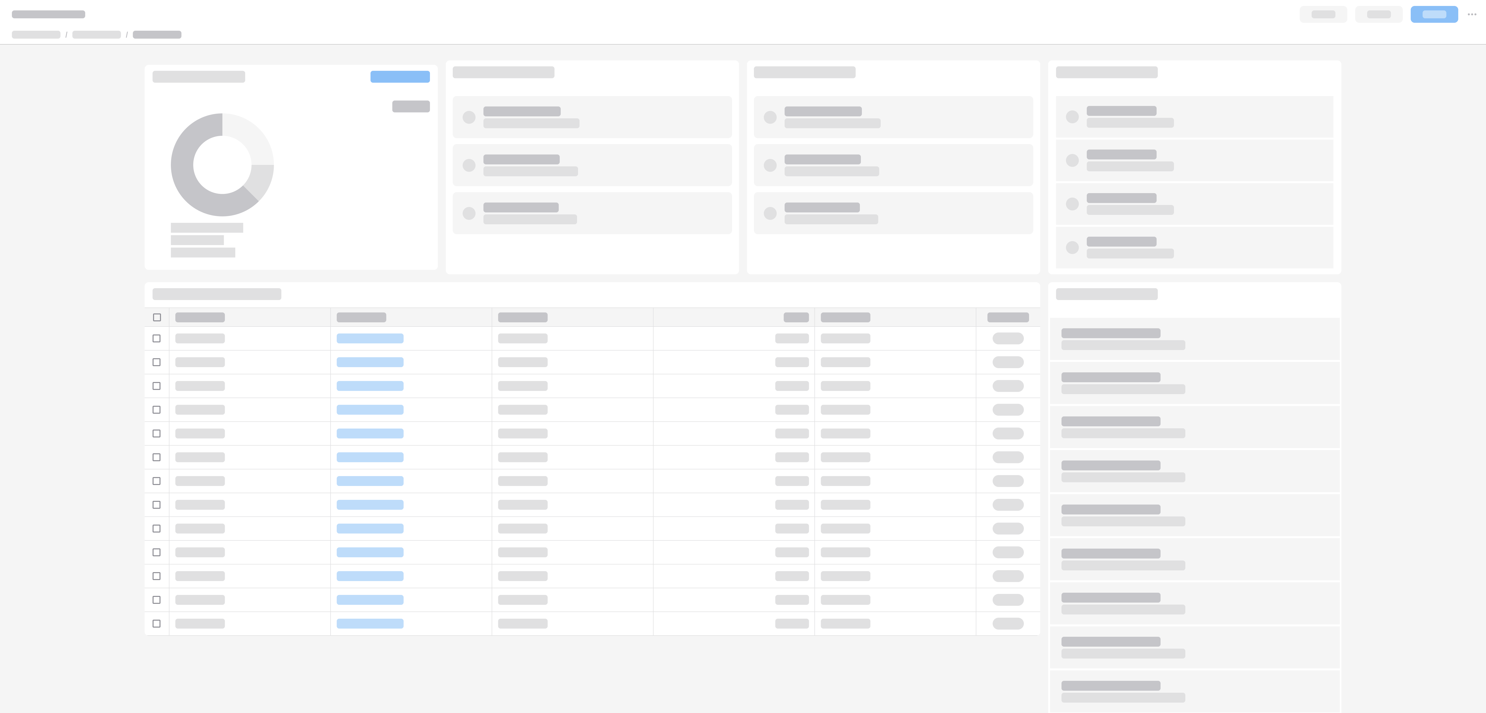
L
1024–1279 pixels
Use a fluid 3-column grid or a fluid 2-column grid, depending on the content. For example, if horizontal scrolling would appear in the 3-column grid, it’s better to switch to 2 columns.
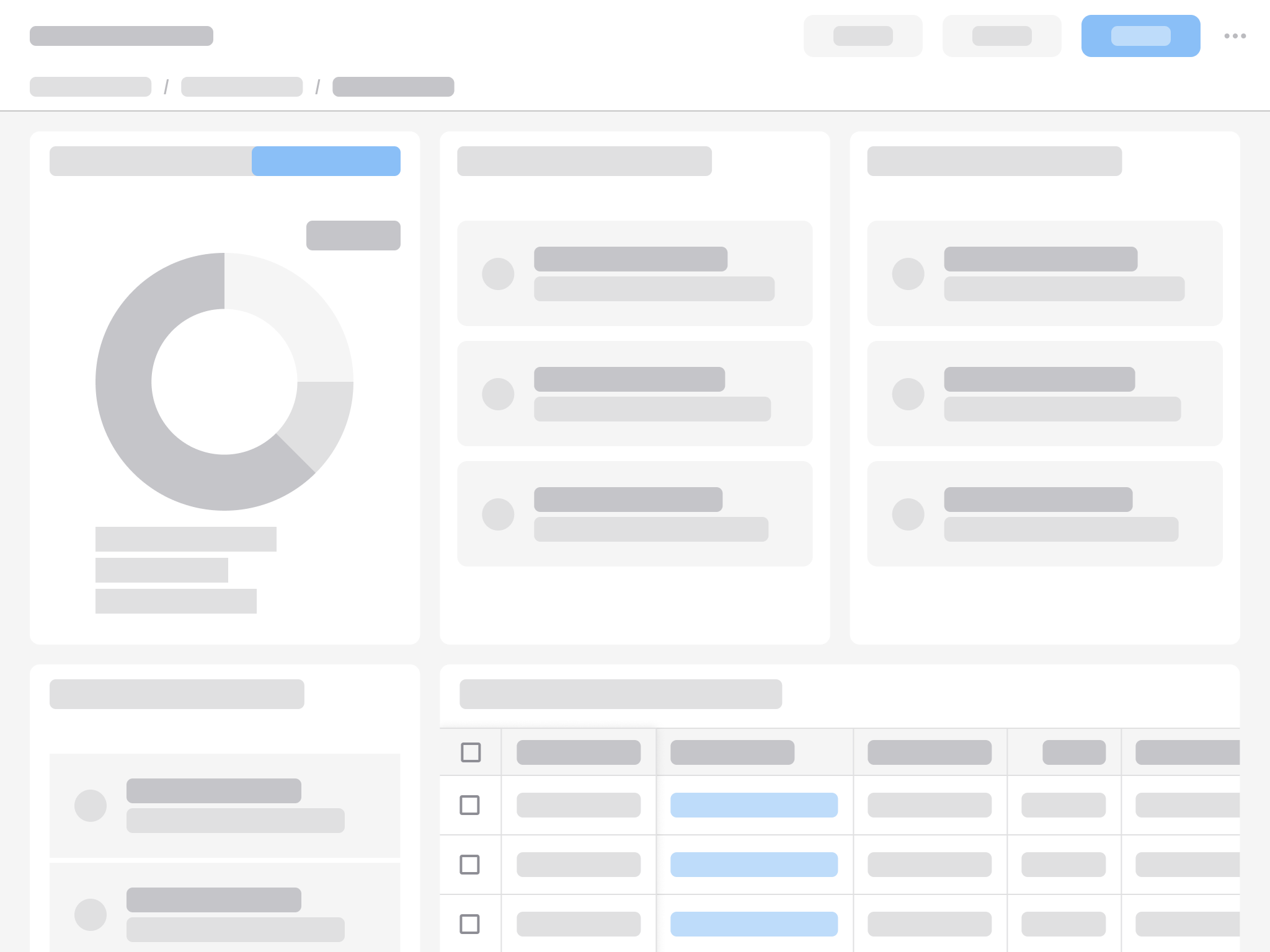
L with a fluid 3-column grid.
L with a fluid 2-column grid.
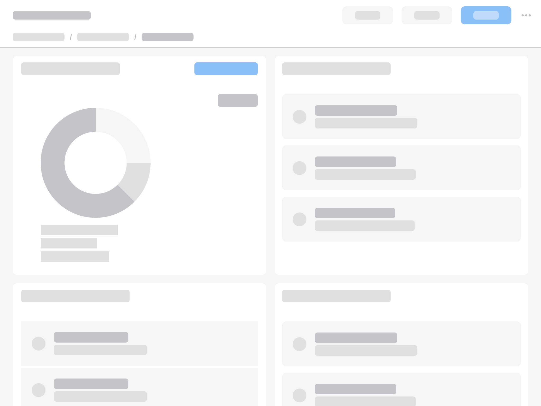
M
768–1023 pixels
Use a fluid 2-column grid.
M with a fluid 2-column grid.
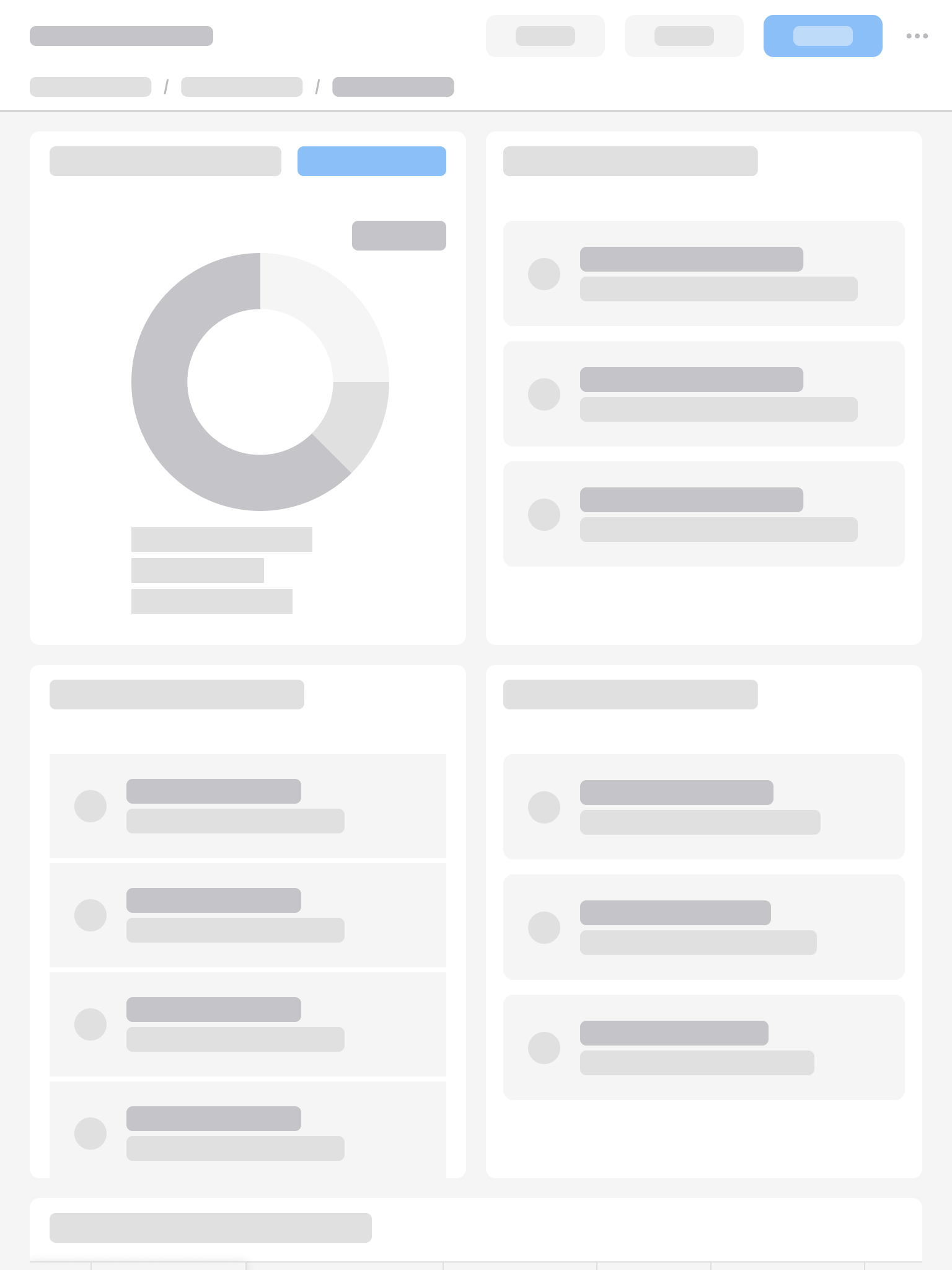
S
575–767 pixels
Use a fluid 2-column grid.
S with a fluid 2-column grid.
XS
360–574 pixels
Stack the content in a single column.
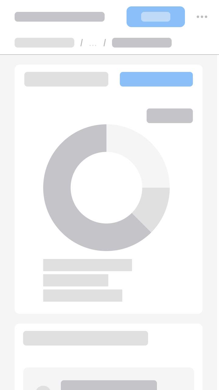
XS with a fluid 1-column grid.