Sign In
The sign-in pattern lets users access the application by entering their credentials.
The sign-in pattern enables the user to access the application using their credentials or other authentication options. It ensures secure, quick, and reliable access that protects the user’s information. A simple, easy, and predictable sign-in experience is an important first step in the user’s journey.
Anatomy
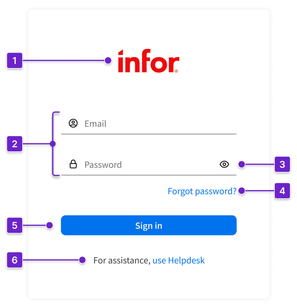
- Infor logo
- User credentials
- Show or hide password
- “Forgot password?” hyperlink
- “Sign in” button
- More information with hyperlink (optional)
When to Use
- When the user needs to access the application.
- When the user signs out voluntarily, a confirmation message appears and they’re automatically redirected to the sign-in page.
- When the user is signed out due to inactivity, redirect them to the last page they visited after they’ve signed in again.
Best Practices
Sign In
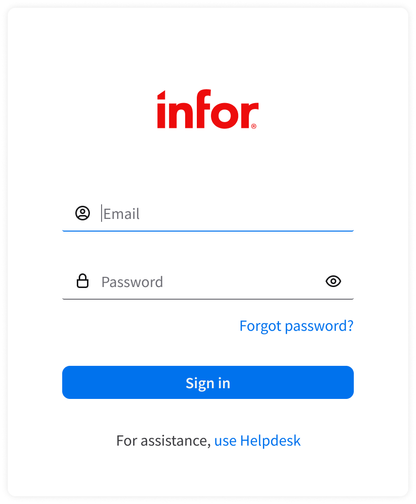
- Automatically set focus to the first required field. This is usually the email field.
- Ensure that fields are empty on load and have clear labels like “Email” and “Password” to avoid confusion.
- Note: While these examples show “Email”, use “Username” if that’s what the system requires.
- Provide autocomplete support (browser native).
- Mask password characters by default.
- Include a “Show or hide password” toggle to help the user verify their input.
- “Sign in” button:
- Disable it unless all required fields are populated. Also disable it during loading to prevent multiple submissions.
- Show a loading indicator when the authentication request is in progress.
Errors
- Give clear error feedback.
- Display short, specific messages.
- Don’t hide errors.
- Avoid vague messages like “Sign in failed”.
- Don’t automatically clear all fields after an error. Keep the user’s input intact to reduce frustration.
- There are 3 types of errors: field-level, form-level, and system error.
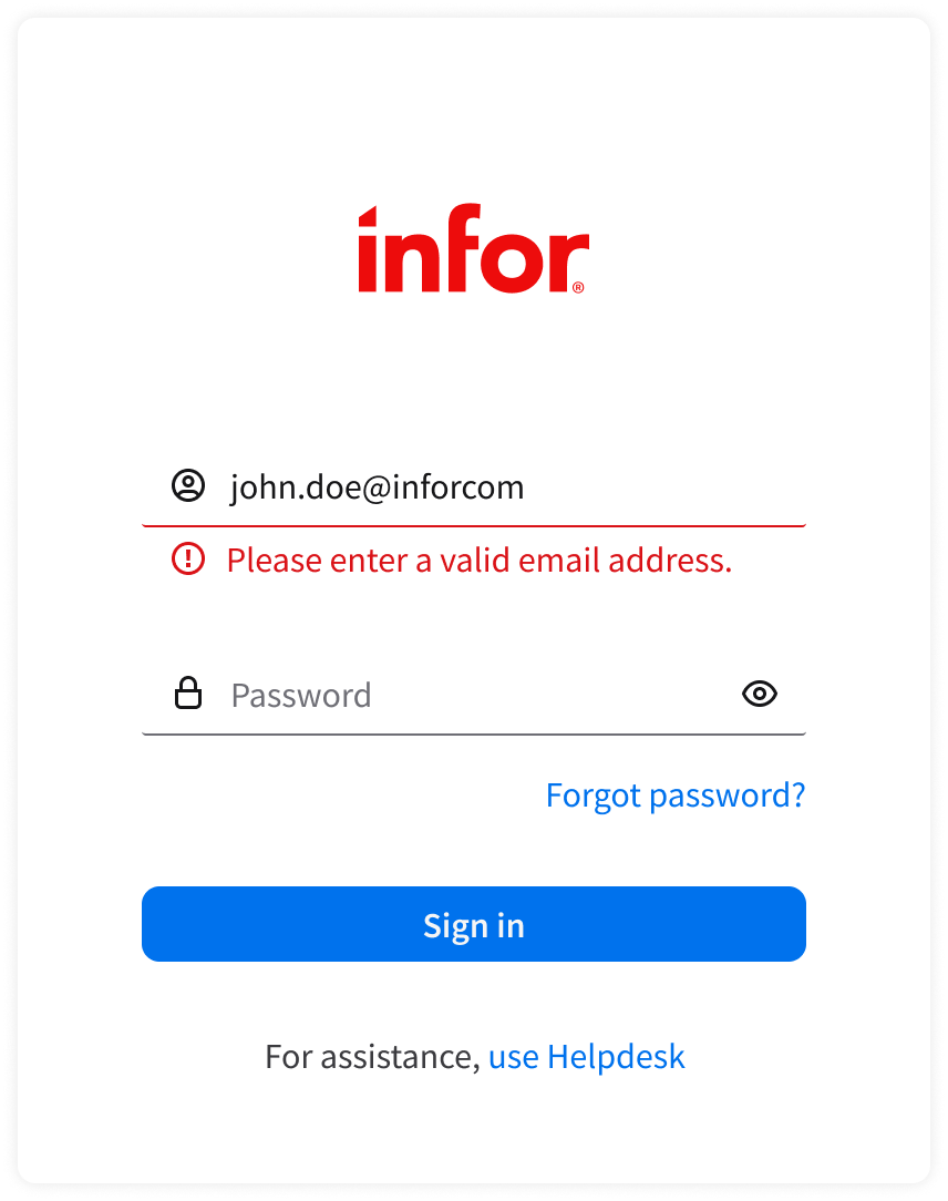
Field-Level Error
- For input that doesn’t meet specific field criteria (such as an invalid email format), display actionable help text (field-level errors) below the relevant field. Help text appears only after the user navigates away from the field.
- Examples: “Please enter a valid email address.” or “Password is required.”
- Use red text and clear indicators around the field. Clear the error state as soon as the user starts revising the field. Revalidate when they navigate away again.
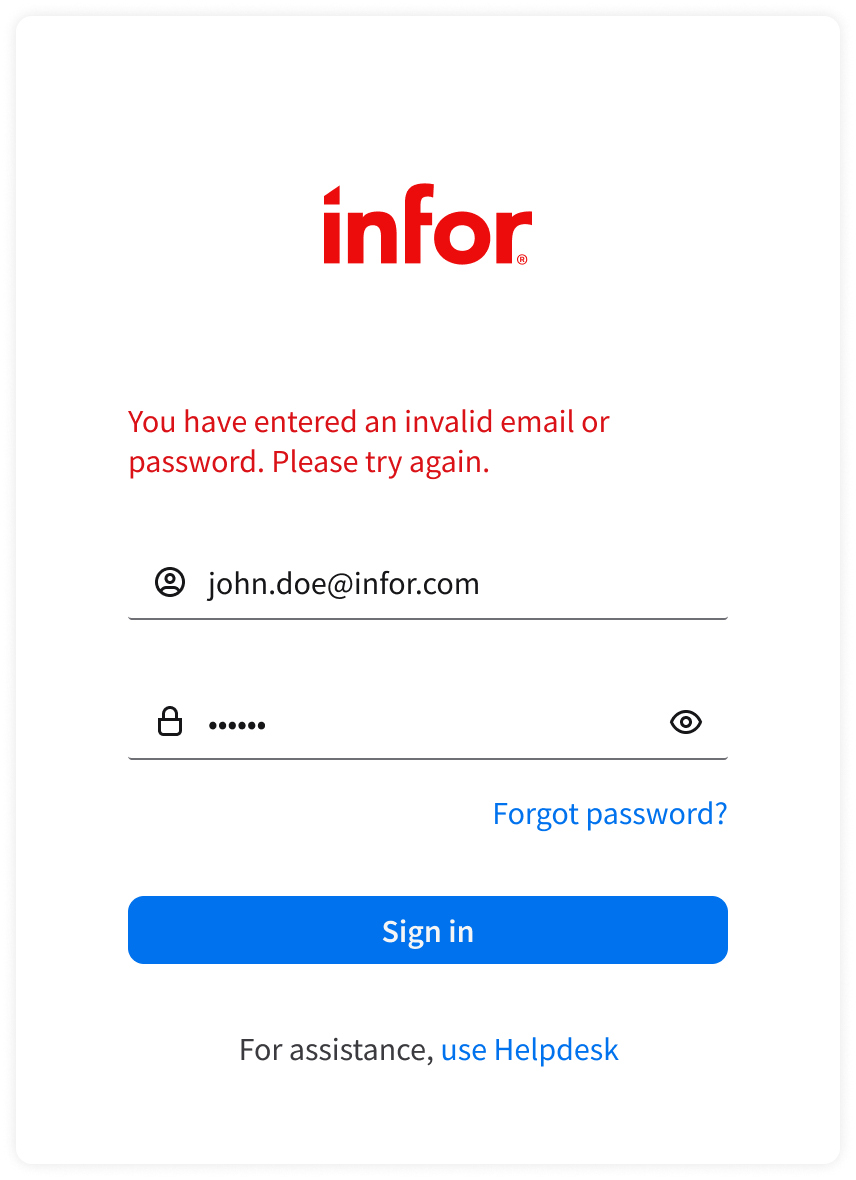
Form-Level Error
- When the user enters either field (or both fields) incorrectly, display a form-level error on submit:
- Invalid email or password.
- For security, don’t reveal whether the email exists. Example: “You have entered an invalid email or password. Please try again.”
- The account is locked or suspended.
- Example: “This account is locked. Please contact Helpdesk.”
- Invalid email or password.
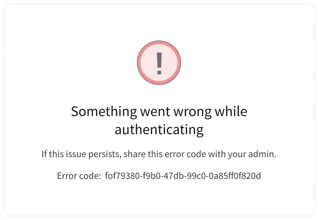
System Error
If a system error occurs, present an error message.
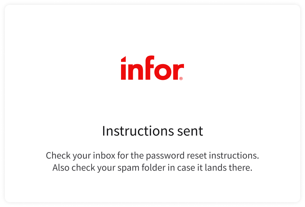
Forgot Password
- Use a simple, single-field form.
- Only ask for the user’s email address.
- After submission, show a confirmation message.

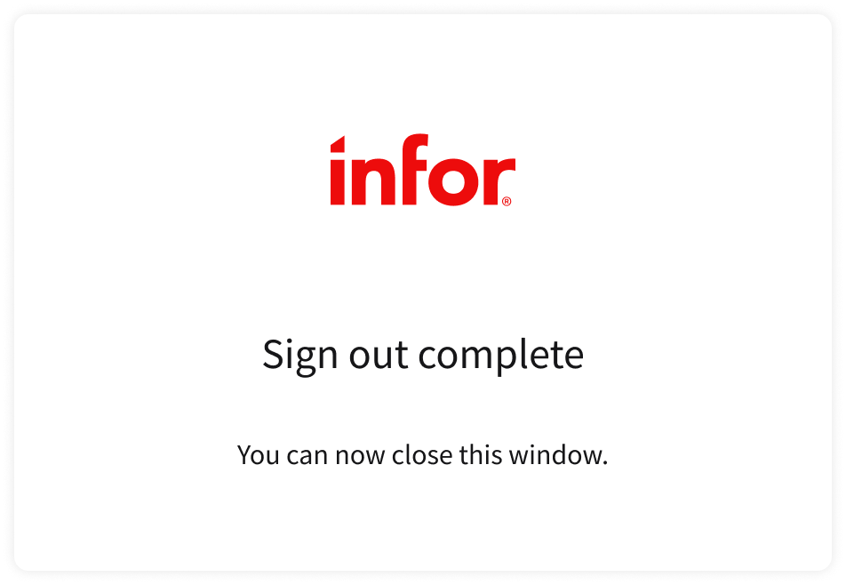
Sign Out
When the user signs out, show a confirmation message.
UX Writing
- Use sentence case for field labels: Only capitalize the first word and any proper nouns.
- When the user submits incorrect credentials, be concise, specific, and helpful. Include details that guide next steps.
- For example, if the account is locked, tell the user exactly how long they must wait before trying again: “Too many incorrect attempts. Try again in 15 minutes or reset your password.”
- Use “sign in” (2 words) instead of “signin”, “log in” or “login”.
- “Sign in” is clear and ensures consistency when paired with “sign up” and “sign out” elsewhere in the UI.
- Use “sign in” (no hyphen) when it’s an action or verb. Use “sign-in” (hyphenated) when it’s a noun or an adjective modifying another noun (for example “sign-in procedure”).
Accessibility
- Screen reader
- Provide field labels or alt text for icons, plus helper or placeholder text, so that screen readers can accurately read the information.
- Announce an error when it appears.
- Ensure that there’s strong color contrast.
- Text, buttons, and error states must meet at least WCAG AA contrast ratios (4.5:1 for text).
- Announce feedback to screen readers.
- Clearly identify success, error, or loading states.
- Maintain visible focus indicators.
- Provide a clear visual outline or state when elements are focused.
Keyboard Interactions
TaborShift + Tabmoves focus to the next or previous element in sign in.EnterorSpacetriggers the action for the focused element, such as activating the “Sign in” button or “Forgot password?” link.