Notification
A notification informs the user without interrupting their workflow unnecessarily. A good notification clearly communicates:
- What happened
- Why it happened
- What to do next
Potential Components
When to Use
- Communicate that the result of the user’s action will affect more than a single field but it doesn’t require further action.
- Surface system conditions or updates that should remain visible because they may impact the user’s current task.
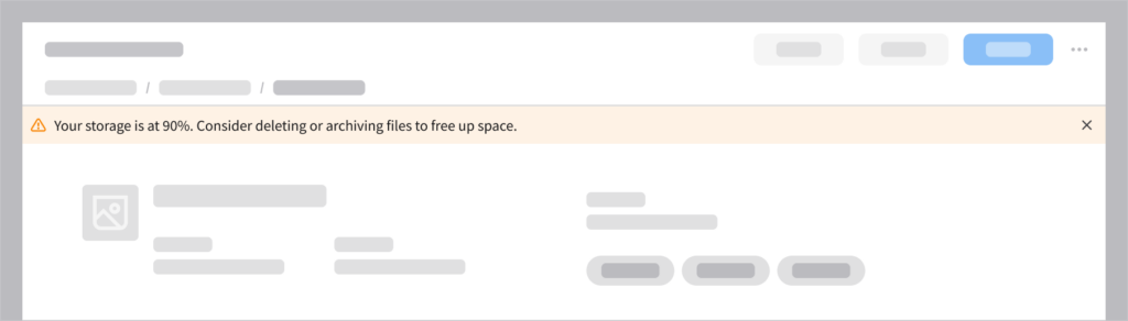
- Example: Low storage warning
- Require the user’s confirmation before continuing in order to prevent data loss or an irreversible action.
- Example: Deleting a record
When to Use Something Else
- If an error is caused by a specific input, show inline validation with helper text.
- Example: When the user enters something in a form field incorrectly, “Invalid format” will appear below the field.
- When a status applies to a specific element on the page, use a visual indicator like an icon, a badge, or a status color.
- Examples: Using an asterisk to indicate that a specific form field is mandatory; using a filled star icon to indicate that an item has been favorited.
- When an action causes an instant and visible change, rely on inline visual feedback.
- Example: Applying a filter and seeing a list update immediately.
- When a screen or a component has no content, use an empty message to explain the situation and suggest next steps.
- Example: If a “Saved filters” list is empty, briefly explain to the user that once they save a filter, it will appear as an entry in the list.
How It Works
Notifications support 3 key use cases.
| Use case | Component | Feedback criticality | Persistence | User interaction required |
|---|---|---|---|---|
| Confirm the outcome of the user’s action | Toast | Low | Temporary, dismisses itself after 6 seconds | Optional |
| Inform the user about updates or changes to their workflow | Notification banner | Medium to high | Non-blocking and persistent until dismissed | Optional or required depending on context |
| Require the user’s attention for critical tasks or errors | Message modal | High to critical | Blocks content and persistent until dismissed | Required |
1. Confirm the Outcome of the User’s Action
This confirms that an action was successfully completed. Use toasts for low-priority, non-blocking confirmations of completed tasks.
When to Use
- Success confirmation after user action
- Non-critical system updates
- Feedback that doesn’t require further action
Examples
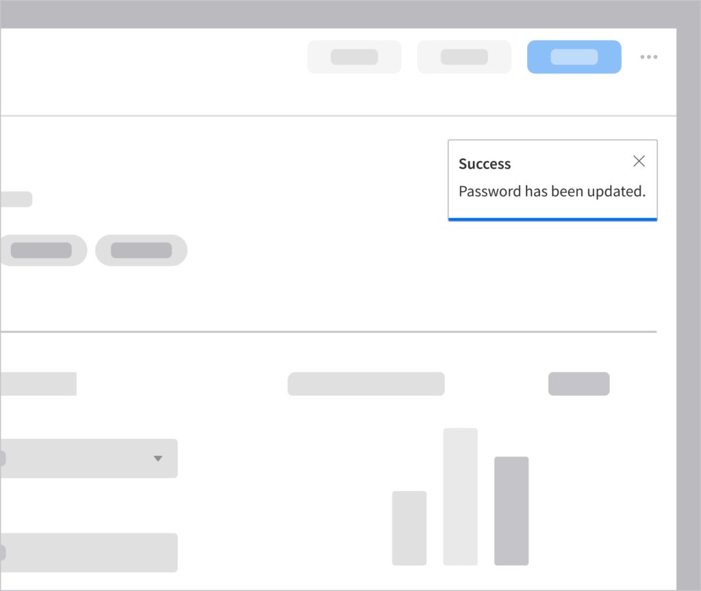
Updated password
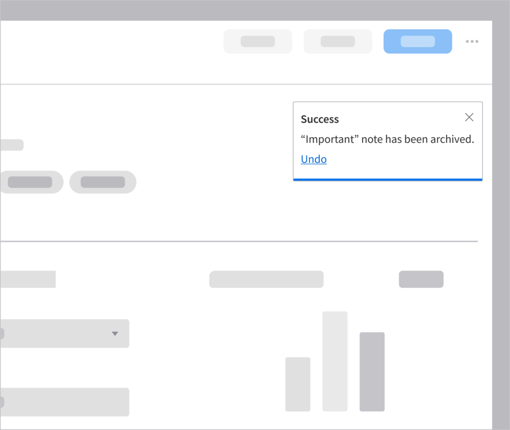
Archiving a note that can be restored
Best Practice
Include an “Undo” option for reversible actions such as deleting a saved filter. Learn more about using toasts.
2. Inform the User About Updates or Changes to Their Workflow
When the information may impact the user but it doesn’t require their immediate action. This could also be a non-critical warning. Use a notification banner when the message may influence what the user is currently doing but shouldn’t block them.
When to Use
- System-level alerts
- Non-critical warnings that affect the current page
- Recoverable errors
- Reminders requiring attention
Examples
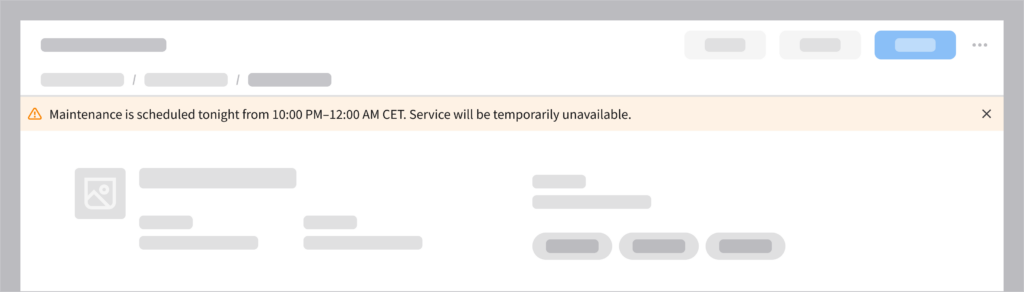
Scheduled maintenance
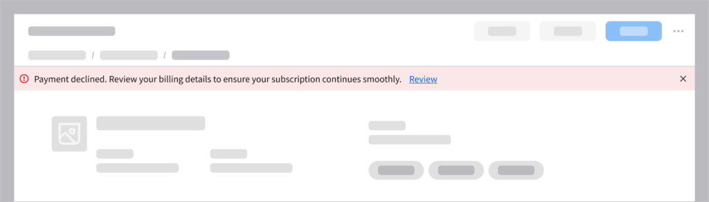
Review payment details
Best Practice
Avoid displaying multiple banners at the same time—they’ll be competing for the user’s attention. Learn more about using notification banners.
3. Require the User’s Attention for Critical Tasks or Errors
When the user must stop and decide what to do before they can continue. Use modals, which block access to the page and require explicit action from the user, ensuring that critical messages aren’t ignored.
When to Use
- Destructive actions
- Irreversible decisions
- Preventing data loss
- Critical system failures that require acknowledgment
Examples
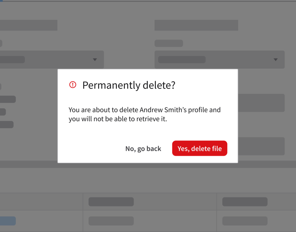
Permanent record deletion
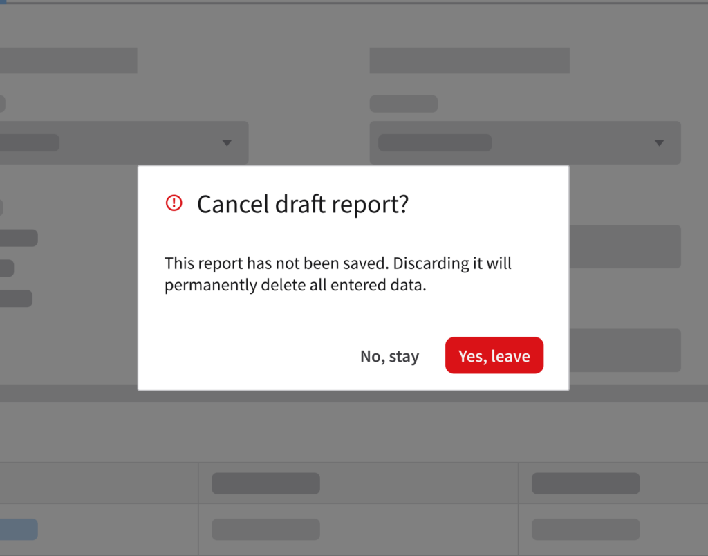
Unsaved draft
Best Practice
Explain the issue and provide clear actions that will allow the user to resolve or dismiss the notification. Learn more about using modals and follow these UX writing tips for effective messages about destructive actions.
Behavior and Interaction
There are 2 primary ways to trigger a notification.
1. User Action Based
Communicates the result immediately after the user performs an action such as “Save”, “Submit”, or “Delete”. It confirms that the task was completed successfully or if there is an issue that requires attention.
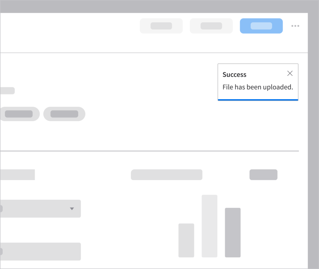
Successful file upload
2. System Based
Communicates system conditions and asynchronous processes, informing the user when an application state affects their work or when a background task is completed, delayed, or failed.
Low storage system alert
Best Practices
Not every system event or user action requires a notification. Effective notifications are relevant, actionable, and timely. To help you decide when to notify the user, consider these best practices.
Prevent Alert Fatigue
Too many notifications reduce their effectiveness. Only notify the user when the information matters to their current task or workflow.
- Avoid notifications for minor updates, repetitive messages, or expected outcomes that don’t require the user’s attention.
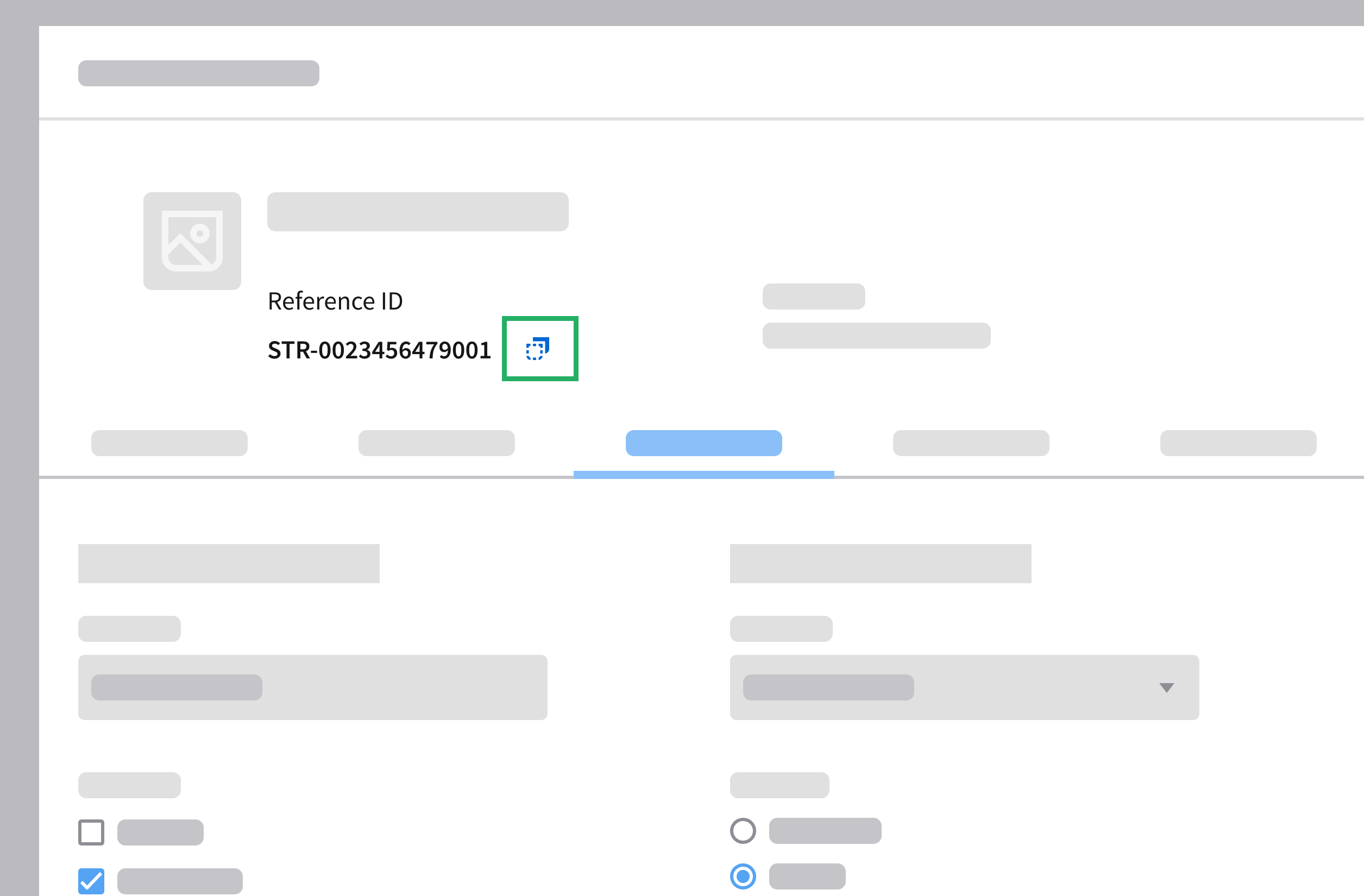
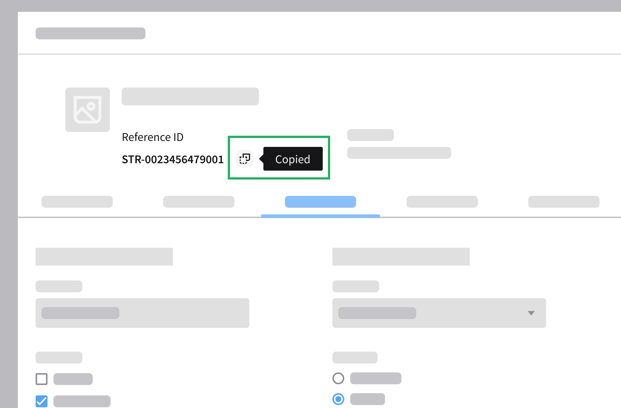
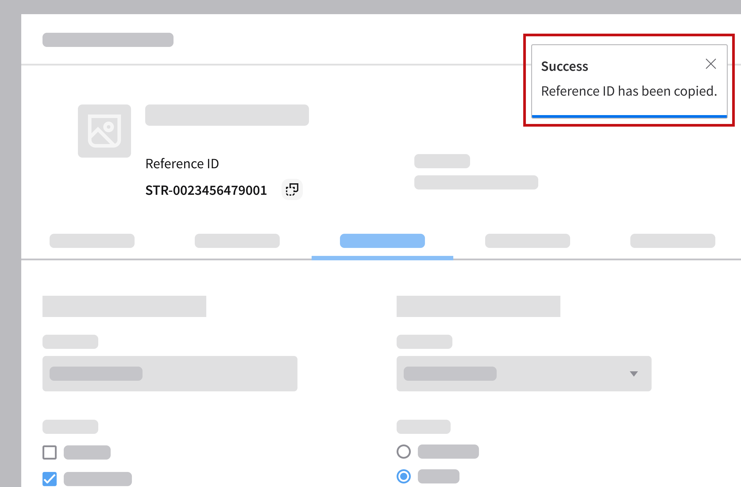
- Example: The user copies a long reference ID by clicking the copy button and the system generates a notification each time the action is performed.
- Why it’s a problem: The user expects the copy action to work. Repeated notifications will be distracting, not helpful.
- Better approach: Use a visual indicator or a tooltip near the copy button, where the label changes to “Copied” after it’s clicked.
Do
Do
Don’t

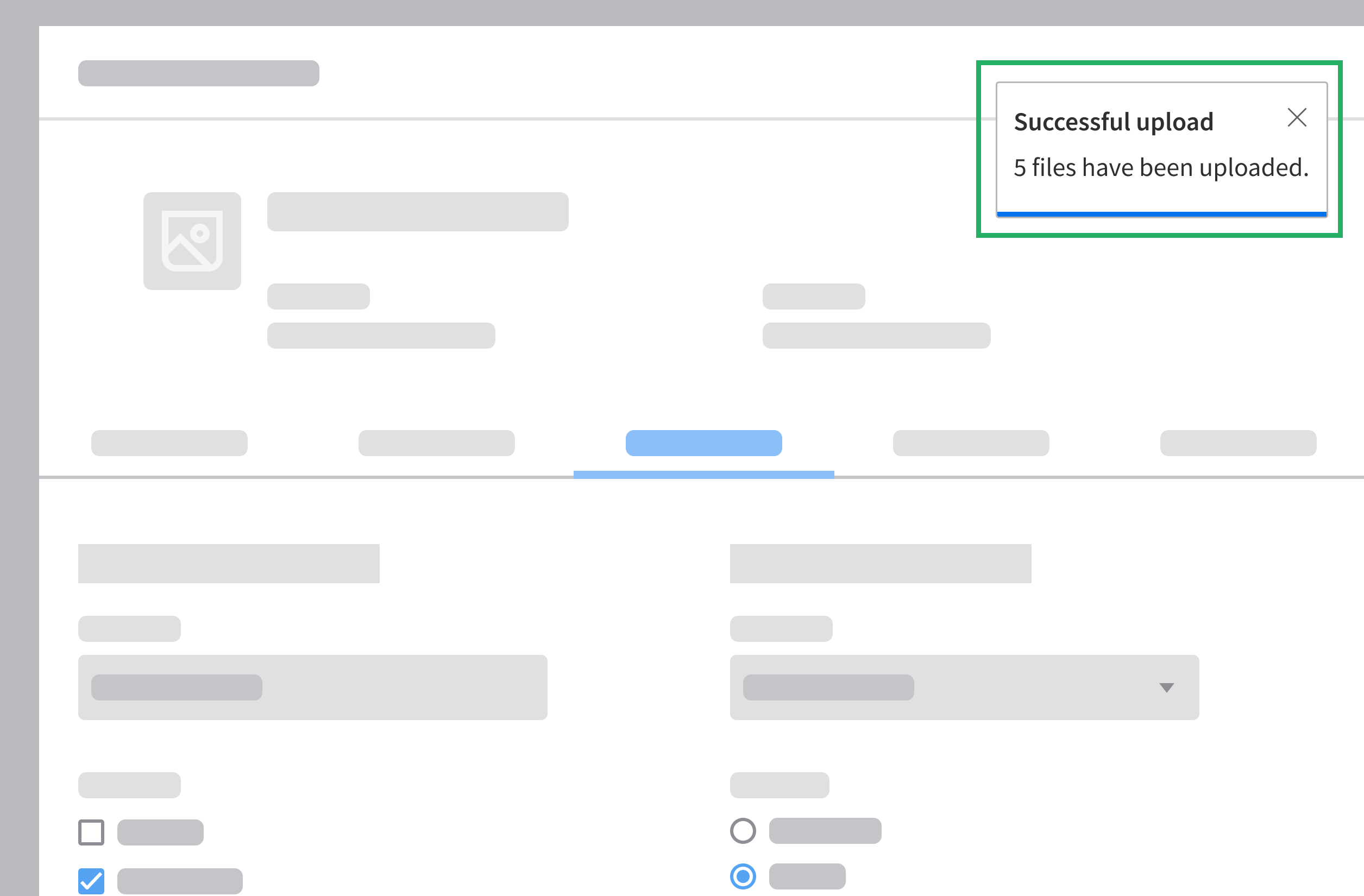
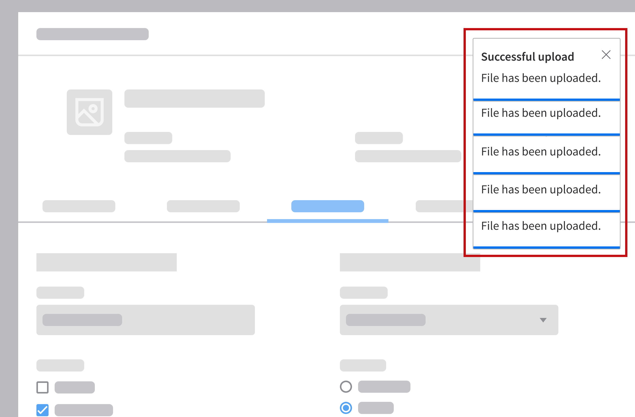
- Combine multiple related messages when possible.
- Example: The user uploads multiple files at once and the system generates separate success notifications for each file.
- Why it’s a problem: Multiple notifications stack up and clutter the screen.
- Better approach: Combine them into a single notification such as “5 files have been uploaded.”
Do
Don’t
Prevent Errors Before They Happen
Notifications should not be the primary mechanism for correcting the user’s mistakes. Prevent errors by guiding the user before they act, rather than notifying them after a failure.
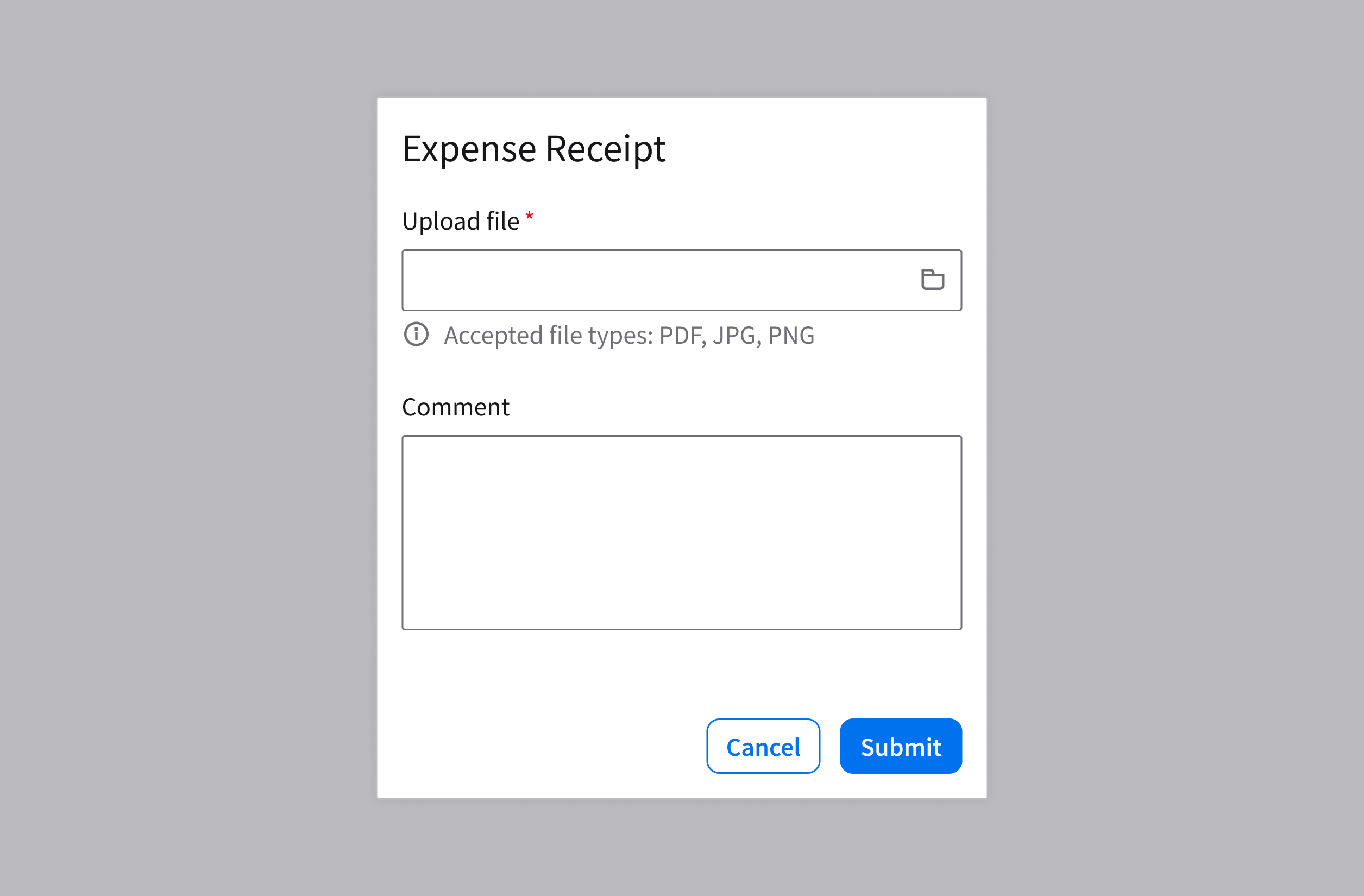
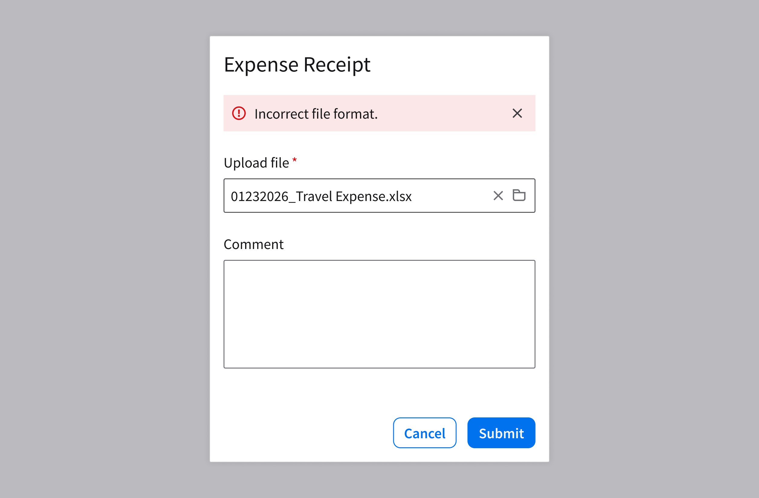
- Provide inline validation or helper text for inputs, such as password rules or required file types.
- Example: A file uploader shows helper text that says “Accepted file types: PDF, JPG, PNG”.
Do
Don’t
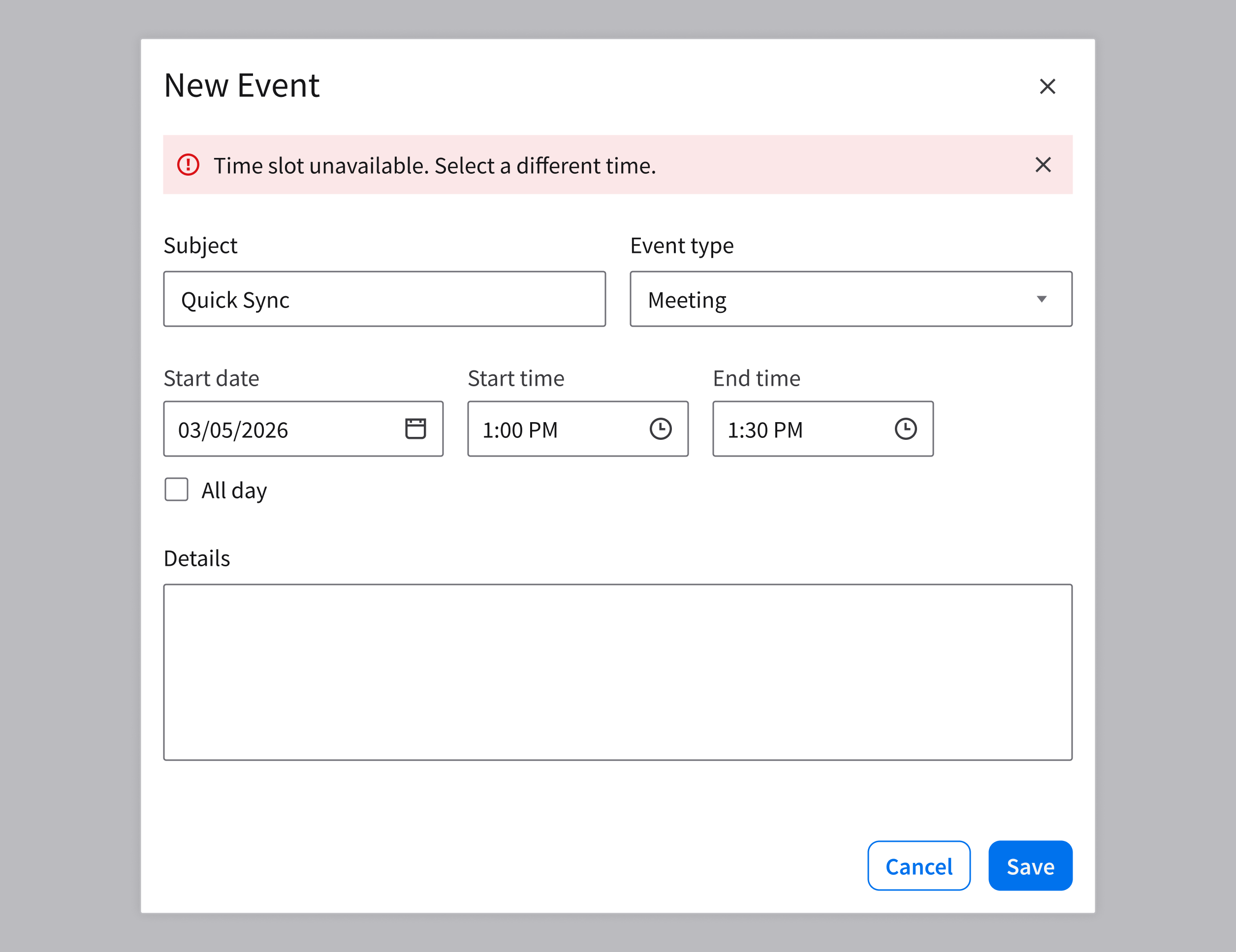
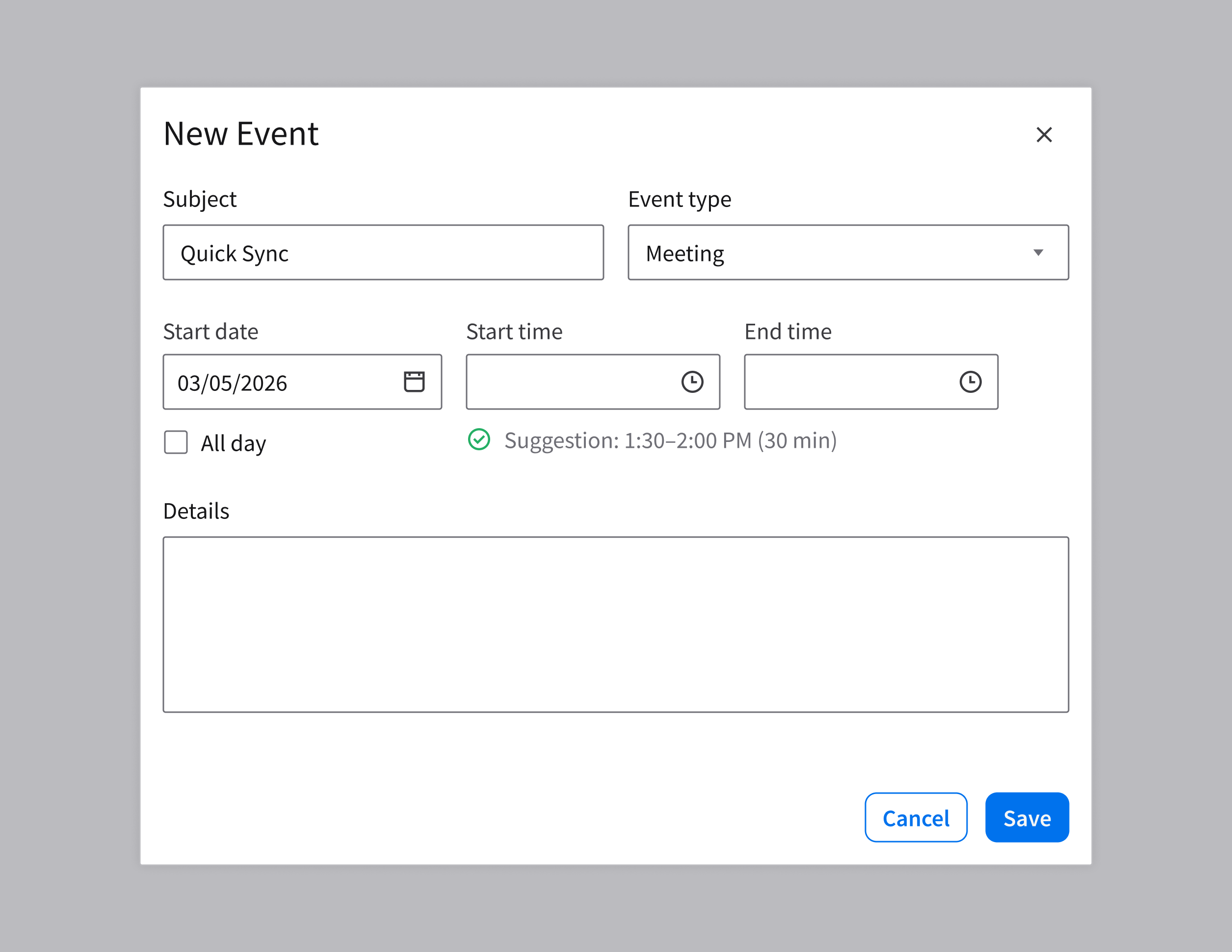
- Communicate any constraints and requirements up front, so the user knows what’s expected.
- Example: To prevent conflicts, a scheduling app suggests an available meeting time.
Do
Don’t