List and Details
In a list and details page, a clickable list of items is on one side of the page.
When the user clicks an item on the list, details about that item will appear on the other side of the page. The user can efficiently flip from item to item without having to navigate back and forth to a separate list page.
When to Use
Follow the list and details page layout when the user needs to look up, view, or edit:
- Profiles of people, customers, products, or other items
- Orders, receipts, or requisitions
Key Sections
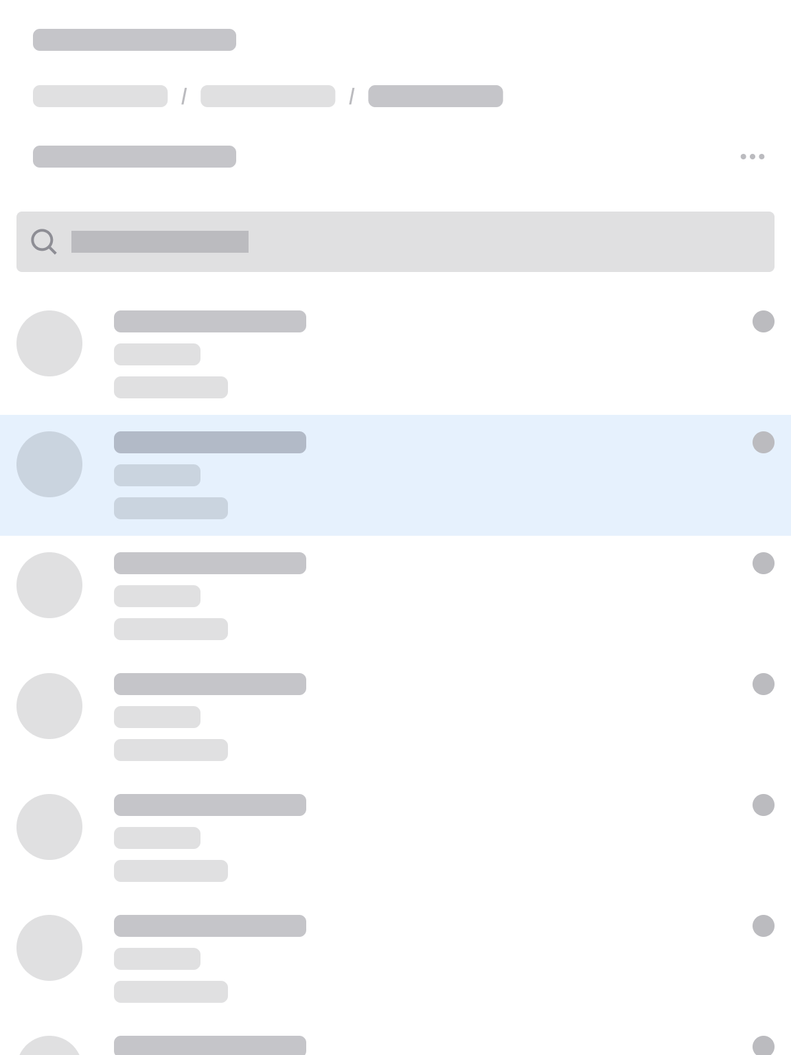
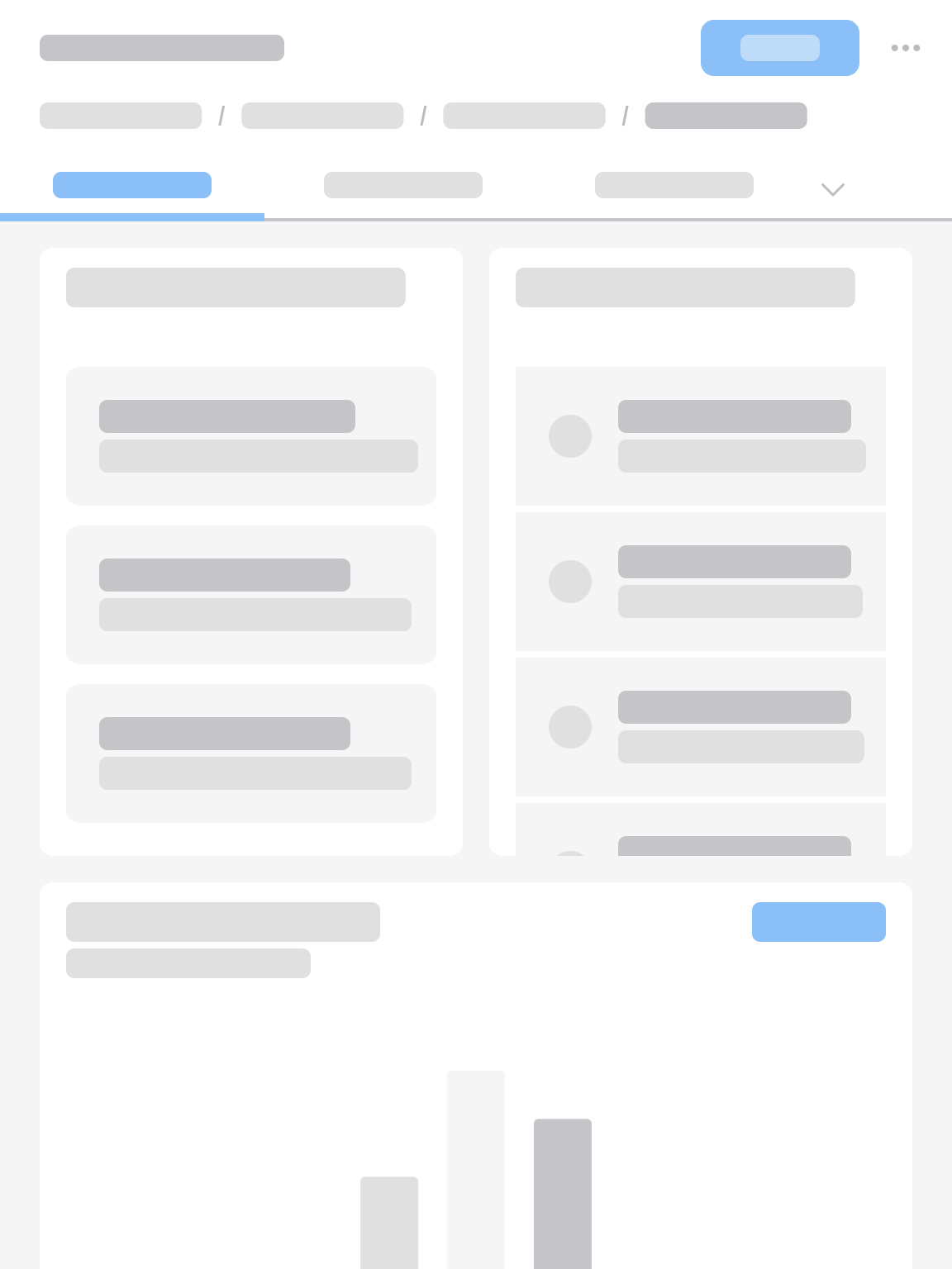
A typical list and details page has 3 sections of content:
- Header area
- List
- Details
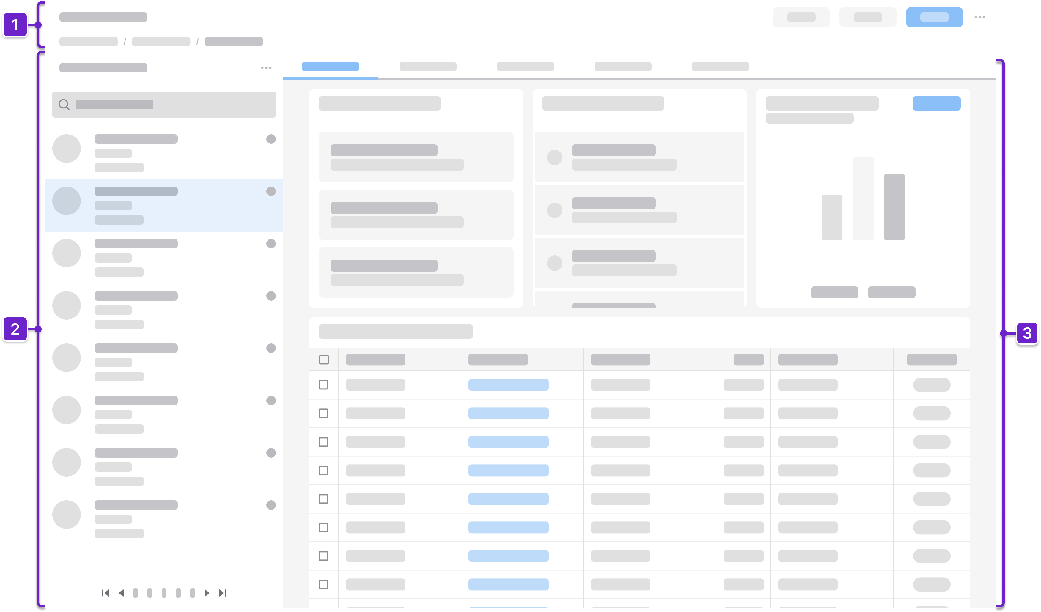
1. Header Area
Tells the user where they are within the application and provides context about what’s on the page. This generally includes the page title and actions. It could also include a breadcrumb.
2. List
Displays a searchable or filterable list of items with key identifying details, allowing the user to quickly scan and select an item for more information.
3. Details
Shows the relevant details about the selected item. It updates instantly when the user chooses a different item from the list.
Components
IDS components can help you build a list and details page. The structure of the page will depend on how much information the user needs to see. Here are some components to consider:
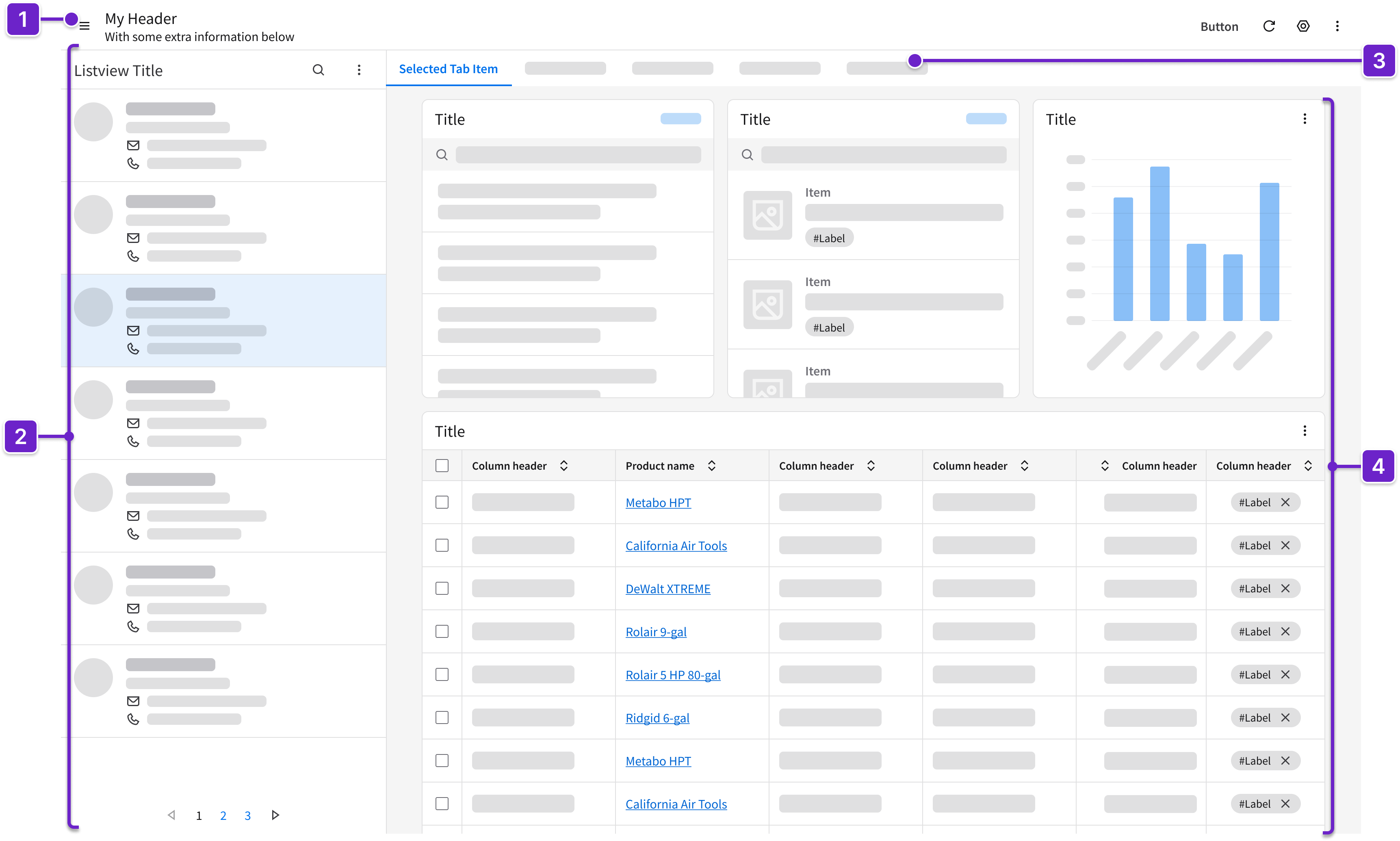
- Header
- Can include breadcrumbs and a toolbar with action buttons that are specific to the page.
- Listview
- Can contain a header with search or filter options for the list.
- Displays a vertical list of items, each showing essential attributes and differentiators, such as name, ID, or status.
- Supports quick scanning and selection.
- Visually indicates the item that is currently selected.
- May use a virtual scroller or a pager for handling large data sets.
- Tabs
- Organize the selected item’s details into separate sections.
- Clearly label them for easier navigation, such as “Overview”, “History”, or “Attachments”.
- Card*
- Displays information (such as status or key metrics) or quick actions (such as “Edit” or “Delete”) about a selected item.
- May contain other components such as data grids, icons, fieldsets, and stats.
* As an alternative to cards, consider using other components that are described in the profile record page layout or the data grid view page layout.
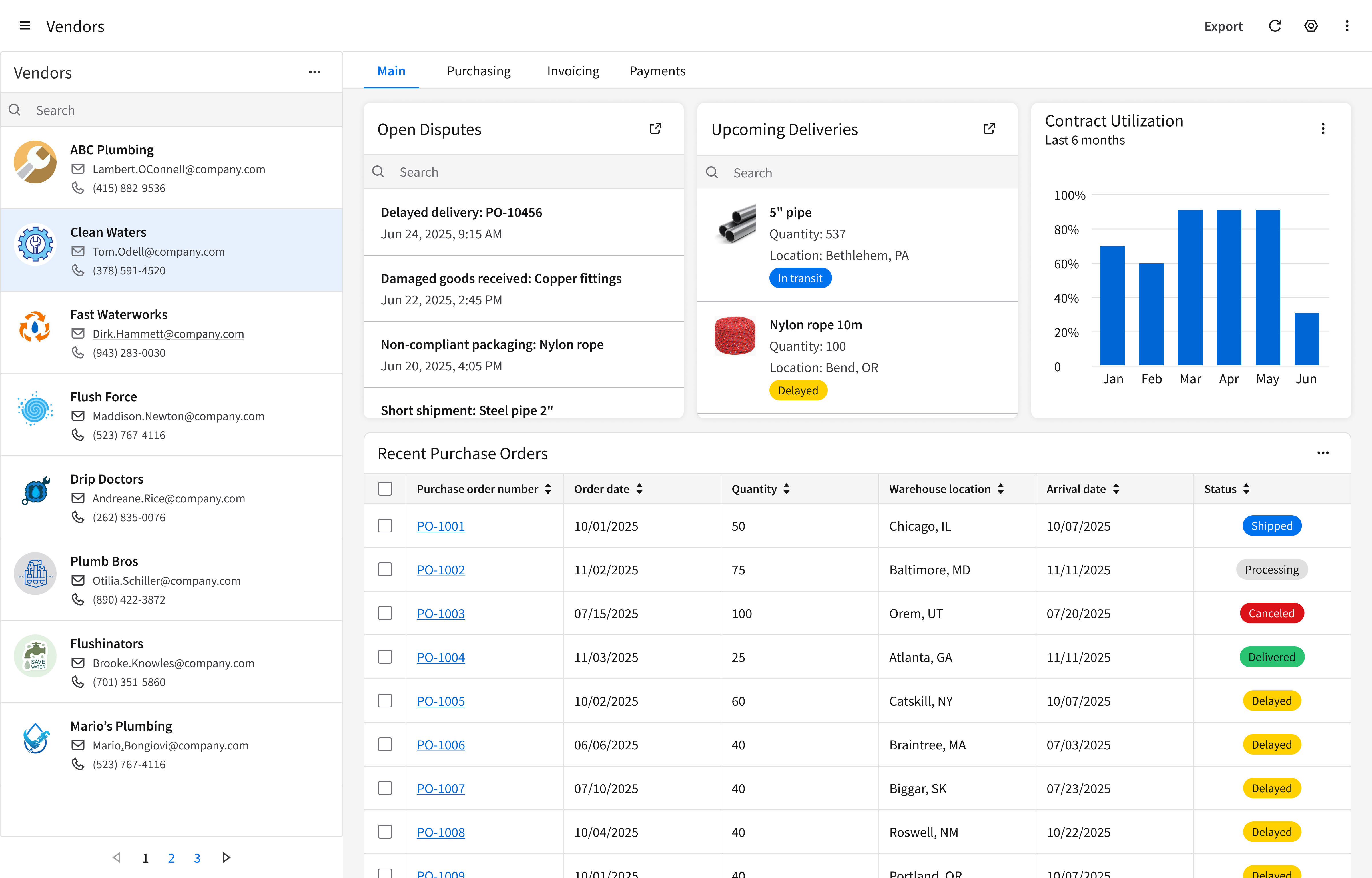
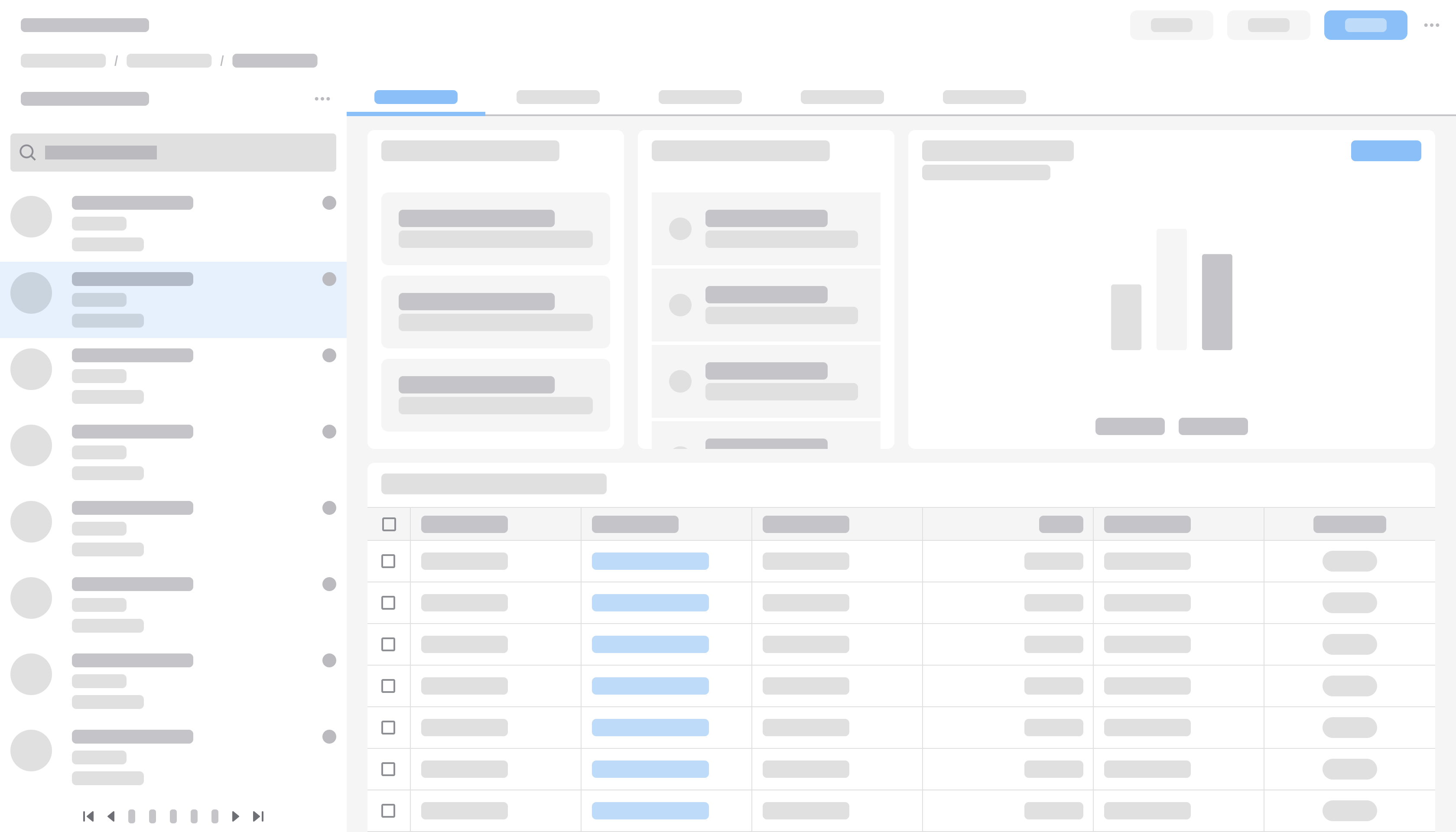
Example
This is a hi-fi example of a list and details page designed using IDS components. Use it as a guide for designing your own page. This layout is available in Figma in the IDS Patterns Library.
Refer to this library to see examples of list and details pages that are being used in the CloudSuites today. (For internal reference only. An Infor SAAM request is required for Wiki access. Updated March 2026.)
Responsiveness
The list and details page layout is responsive and supports all Infor screen sizes from XXL (>2560 pixels wide) to XS (360–574 pixels).
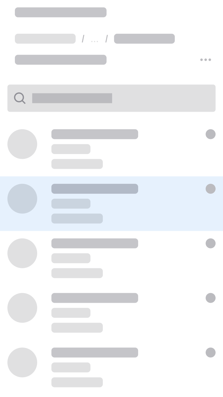
- On laptop and desktop screens, the list will be a fixed-width panel, located on the left side of the screen.
- On mobile and tablet screens, the content will split into separate list view and detail view pages.
XXL
>2560 pixels
- Use a fluid, left-aligned, and maximum 4-column grid to:
- Maintain proximity between the selected item and its details.
- Improve readability of the detail content.
- Only if the details section contains very dense information, such as a data grid with many columns, you can consider using a fluid grid. In general, using a fluid grid for a list and details page is not recommended because it potentially hides information on smaller screen sizes.
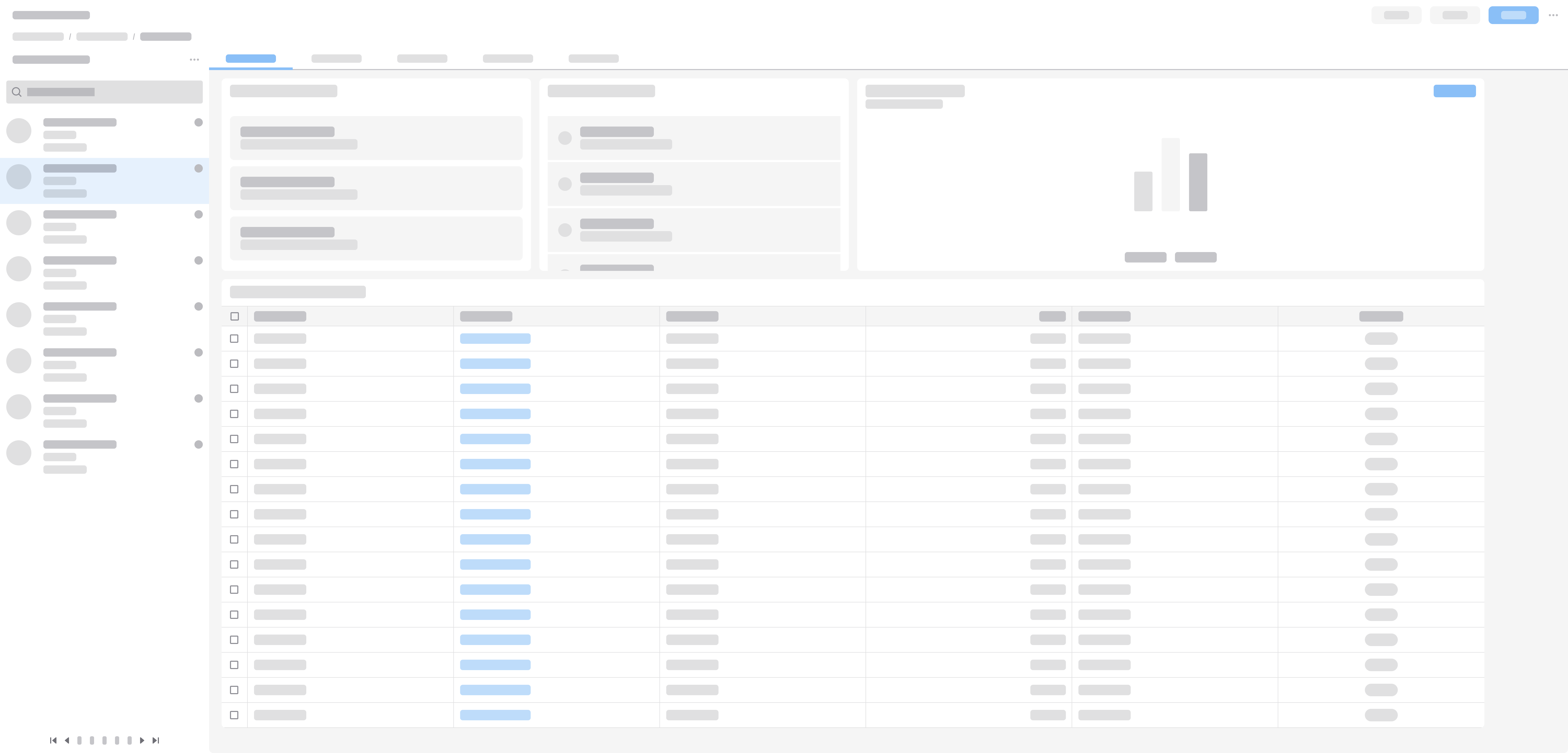
XXL with a fluid, left-aligned 4-column grid.
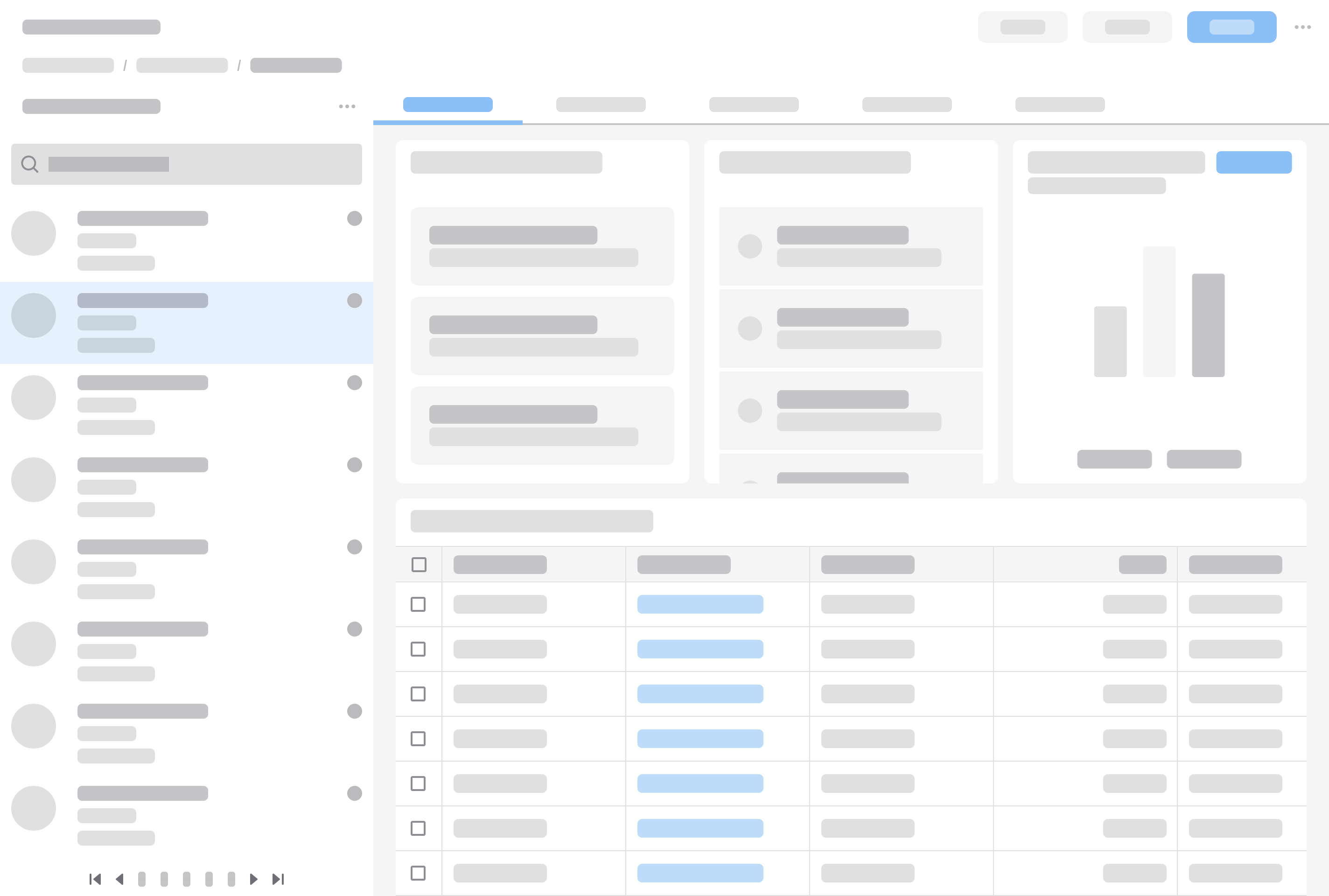
XL
1280–2560 pixels
If the width of the details section is more than 1280 pixels, use a fixed list panel and a fluid 4-column grid.
XL with a fluid 4-column grid.
If the width of the details section is less than 1280 pixels, use a fixed list panel and a fluid 3-column grid.
XL with a fluid 3-column grid.
L
1024–1279 pixels
Use a fixed list panel and a fluid 2-column grid.
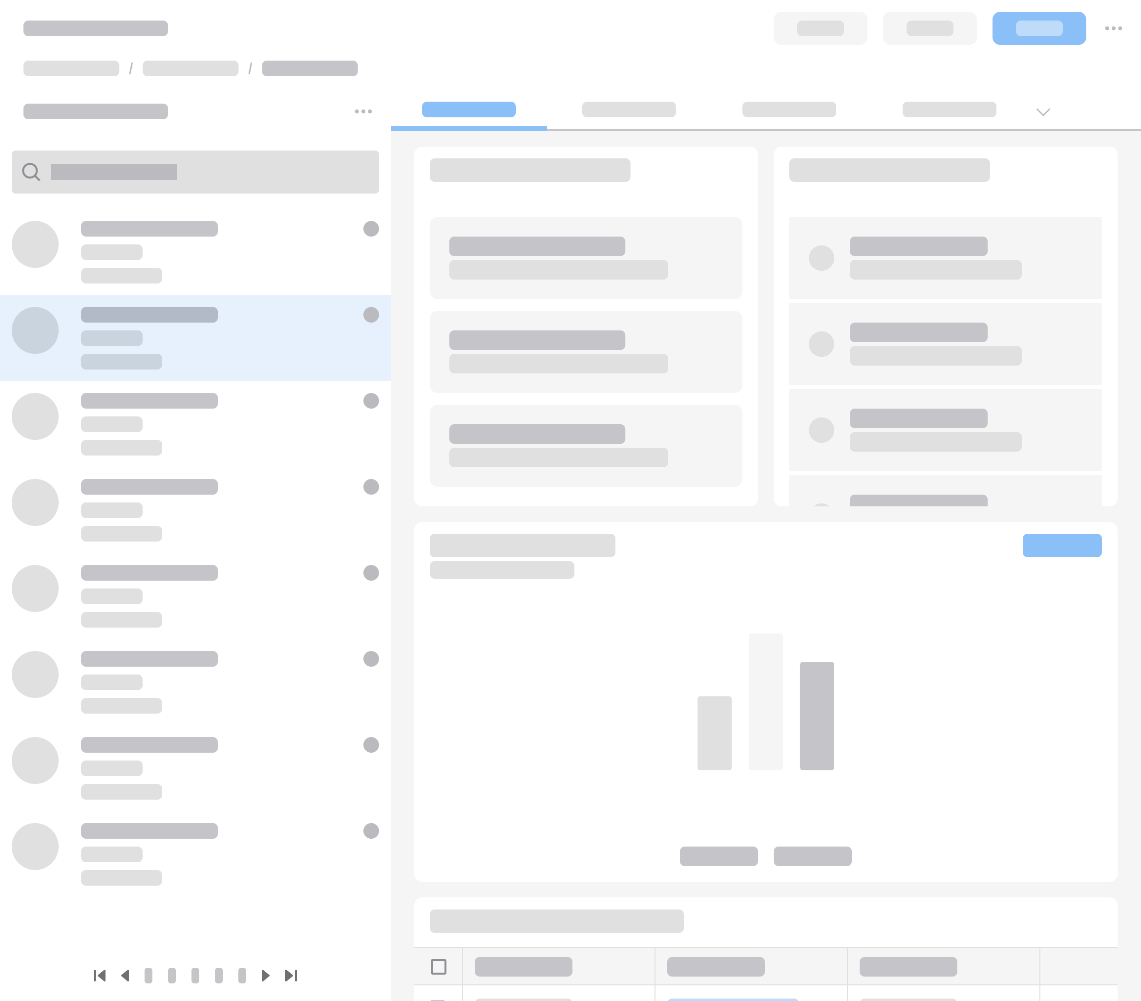
L with a fluid 2-column grid.
M
768–1023 pixels
Use a fluid 2-column grid.
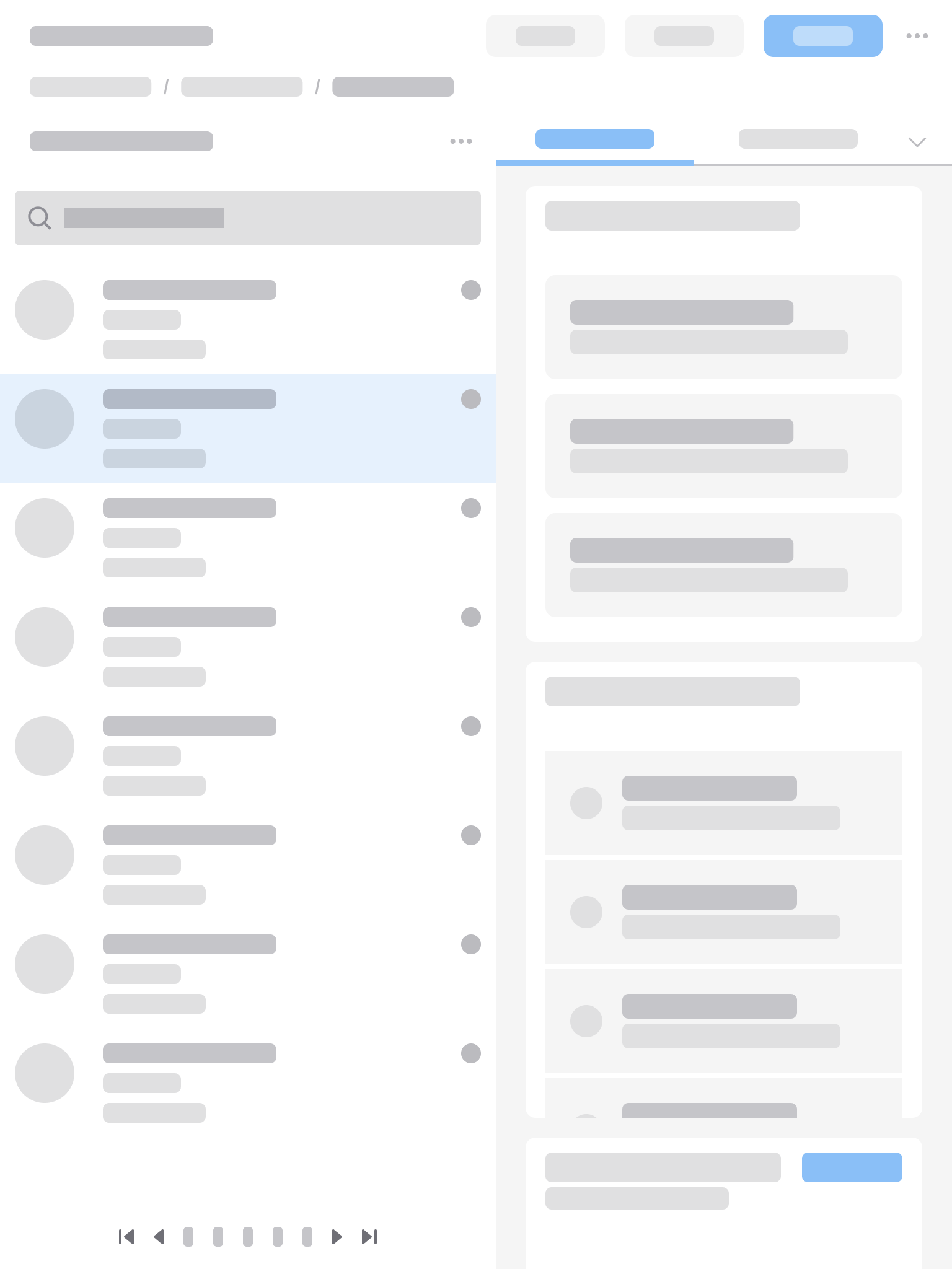
M with a fluid 2-column grid.
S
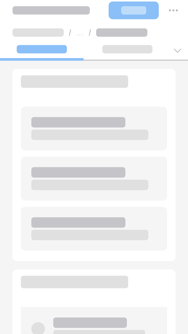
575–767 pixels
The list panel and the details section appear on separate pages. Selecting a list item by clicking it or tapping it navigates to the detail view.
S with a list panel.
For the detail view, use a fluid 2-column grid.
S with a detail view and a fluid 2-column grid.
XS
360–574 pixels
- The list panel and the detail view appear on separate pages. Selecting a list item by clicking it or tapping it navigates to the detail view.
- Use a fluid 1-column grid for both views.
XS with a list panel and a fluid 1-column grid.
XS with a detail view and a fluid 1-column grid.