
Form
A form is a structured layout that lets the user enter, review, and submit information.
It brings together various input components—like the text input, dropdown, checkbox, and radio button—into a cohesive flow, guiding the user through data entry with labels, validation, and feedback.
Anatomy
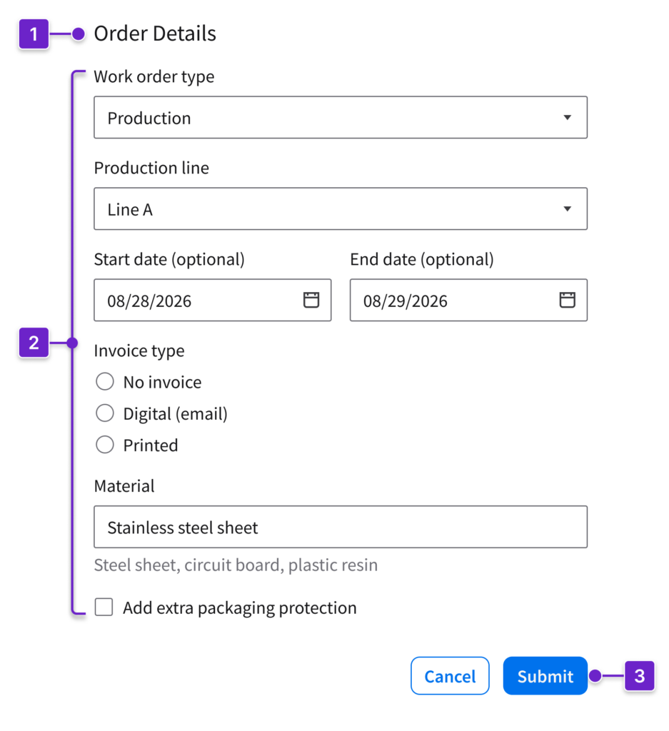
- Title (optional)
- Input elements
- Button group
Potential Components
- Inputs: Text input, text area, editor (rich text), spinbox
- Selection controls: Checkbox, radio, switch, dropdown, multiselect
- Pickers: Datepicker, timepicker
- Search and lookup: Search field, lookup
- File handling: File upload, file upload (advanced)
- Actions: Button, button group, header, toolbar
When to Use
To enter structured information in order to complete a task, such as:
- Collecting structured data: Contact info, account details
- Completing transactions: Checkout flows, registrations, applications
- Handling custom requests: Orders, scheduling, support tickets
- Gathering feedback: Satisfaction surveys, incident or bug reporting
When to Use Something Else
- For conversational interactions, consider an AI assistant.
- For complex multistep tasks, use a wizard.
- For visual inputs or dynamic inputs, use sliders or toggles, or let the user drag and drop elements.
- For binary decisions or simple decisions, use buttons, checkboxes, or other quick-action elements.
- For user authentication, follow the sign-in pattern.
Grouping
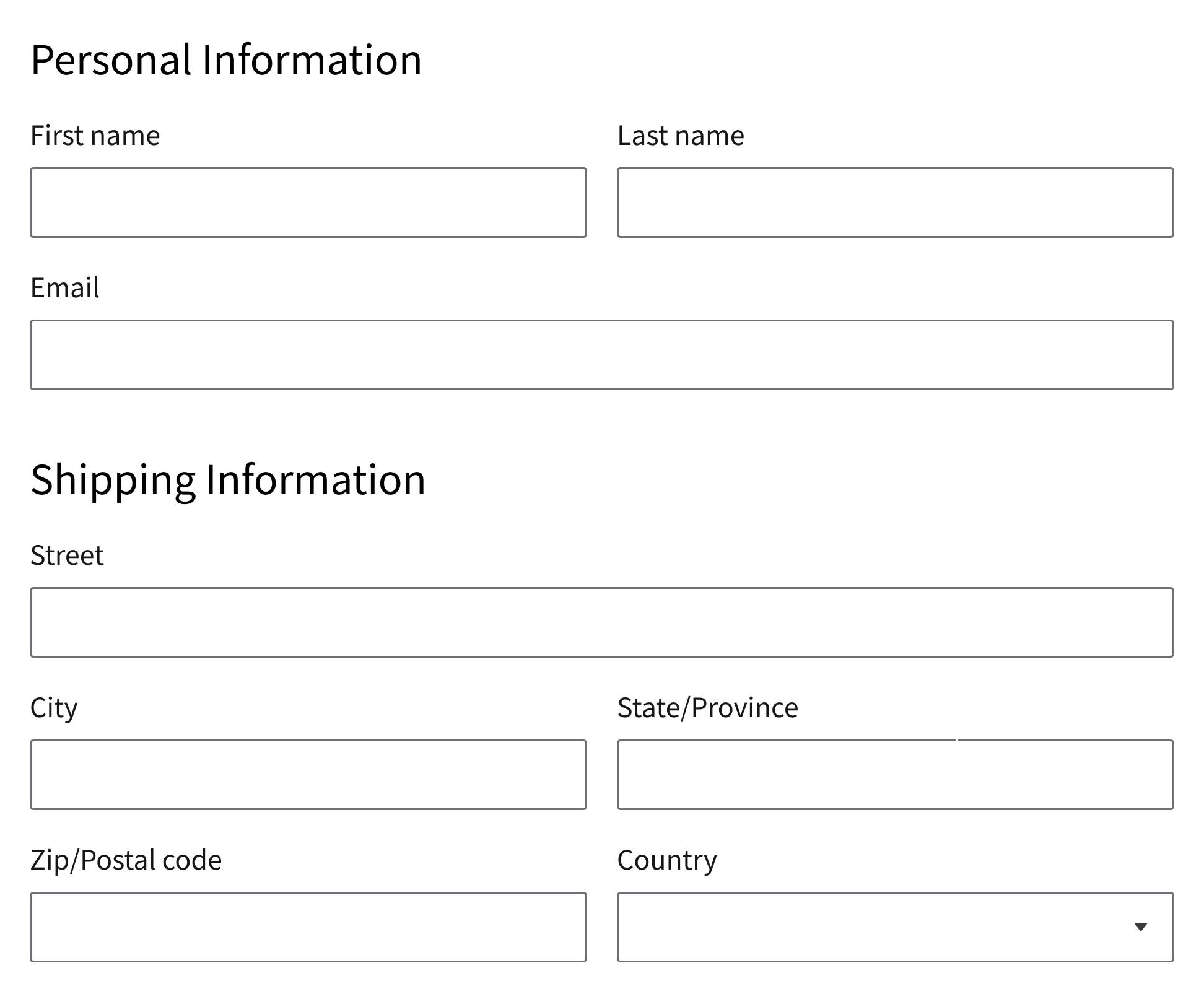
To help the user scan a form and complete it efficiently, organize related fields. Fields can be grouped inline, into sections, or both:
Inline
When they represent a single logical set of information, place related fields on the same row. Examples include names, dates, times, or addresses.
Sections
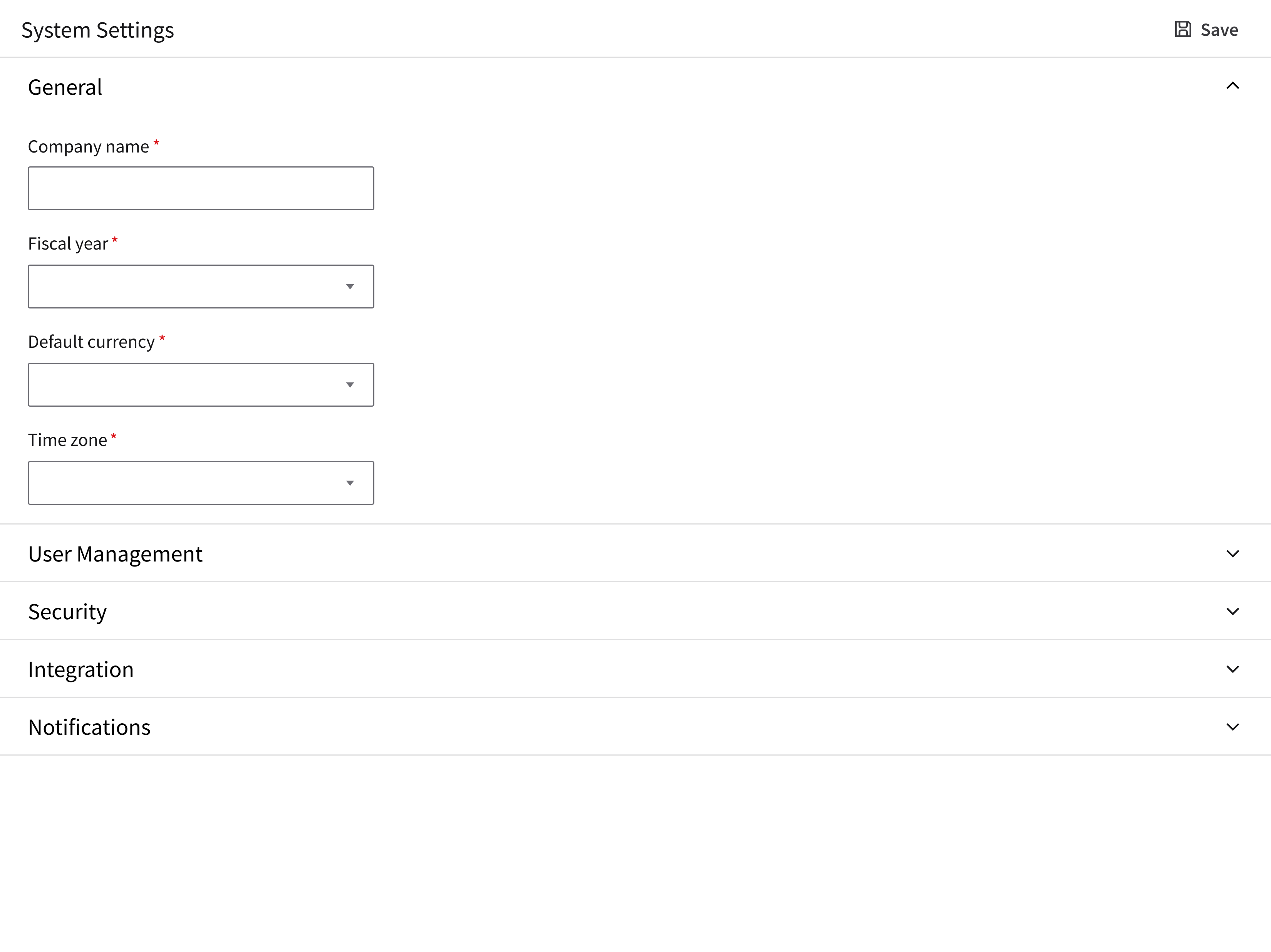
Divide longer forms into labeled sections. For collapsible sections, see progressive disclosure.
Using Both Inline Groups and Sections
Group related inputs within each section.
Layout
Single Column (Recommended)
- Optimizes readability and completion speed.
- Supports natural top-to-bottom scanning.
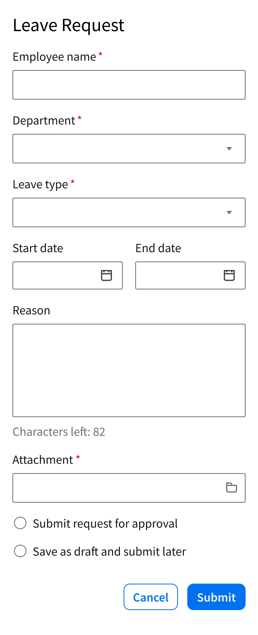
Two Columns
- Best for displaying related content or complementary content side by side.
- Requires clear alignment and visual hierarchy.
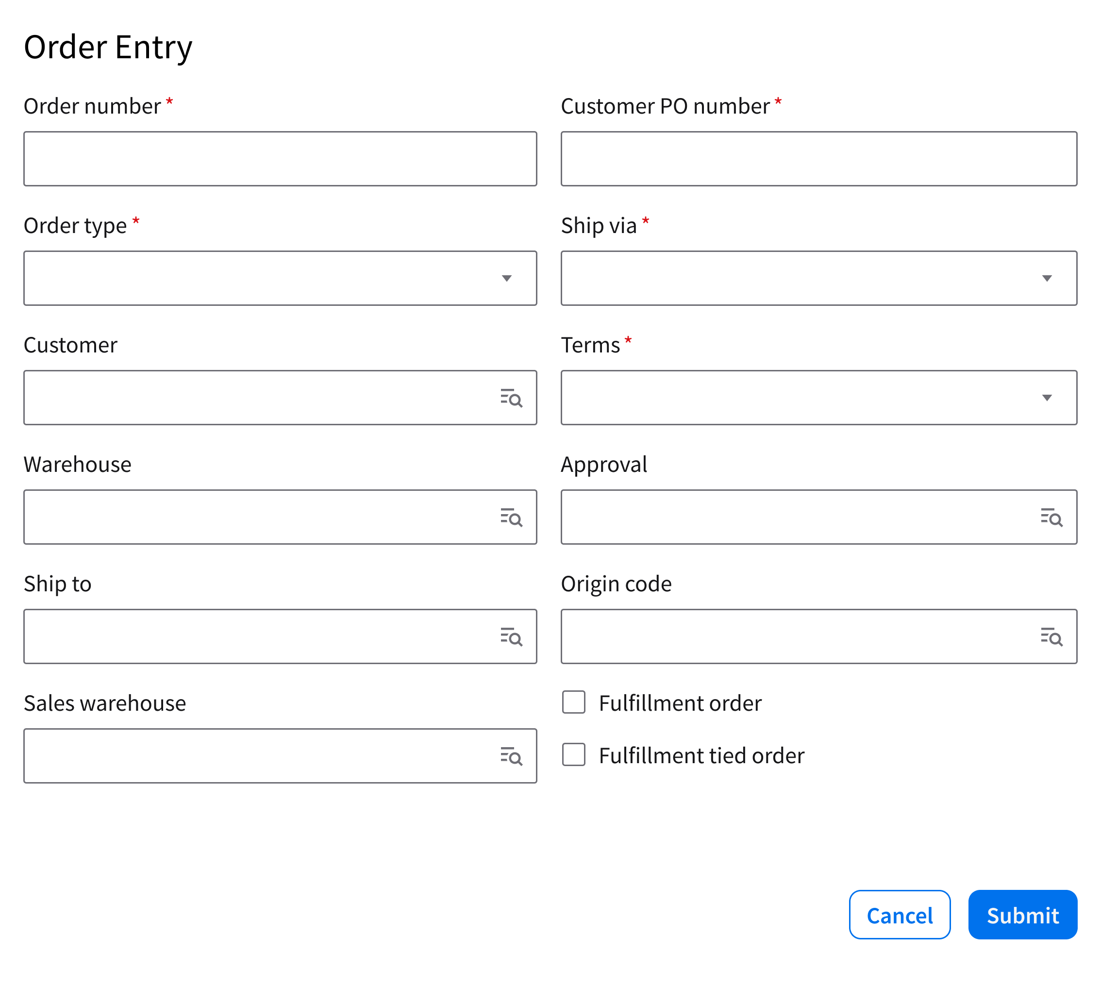
Complex Forms
Help the user focus by reducing cognitive load and revealing information gradually. Two common patterns support this:
Progressive Disclosure
Show the essential fields first. Reveal additional fields as needed.
Multiple Steps
Break up a long or complex form into a sequence of steps by using a wizard.
Behavior and Interaction
The form experience follows a clear progression from entry to completion, guiding the user through each step with feedback and support.
Entry Point
The user initiates the form by selecting an action, such as clicking a button that says “Add”, “Edit”, or “Create”.
Filling Out Fields
The user moves through the form by entering or selecting values.
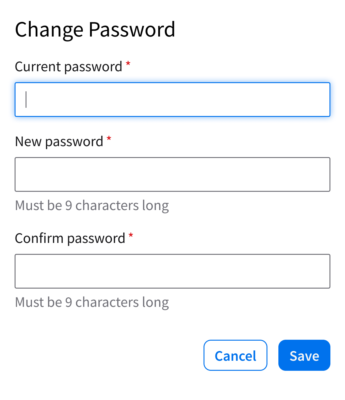
- Selecting a field triggers a focus state, helping the user understand where they are in the form.
- If a field has a specific requirement, include help text.
Inline Validation
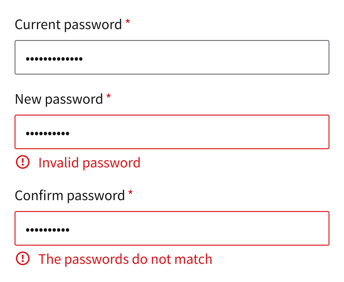
As the user interacts with a form, inline validation provides immediate feedback. If an input is missing, invalid, or unclear, display a short and actionable error message to help them resolve it.
Submitting a Form
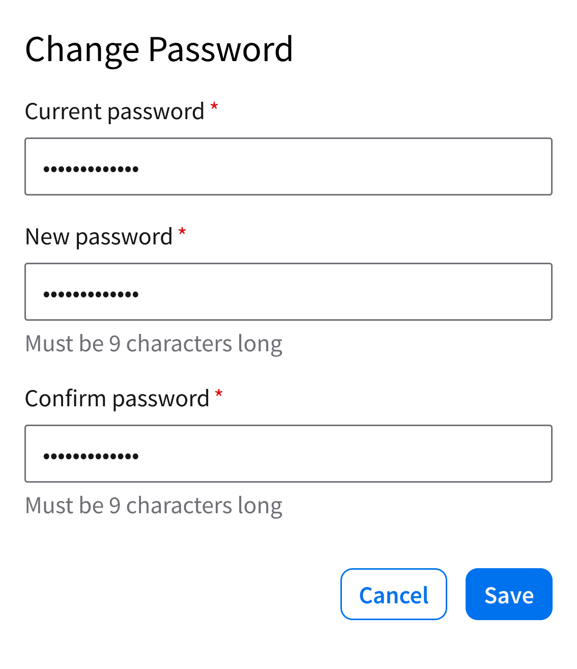
Once the user completes all required fields, they can submit the form by selecting the primary action (“Submit” or “Save”) in a button group.
System Response
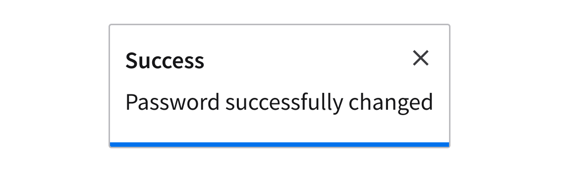
After submission, provide the user with clear feedback. On success, use a toast to display a confirmation message in the top-right corner of the page.
Best Practices
Keep Forms Focused
Include only the fields that are necessary for the user to complete the task. Reduce unnecessary inputs to help the user complete the form faster and with fewer errors.
Do
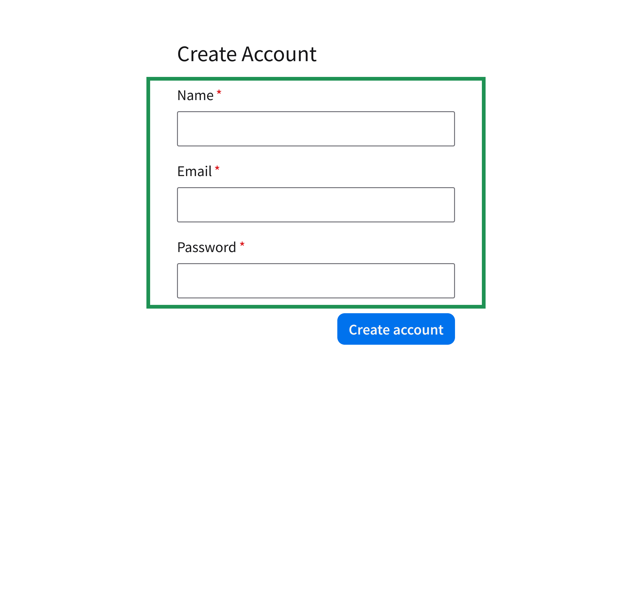
Include only essential fields. Remove anything that doesn’t support the task at hand.
Don’t
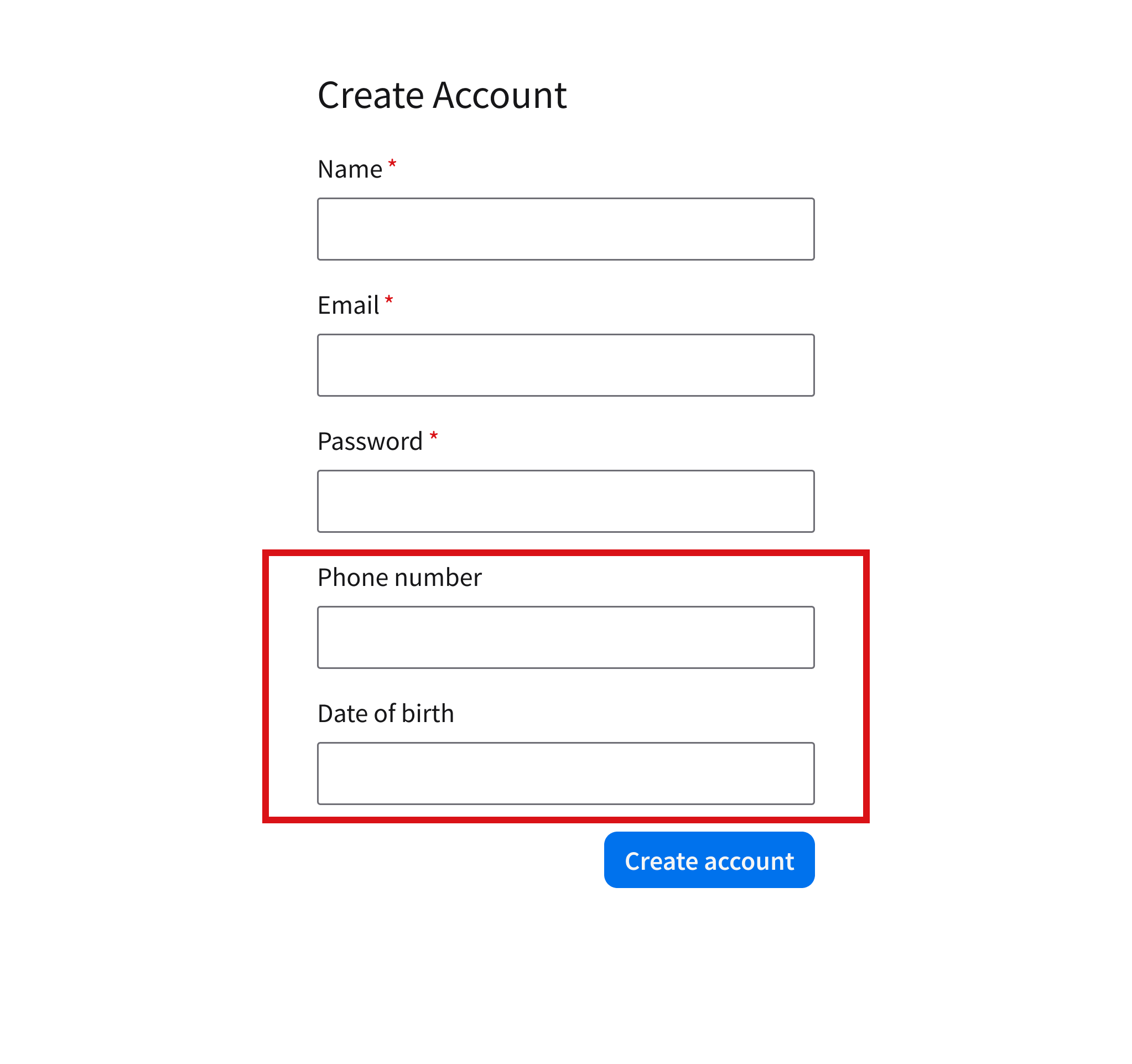
Don’t add fields that aren’t actually required.
Maintain a Clear Flow
To help the user complete all fields in order, follow a predictable, top-to-bottom structure.
Do
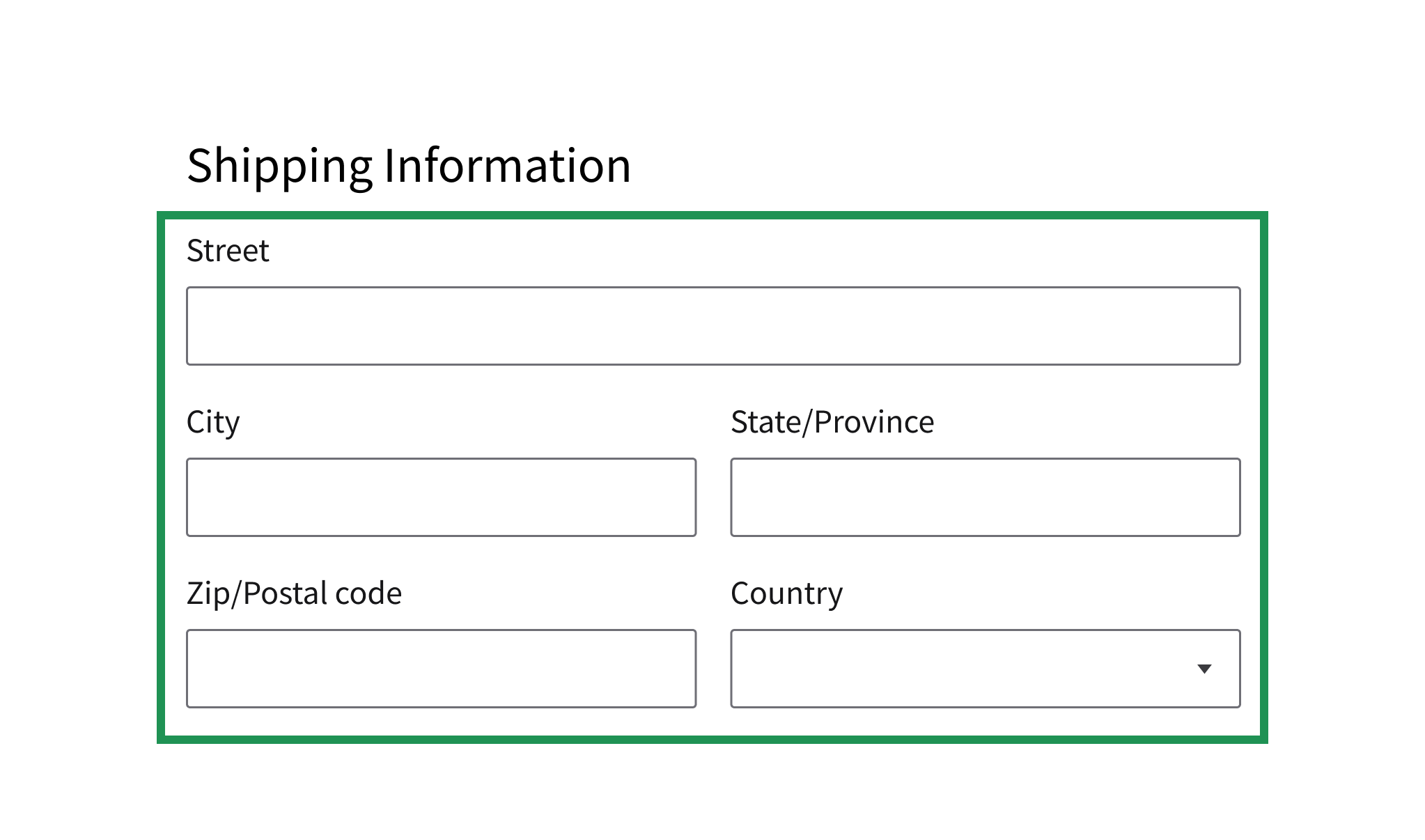
Use a single-column layout with a logical sequence of fields.
Don’t
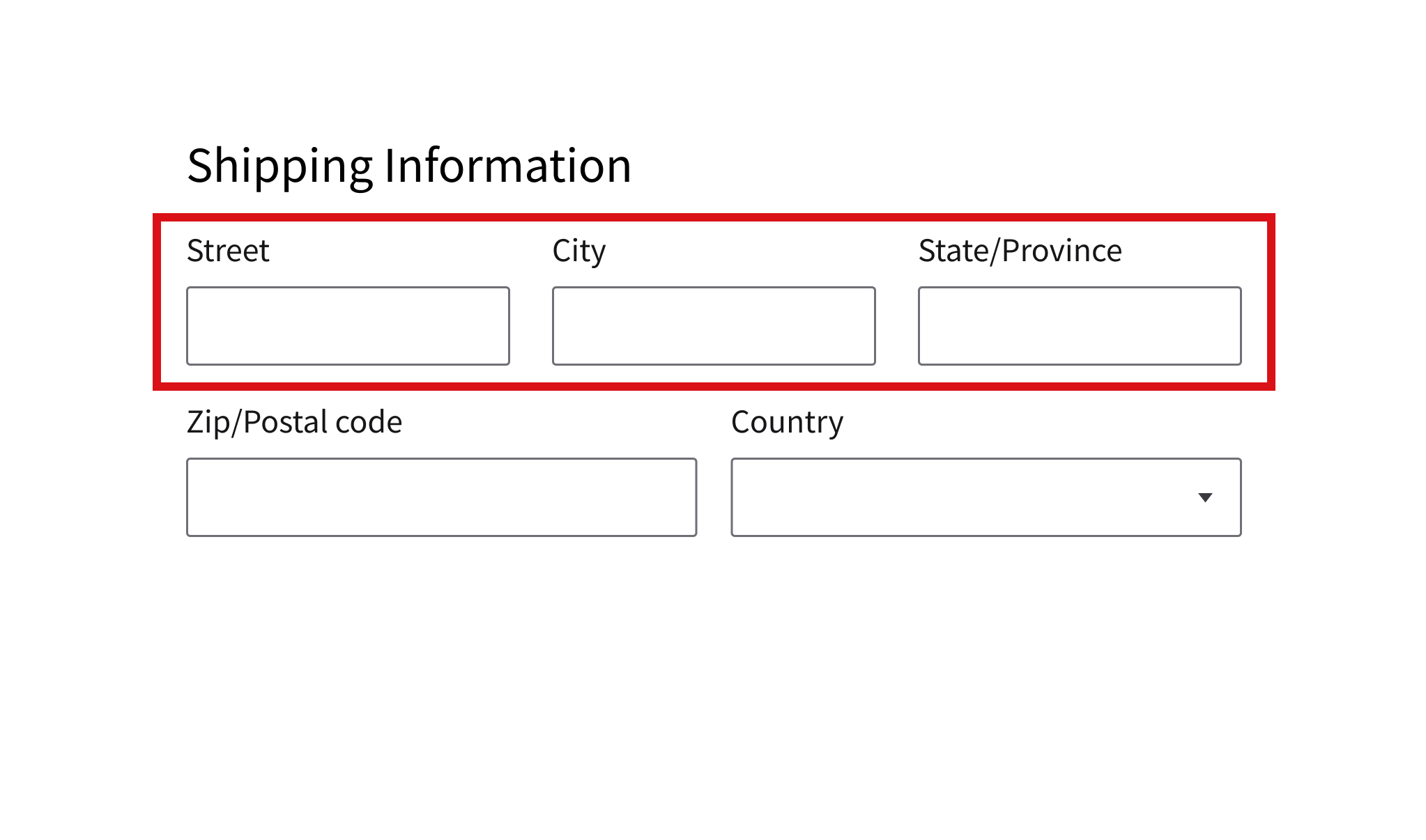
Don’t use a layout with multiple columns, fields that are placed inconsistently, or fields that truncate text.
Support Validation and Completion
Guide the user toward successful submission with clear feedback and accessible actions.
Do
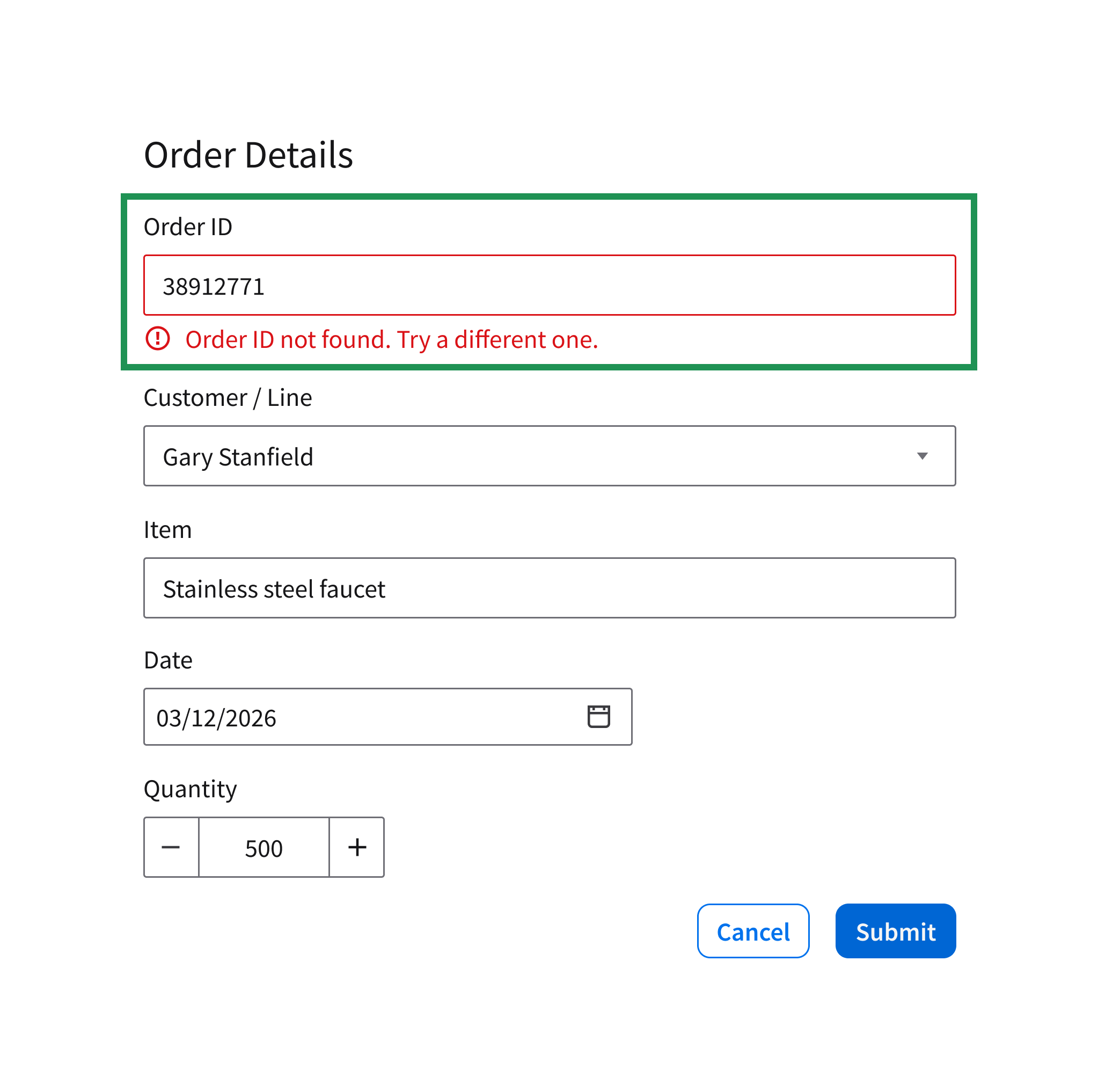
Provide inline validation and use clear primary actions like “Submit” or “Save”.
Don’t
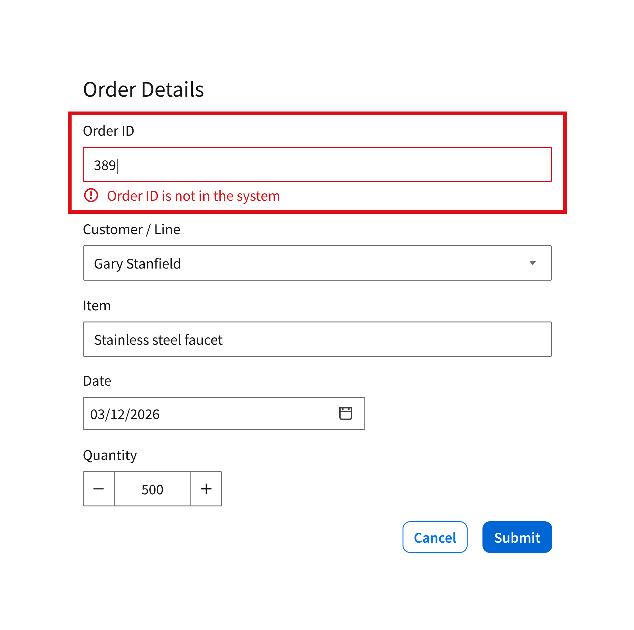
Don’t delay feedback, hide key actions, or show input errors until the user is done typing.
UX Writing
- Use sentence case for labels and help text: Only capitalize the first word and any proper nouns.
- Write help text that is short, concise, and clear.
- Don’t end help text with a punctuation.
- See more UX writing tips for hint text for search and form fields.
Accessibility
See the text input.