Error
An error occurs when a system or user action fails or produces an unexpected result, sometimes preventing the user from completing their intended task.
Errors should be communicated clearly so the user can recognize, understand, and recover when possible. The appropriate way to surface an error depends on the type of failure and the impact to the user’s workflow. A well-handled error clearly communicates what went wrong, why it happened, and what the user can do next.
Potential Components
When to Use
- A user‑initiated action fails to complete as expected.
- A system issue, permission problem, or missing prerequisite blocks progress.
- An unexpected outcome prevents the user from continuing their workflow.
- The user needs to understand what went wrong in order to proceed or recover.
When to Use Something Else
- When no data is available to display, and the situation is not caused by an error, use an empty message (non-error) component to provide context and guide the next step.
- Example: “No reports yet” with a “Create report” button.
- When there’s a page-level message that needs to inform the user about a status, update, or important information, and does not indicate an error or failure, use a notification banner (non-error).
- Example: “New version available” with an option to refresh or learn more.
- When there’s a need to provide brief, non-blocking feedback about an action or system response, and the outcome is successful or informational rather than an error, use a toast (non-error).
- Example: “Report saved successfully” appearing temporarily after saving.
How It Works
| Use case | Component | Feedback criticality | Persistence | User interaction required |
|---|---|---|---|---|
| Background system issue | Notification banner (error) | Low to medium | Non-blocking, visible until resolved or dismissed | Optional |
| Validation error | Inline validation for input type | Medium | Inline, visible until the input is corrected | Required to proceed |
| Workflow interruption | Empty message (error) | High | Replaces content, persistent until resolved | Required |
1. Background System Issue
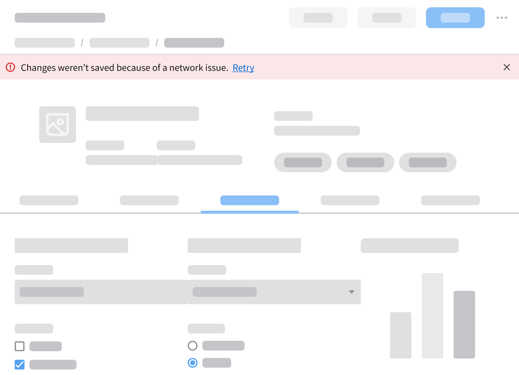
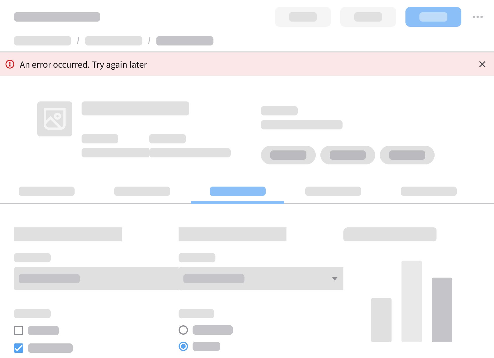
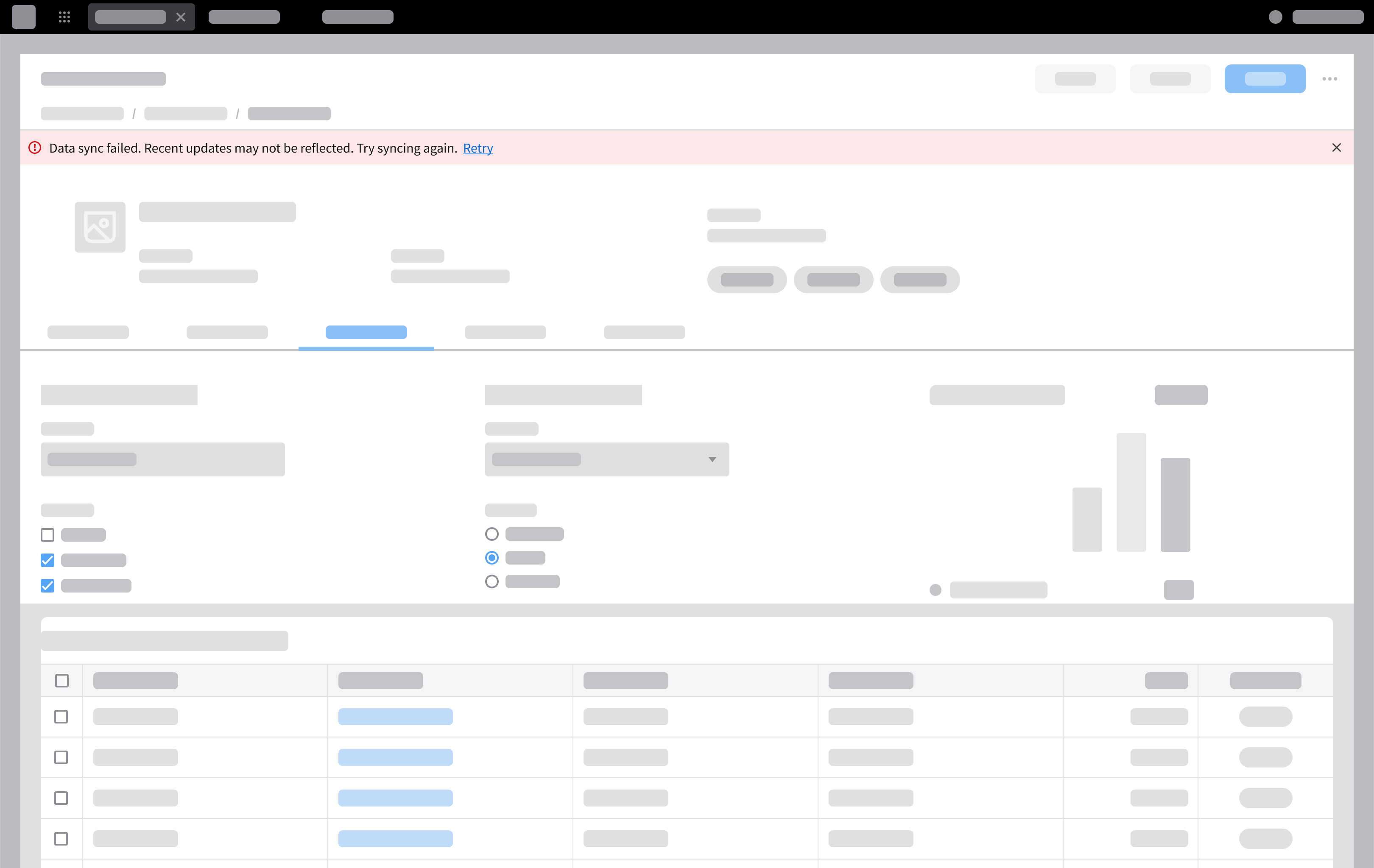
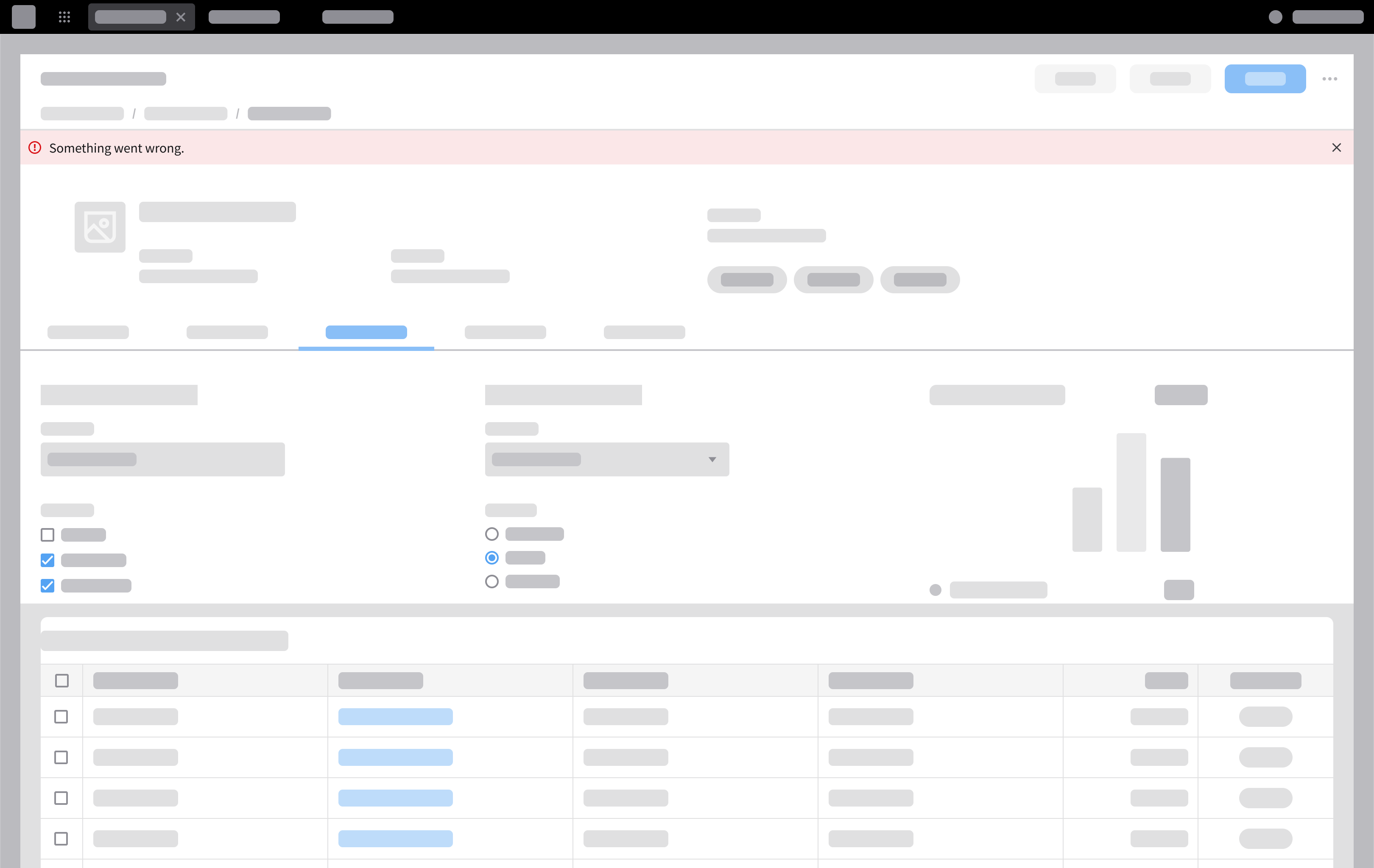
This informs the user about a background problem that occured, but doesn’t prevent them from continuing their task. Use notification banner (error).
When to Use
- A system or background process fails.
- Data may be incomplete (for example, “Saved, but some fields were skipped”) or outdated.
- For an issue that can be resolved later, such as partial data being unavailable while the user can continue working with the available content.
Examples
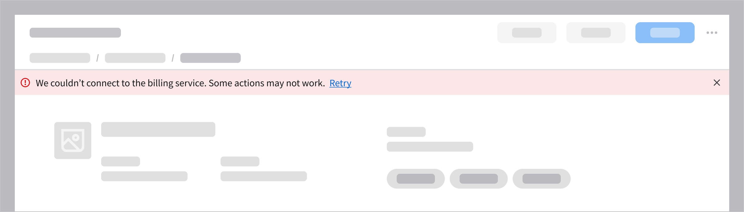
A system connection issue may limit functionality, but the user can continue working.
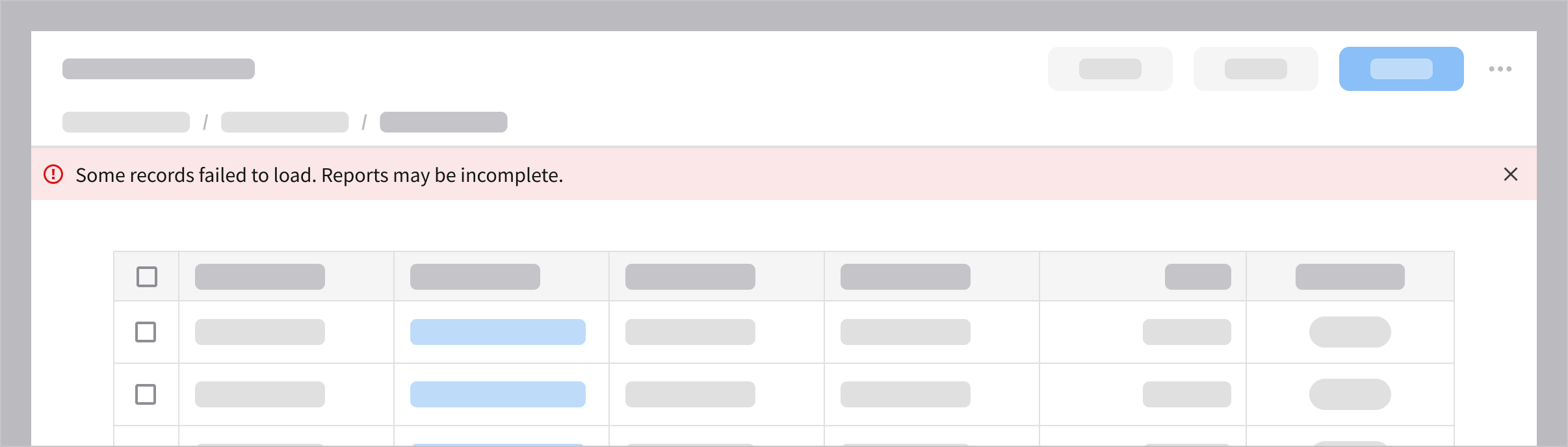
Partial data load may result in incomplete or inaccurate information, but the user can proceed.
2. Validation Error
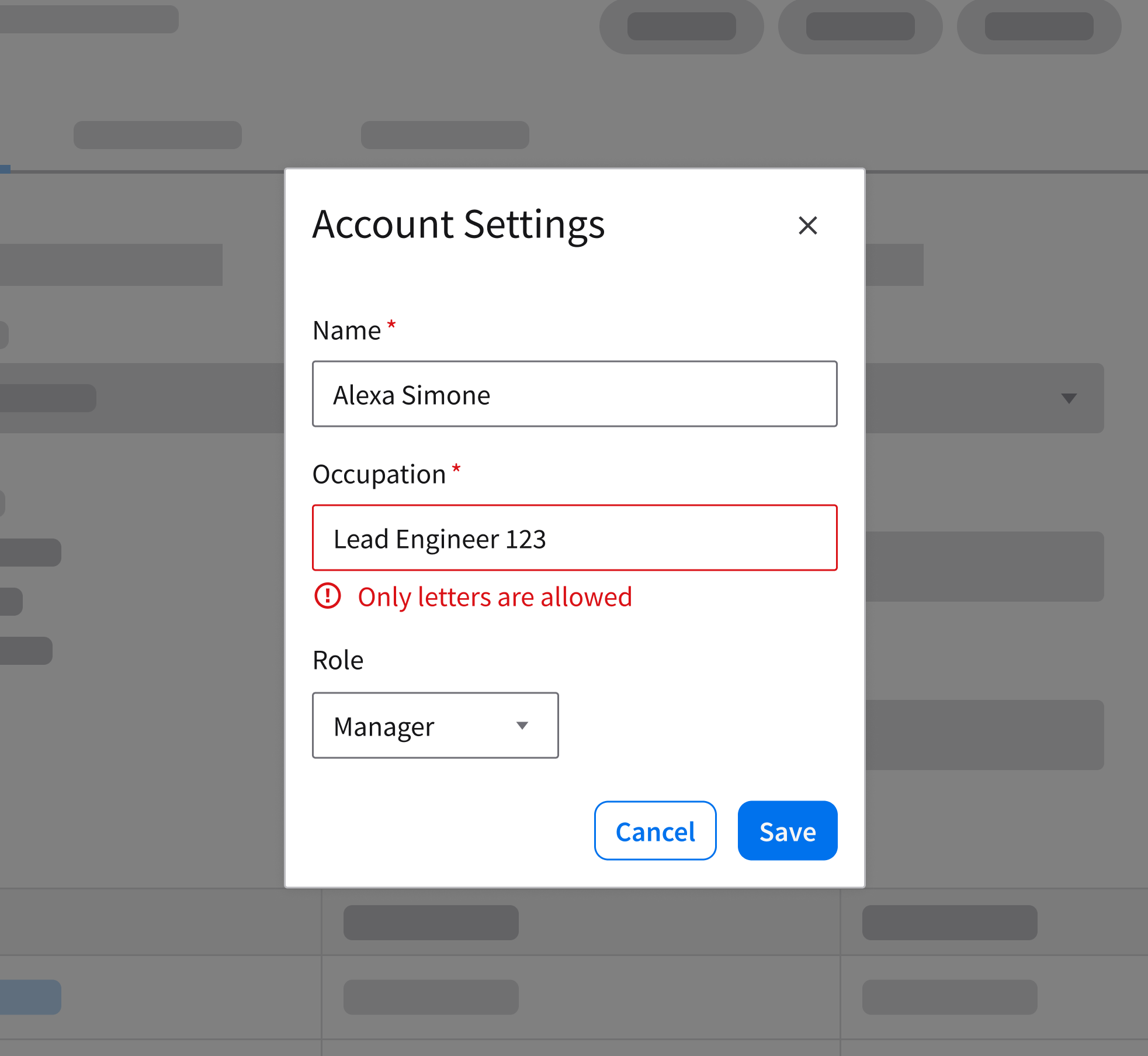
Validation errors occur when the user submits missing, invalid, or incorrectly formatted data. Display these errors inline directly at the specific field to help the user locate the problem without disrupting their flow. Ensure the message is specific and actionable, clearly explaining exactly what went wrong and how to correct it.
When to Use
- To require the user to fix an issue at a specific field before they can proceed.
- To prevent submission until the user provides the correct information.
Examples
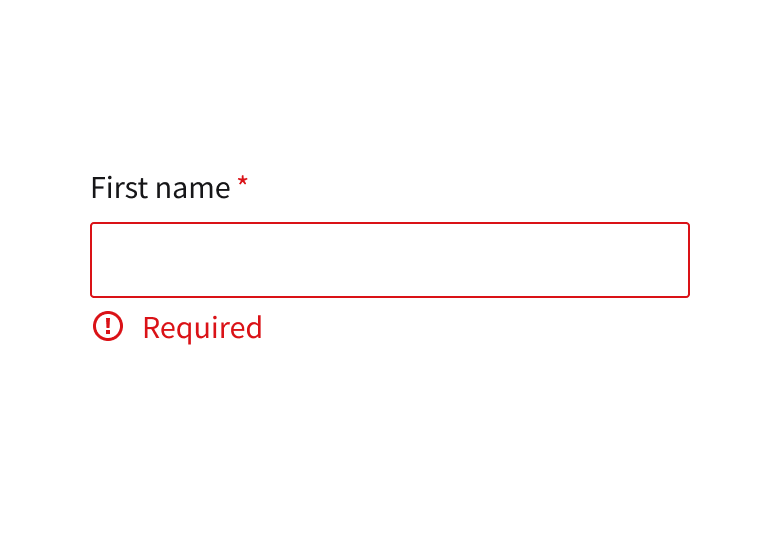
First name is required in a form.
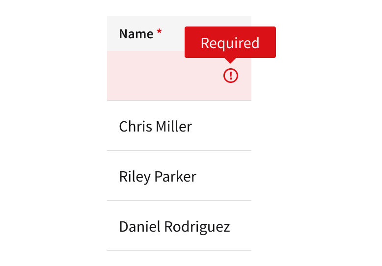
Name is required on a cell in a data.
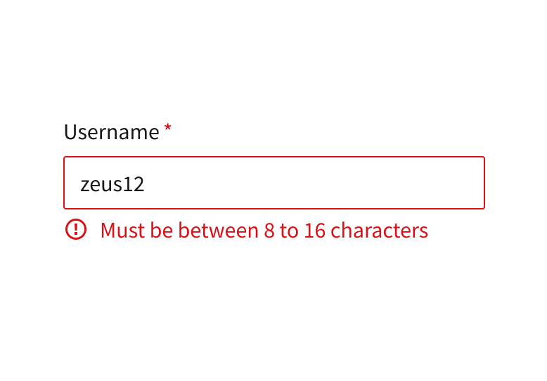
Username must have 8 to 16 characters.
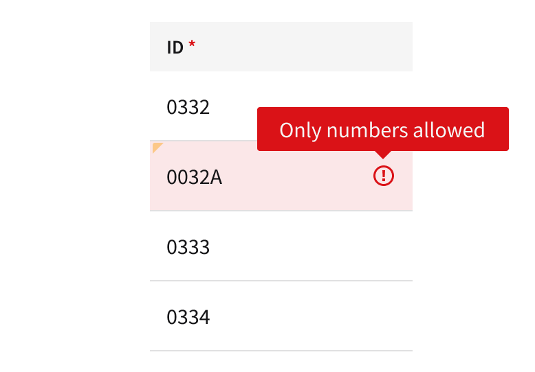
ID containing an invalid character.
3. Workflow Interruption
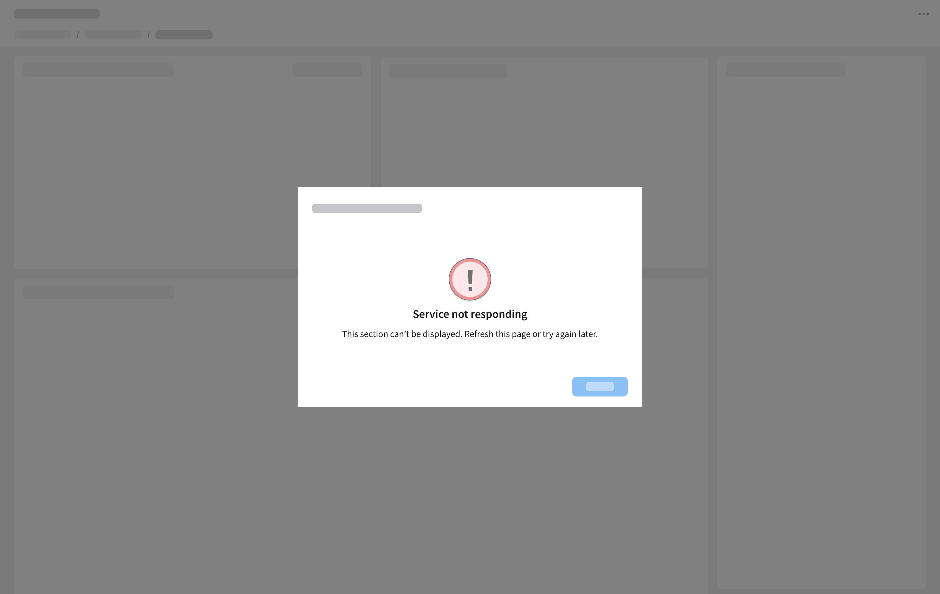
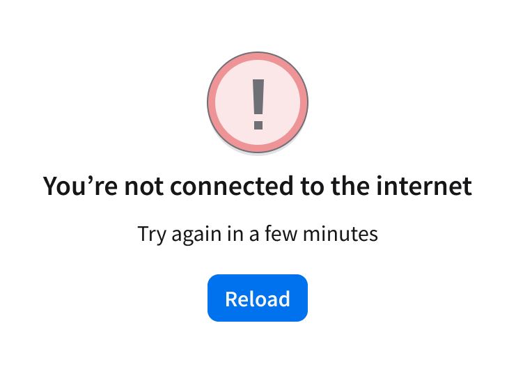
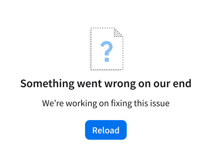
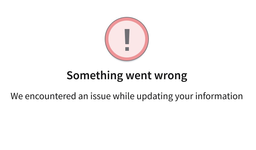
This blocks the workflow and often requires the user to take action (retry, refresh, or contact support). Use a empty message to present the error state. It can fill the entire space (for example, a page, widget, or card), or present an overlaying modal. Use an empty state icon prepared specifically for errors.
When to Use
- To block the workflow when a system failure or lack of permissions completely prevents the user from viewing content or continuing a task.
- To replace a failed interface—such as an entire page, card, widget, or modal—with an empty message so the user understands why the area is blank.
- To require the user to take a specific recovery action, such as refreshing the page or contacting support, before they can proceed.
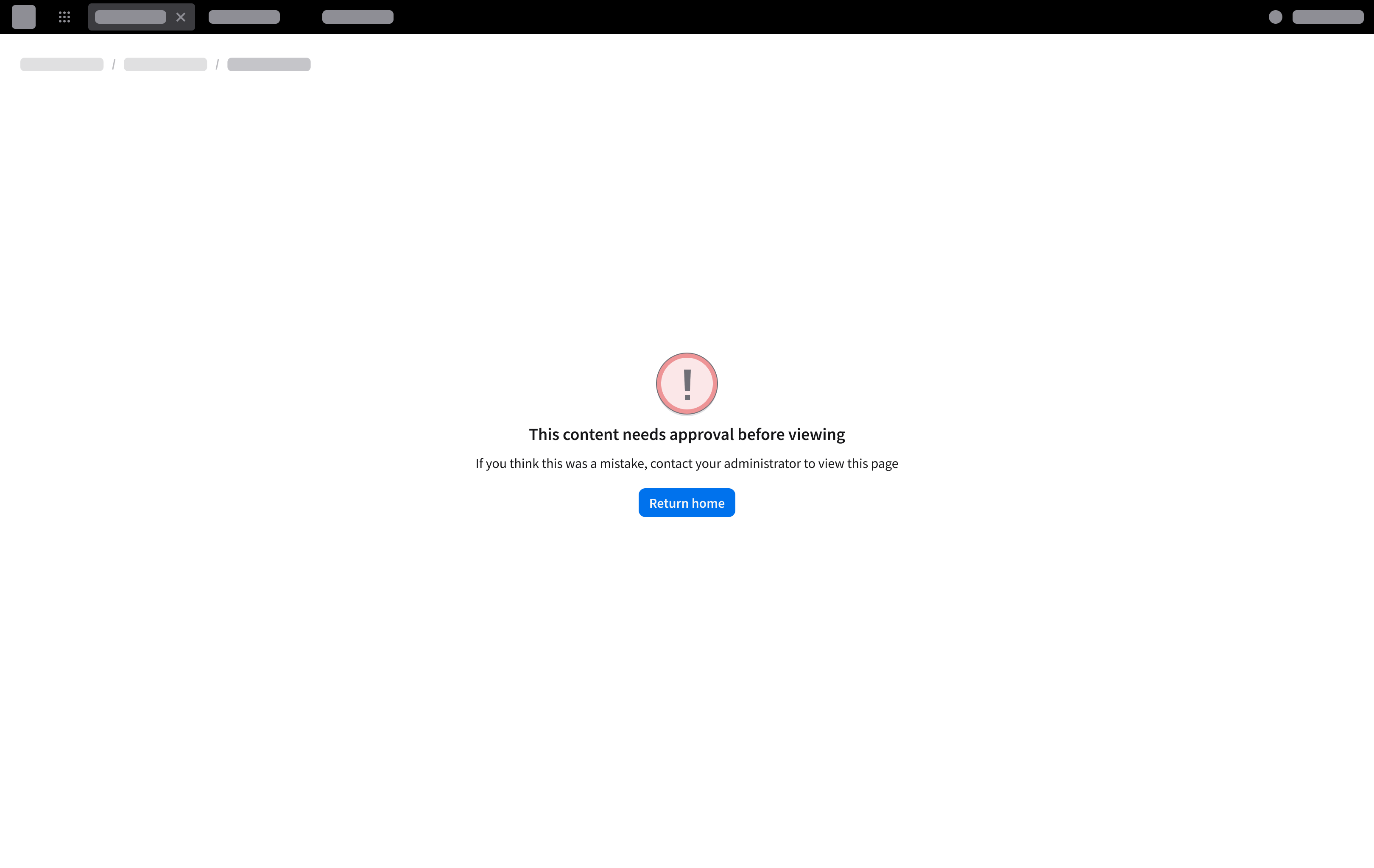
An empty message component in a full page view when the entire page fails to load due to insufficient permissions.
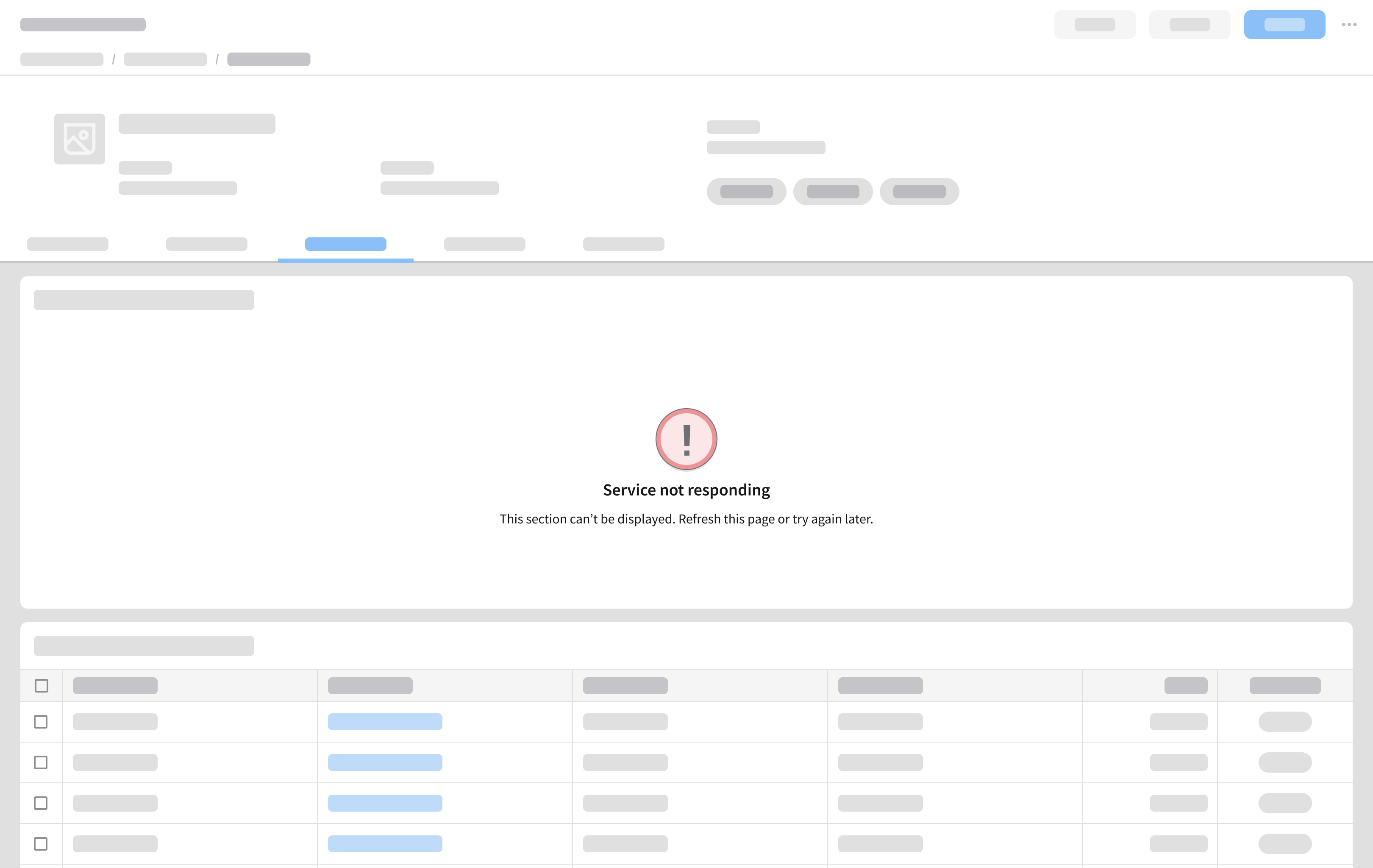
A card-level error showing a data load failure caused by an unresponsive service.
An empty message in a modal showing inaccessible or unavailable content.
Best Practices
Make Errors Clear, Specific, and Actionable
- Clearly communicate what went wrong and how it affects the user.
- Avoid vague or technical language that doesn’t help the user recover.
- Focus on what the user can do next, when possible.
Do
A user encounters an issue when saving a form. Clearly state why it wasn’t saved.
Don’t
The message uses a generic error without explaining what went wrong.
Do
Explain what the code means using simple language. The button label should match the user action that’s necessary to resolve the error.
Don’t
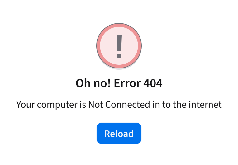
Don’t show http error codes (404, 301, 200, etc.) and use consistent casing.
Do
The button label helps the user understand what happens when they click it.
Don’t
Avoid vague labels not specifying what happened, why, or what the recovery options are.
Offer a Clear Recovery Path
- Provide a clear next step that helps the user recover, continue, and understand what happened.
- Match the recovery action to the type and severity of the error.
- Help the user resume their tasks efficiently by offering next step options that align with the situation they’re in. For example, ”Retry”, “Return to the previous step”, “Go to home”, “Contact support”, “Refresh session”.
- For more information on button usage and labeling, see the button.
Do
Offer a clear recovery path with actionable next steps.
Don’t
Don’t leave the user stuck without guidance or options.
Do
Display a notification banner when data updates fail, and provide a clear retry action to restore accuracy.
Don’t
Don’t present a vague error message that fails to explain the cause or guide the user towards a solution.
Use the Least Disruptive Pattern First
- Choose the error presentation based on how much it interrupts the user’s workflow.
- Avoid blocking the user when the issue doesn’t require immediate resolution.
- Escalate to more disruptive patterns only when the error prevents progress.
Do
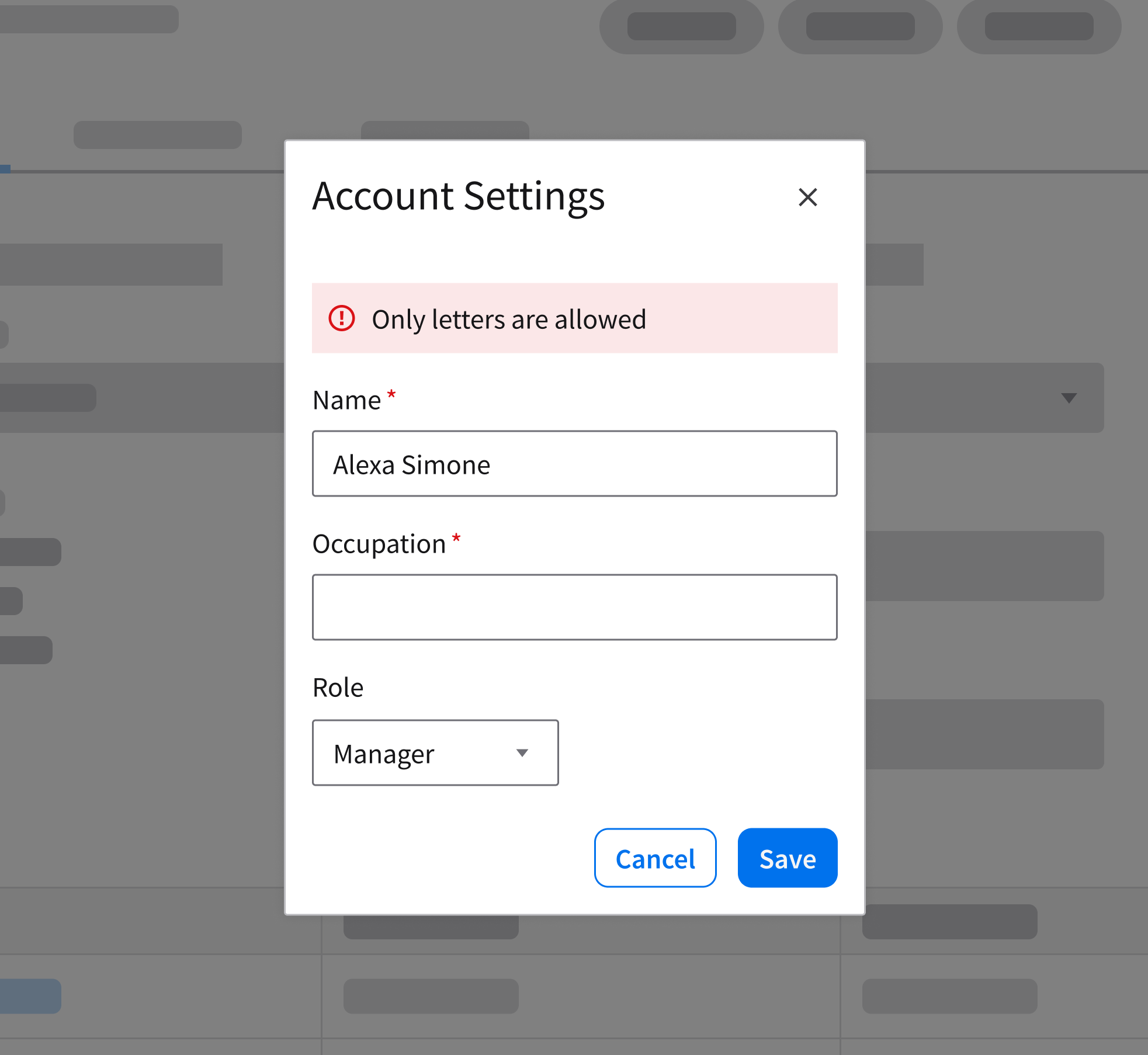
If an input field only accepts letters, use inline validation to notify users when they enter numbers.
Don’t
Avoid banners or modals for field validation errors.
Do
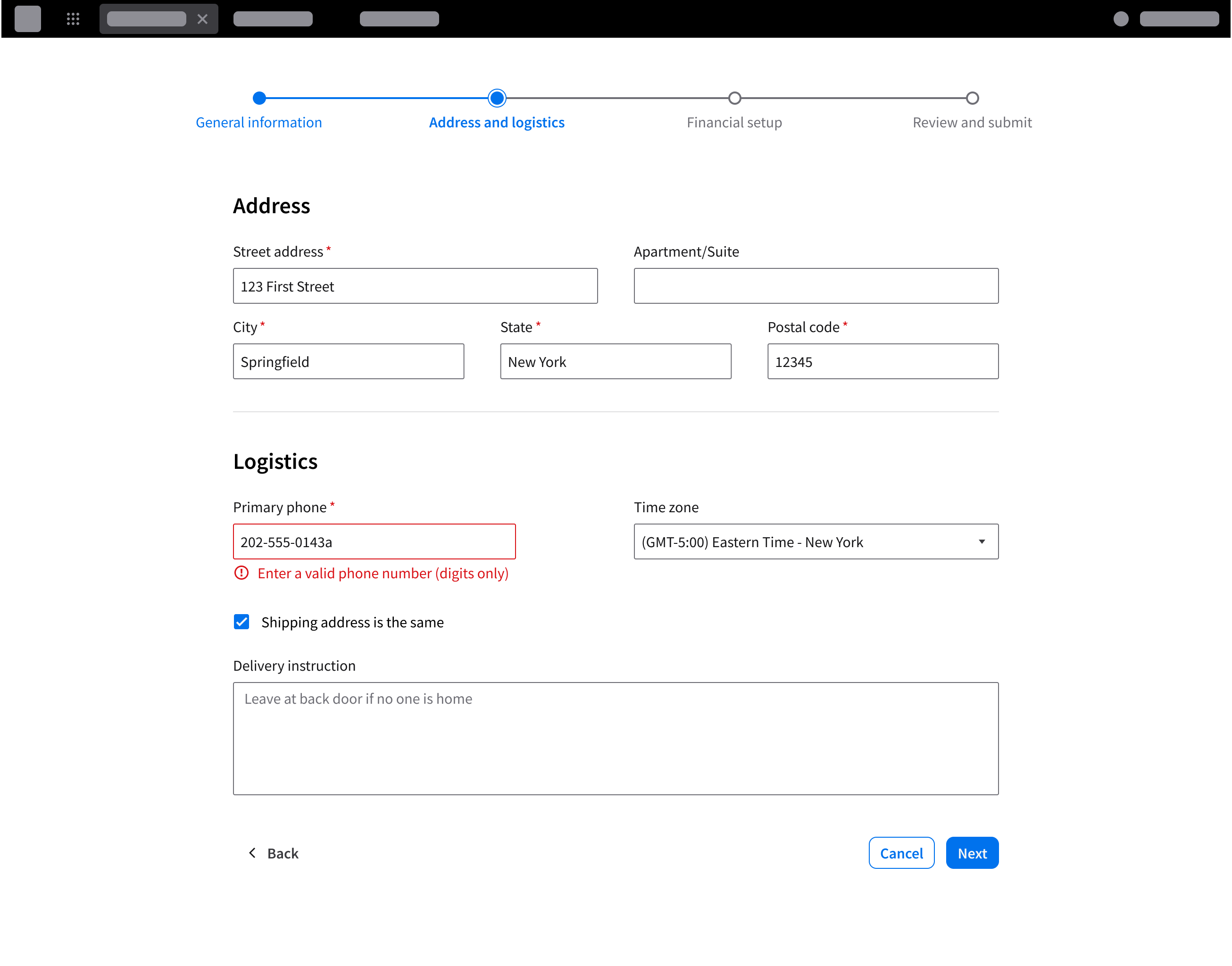
Show validation feedback for an invalid phone number entry.
Don’t
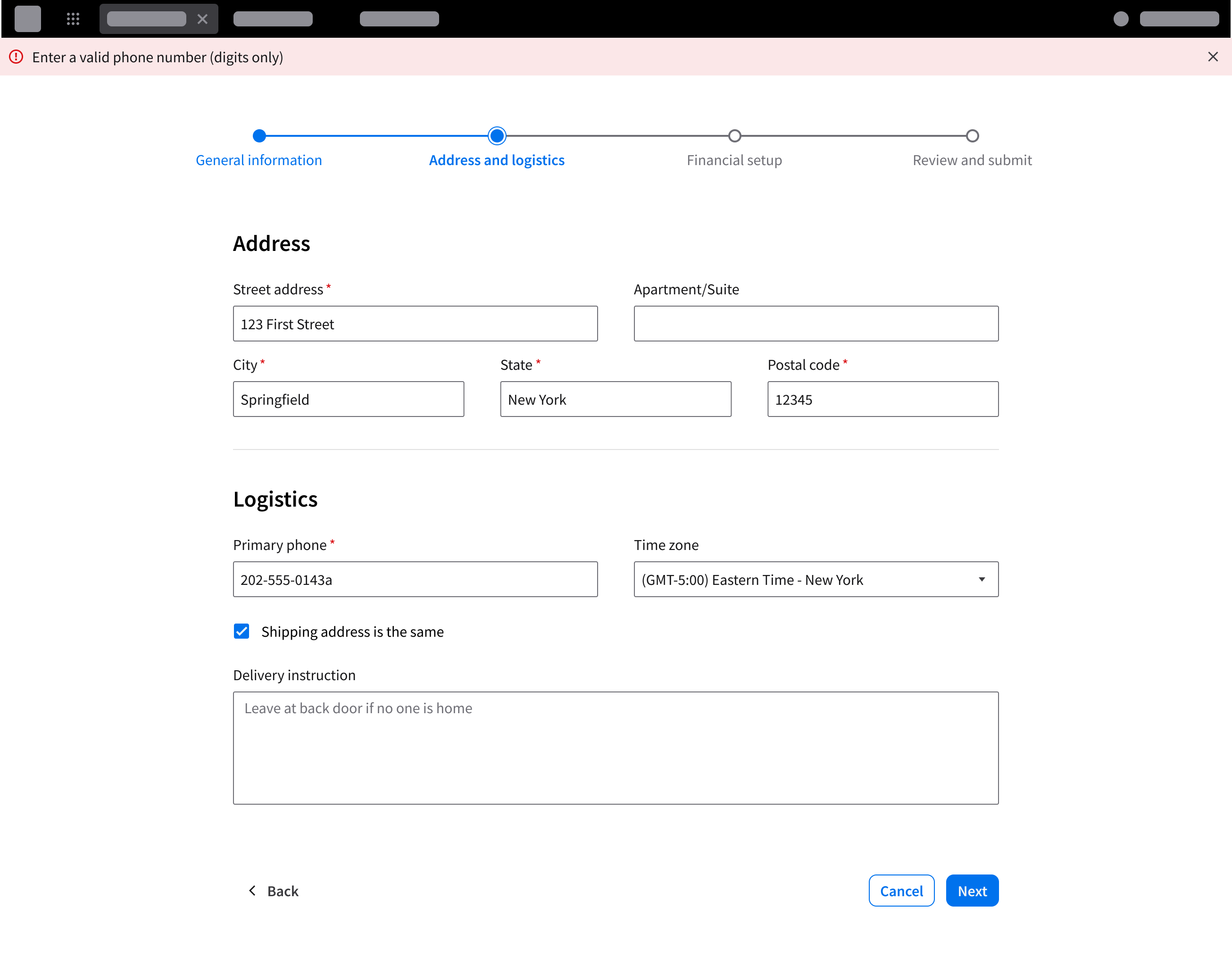
Don’t display validation errors only in a banner.
Provide Clear Input Requirements and Guidance
- Clearly communicate input requirements when errors are caused by invalid or missing user input.
- Help the user understand how to correct the issue directly at the point of interaction.
Do
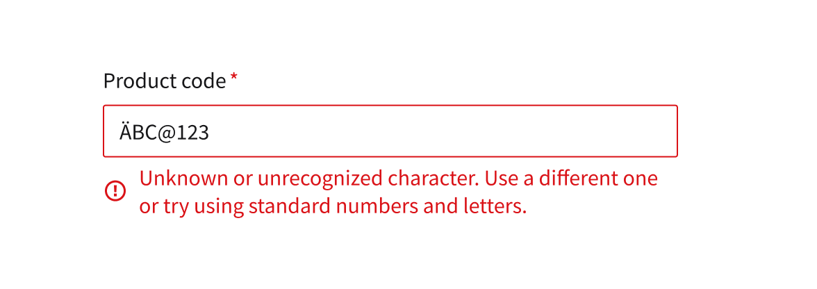
If the user enters an unrecognized character in a form, clearly explain that the system does not accept that character and specify which inputs are allowed.
Don’t
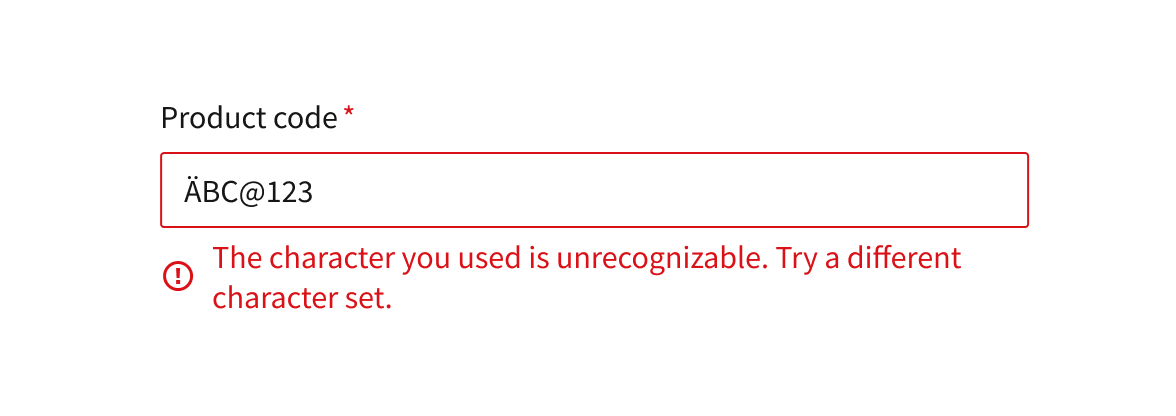
Don’t just say “try different character” without specifying the allowed ones.
Do
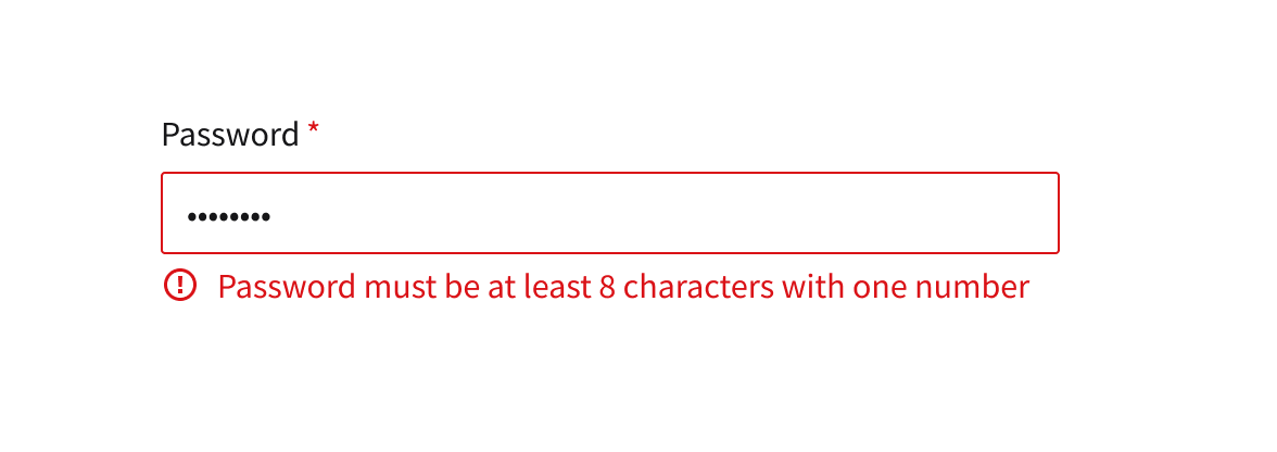
Provide the user with specific requirements to help them complete a form quicker or when entering wrong credentials.
Don’t
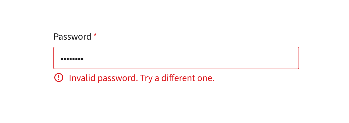
An invalid password error provides no guidance on the required format or how to correct the input.
Accessibility
- Ensure all system feedback such as notification banners, toasts, empty messages and inline validation is accessible and usable for all users.
- Provide meaningful, descriptive alt text for any illustrative imagery used within empty message components.
- Use appropriate ARIA roles (
role="alert"oraria-live="assertive") so messages from banners, toasts, and inline validation are announced to assistive technologies. - Ensure sufficient color contrast for text, icons, and all messages maintain readability.
- Avoid relying on color alone to convey meaning; include concise text in all components that clearly explains the message and any next steps.
- Ensure inline validation messages are programmatically associated with their respective form fields for accurate screen reader context.
- Update the page
<title>element when necessary to reflect significant states (full-page, empty or error states) to provide proper context for assistive technologies.