Split Screen
When to Use
Follow the page layout for a split screen when the user needs to:
- Separate related content within the same workflow.
- Compare or refer to content such as items, customer orders, or payment requests.
The user can show, hide, or resize the supporting panels to reduce visual clutter and maintain their focus.
Avoid a split screen when:
- The user doesn’t need to frequently refer to or interact with any additional content.
- Screen space is limited, making both panes unusable.
- On a smaller screen, use a collapsable panel instead.
- The content is not meaningfully related to the user’s workflow.
Options
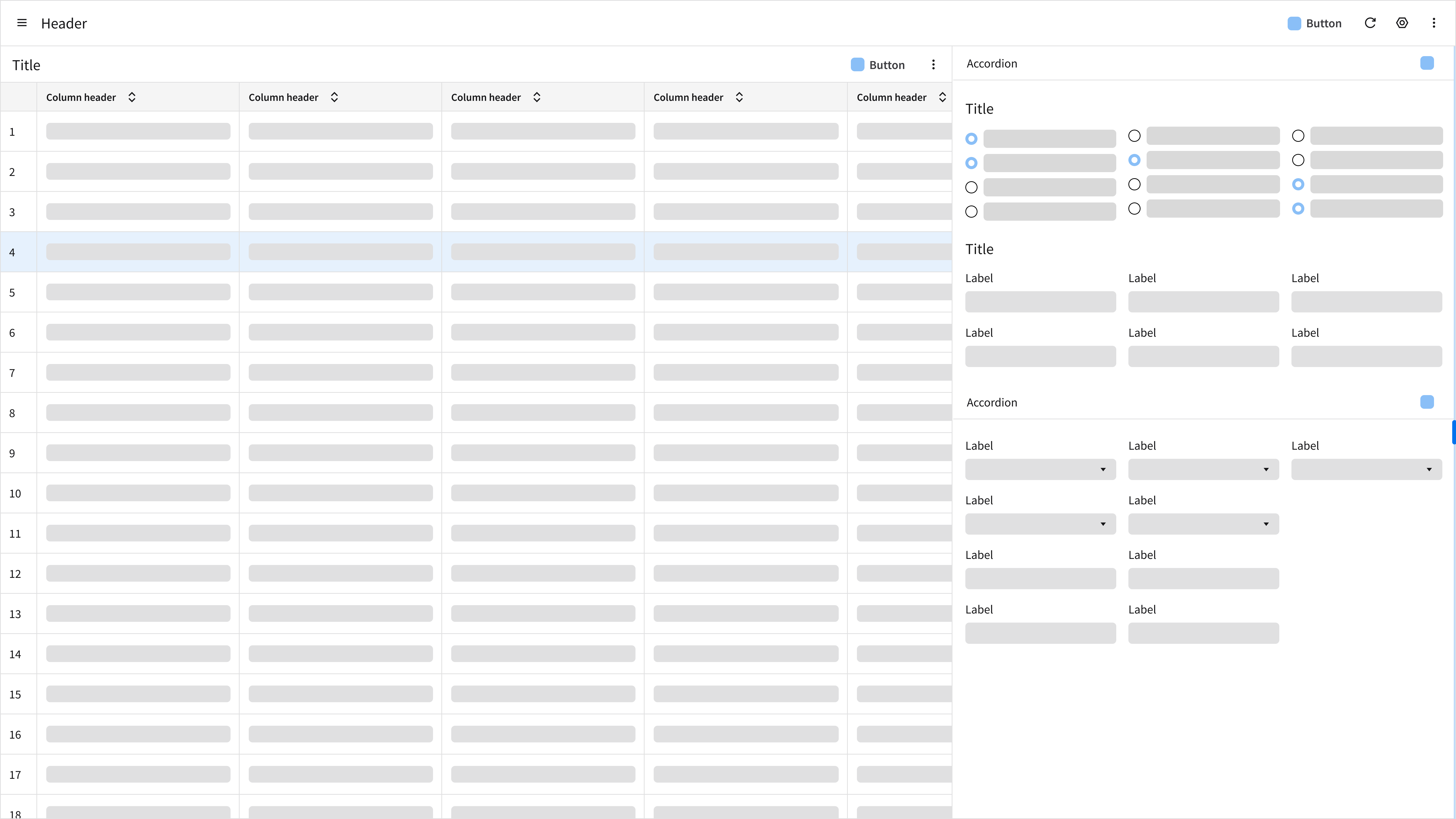
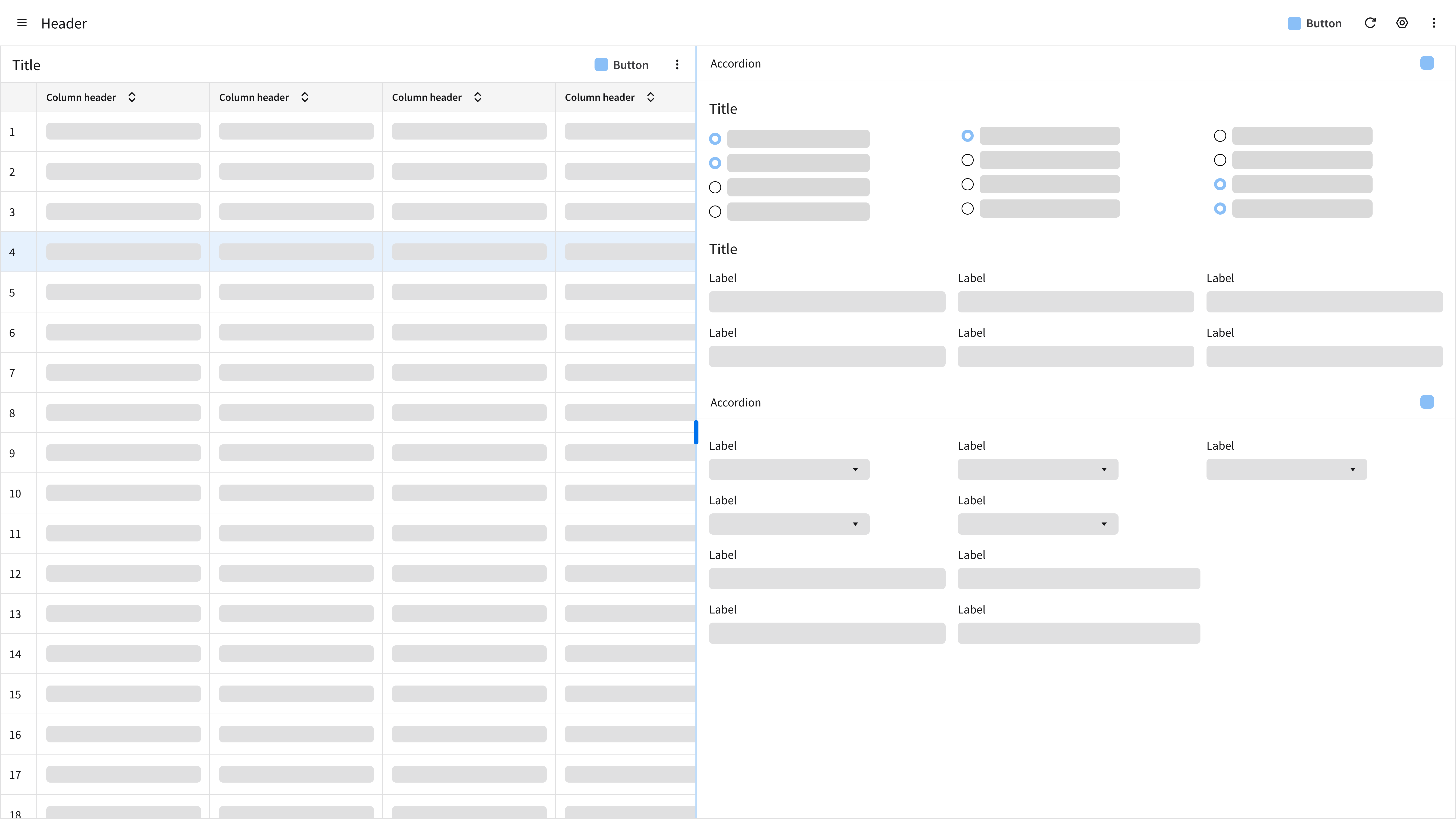
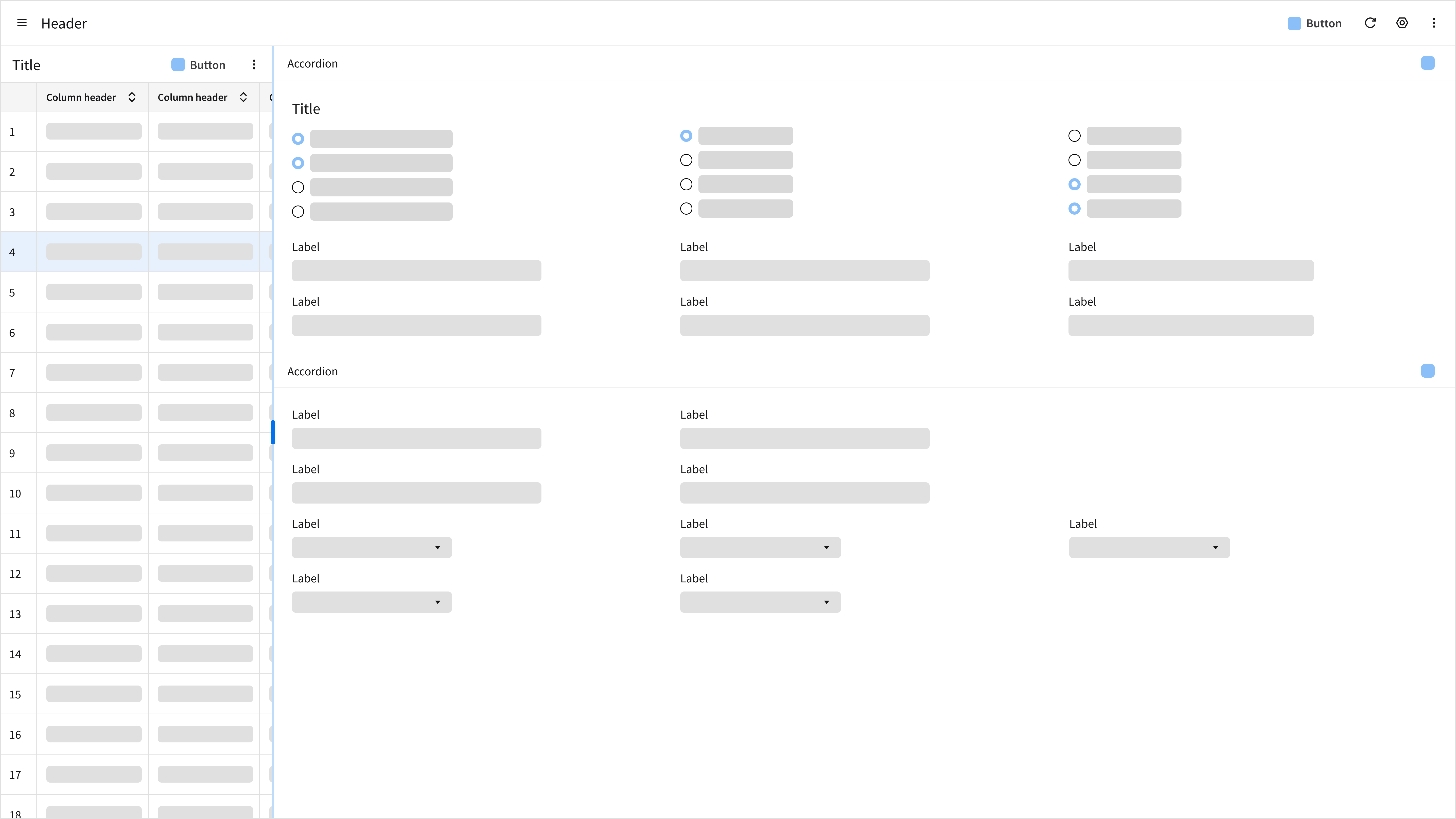
The page layout for a split screen can be vertical or horizontal.
Vertical
- Best for side-by-side comparison or main-detail relationships.
- Example: Viewing a data grid or a list on the left and record details on the right.
- This orientation supports frequent context switching. It helps the user maintain spatial context within large data sets by keeping the primary list (or data grid) visible while maximizing the number of rows scannable at once.
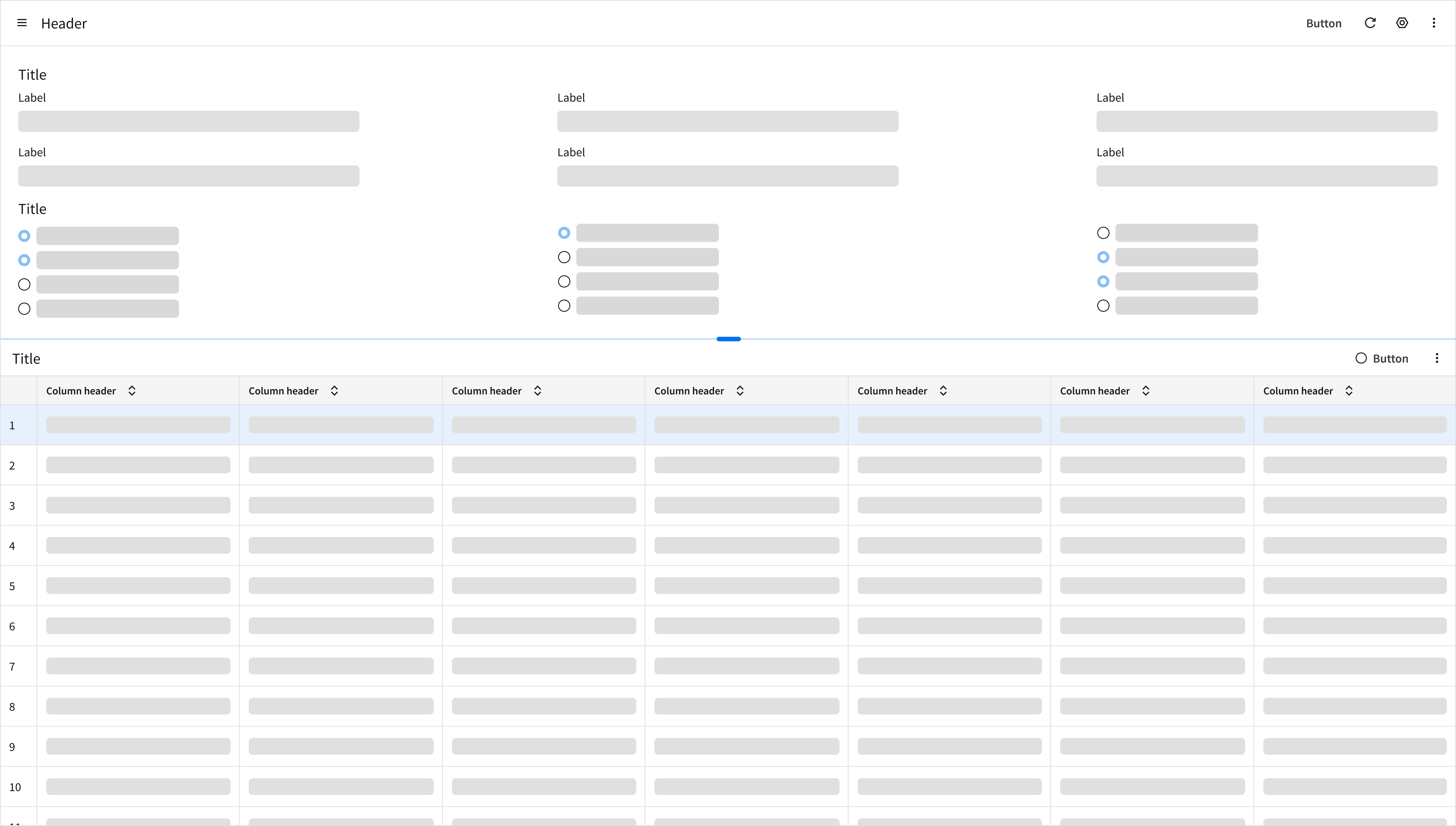
Horizontal
- Ideal for content that requires a full-page width, such as data grids with many columns. This orientation lets the user scan wide data sets without excessive horizontal scrolling.
- Keeps related secondary information immediately accessible below the primary content.
Key Sections
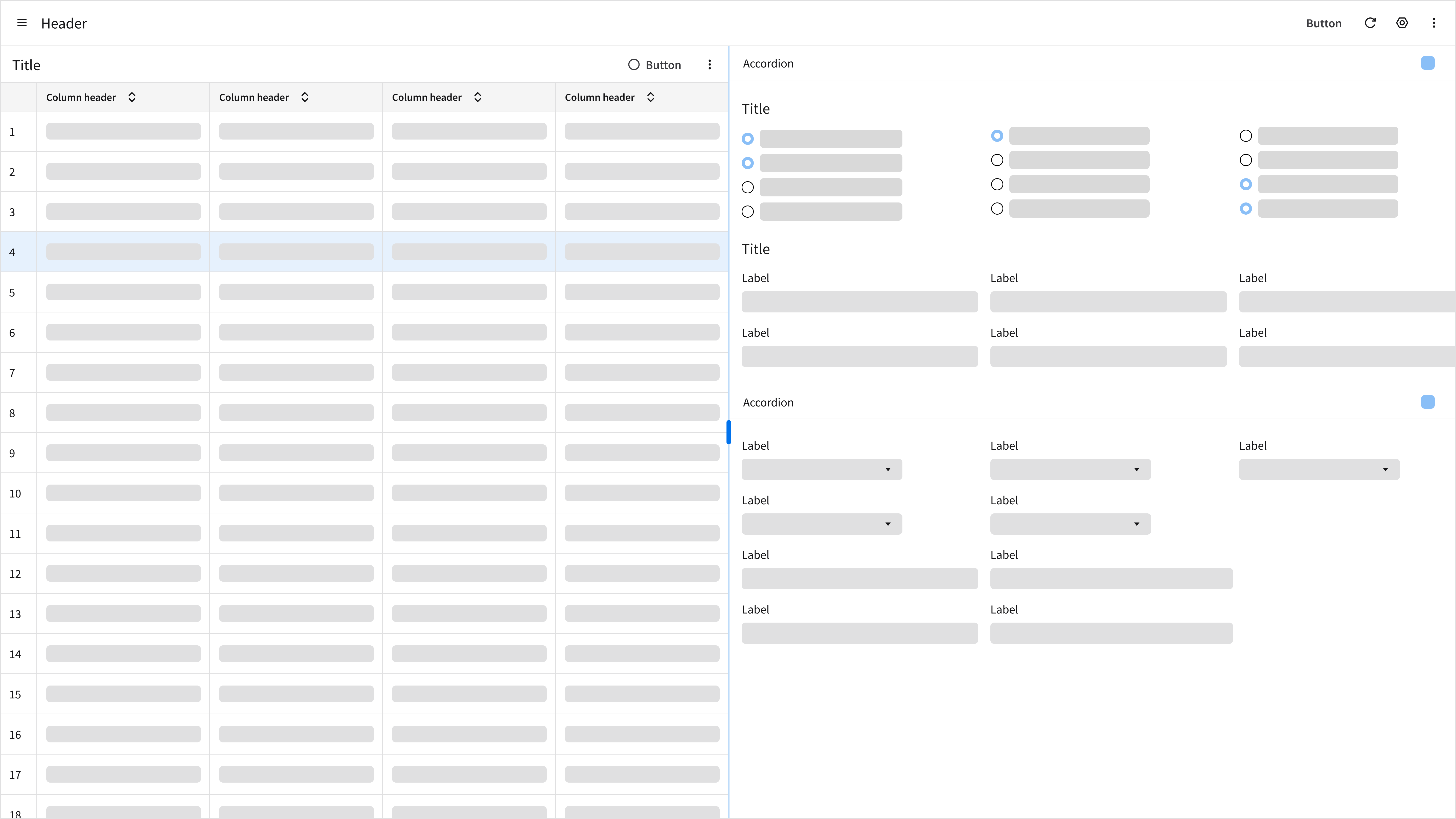
A typical split screen has 3 sections of content:
- Primary panel
- Splitter
- Secondary panel
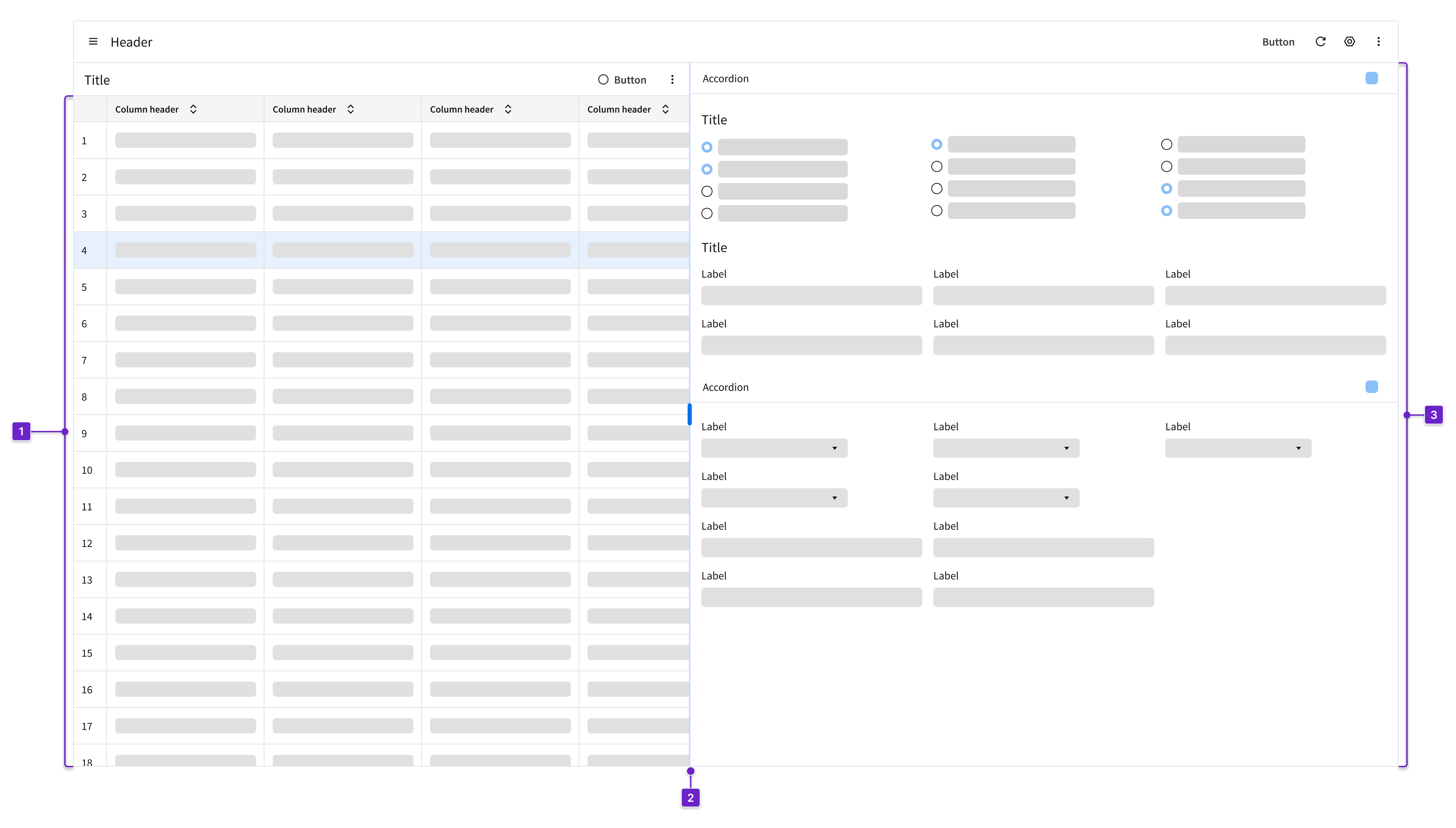
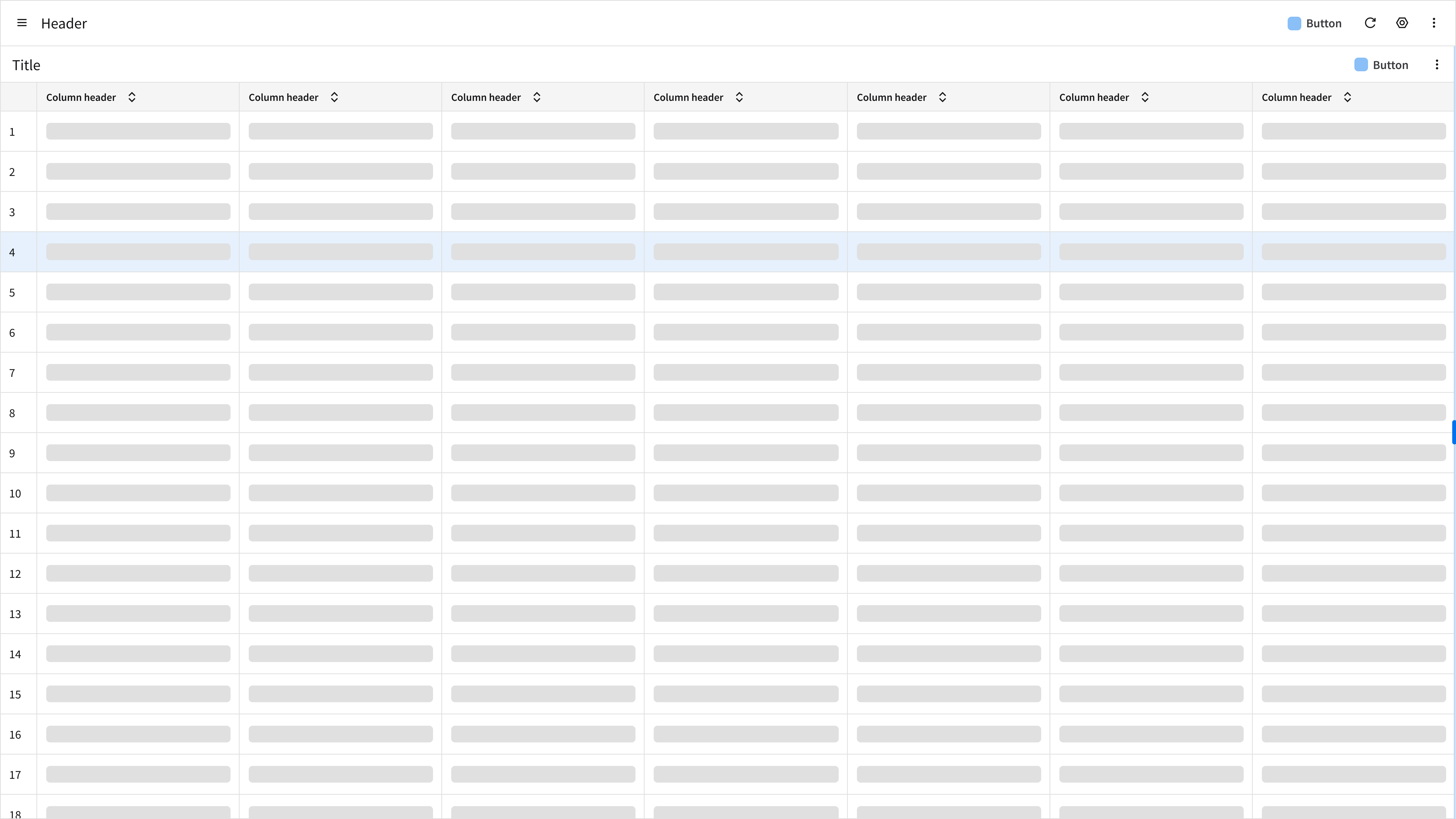
1. Primary Panel
The main task area. Often a listview, a form, or a data grid.
2. Splitter
The splitter is a control that divides the screen and allows the user to resize adjacent sections and adjust the visible area of content.
3. Secondary Panel
Related content such as details, a supporting list, or input methods.
Components
IDS components can help you build a split screen. The structure of the page will depend on how much information the user needs to see. Here are some components to consider:
- Data grid: An interactive interface for displaying, organizing, and managing structured data with features like sorting, filtering, and editing.
- Listview: Displays a set of related data objects and their attributes in a list format.
- Inputs: Used for submitting text, numbers, or other data to the system.
- Accordion: Lets the user decide what to expand and read or what to keep hidden.
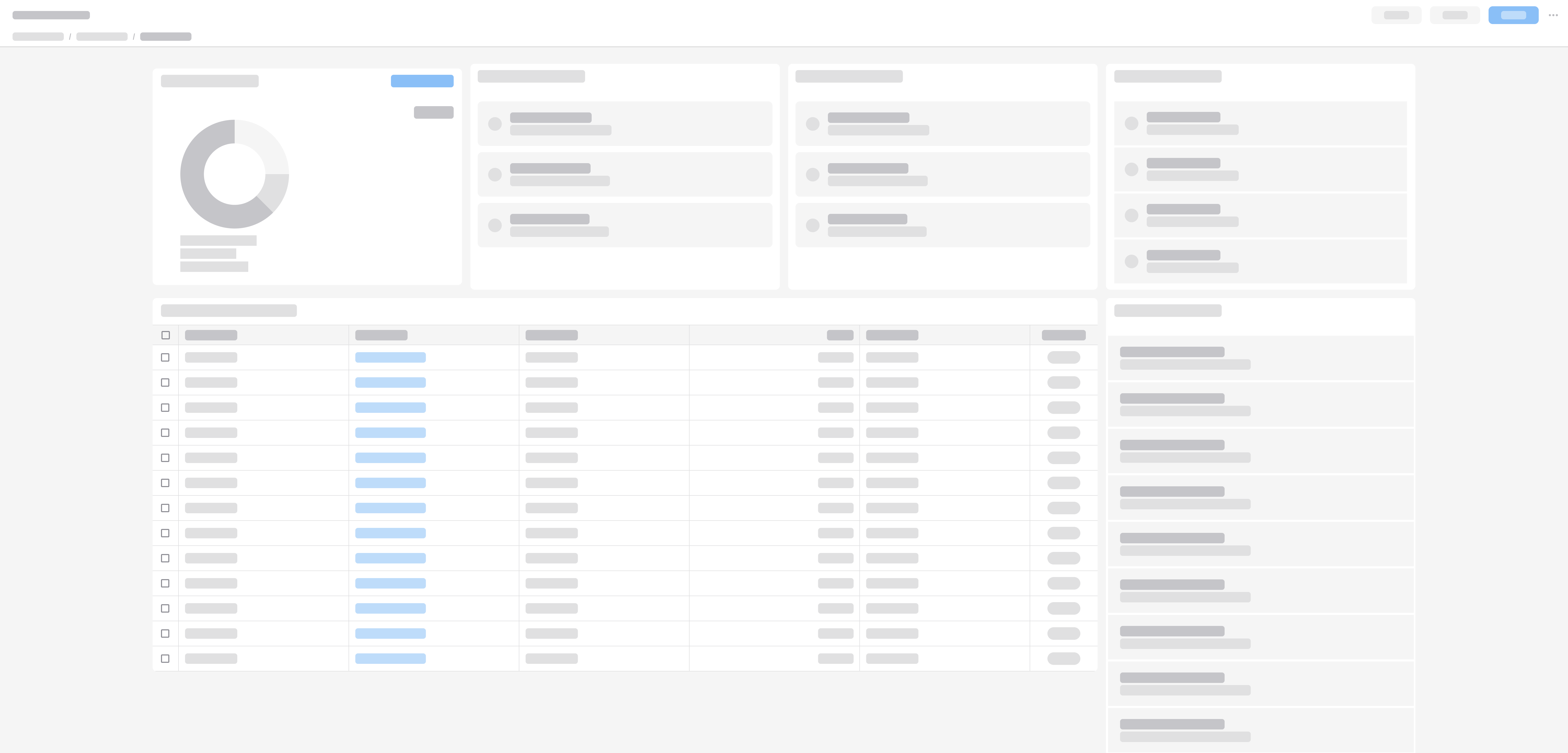
Example
This is a hi-fi example of a manufacturing form profile record with a split screen designed using IDS components. Use it as a guide for designing your own page. This layout is available in Figma in the IDS Page Layout Library.
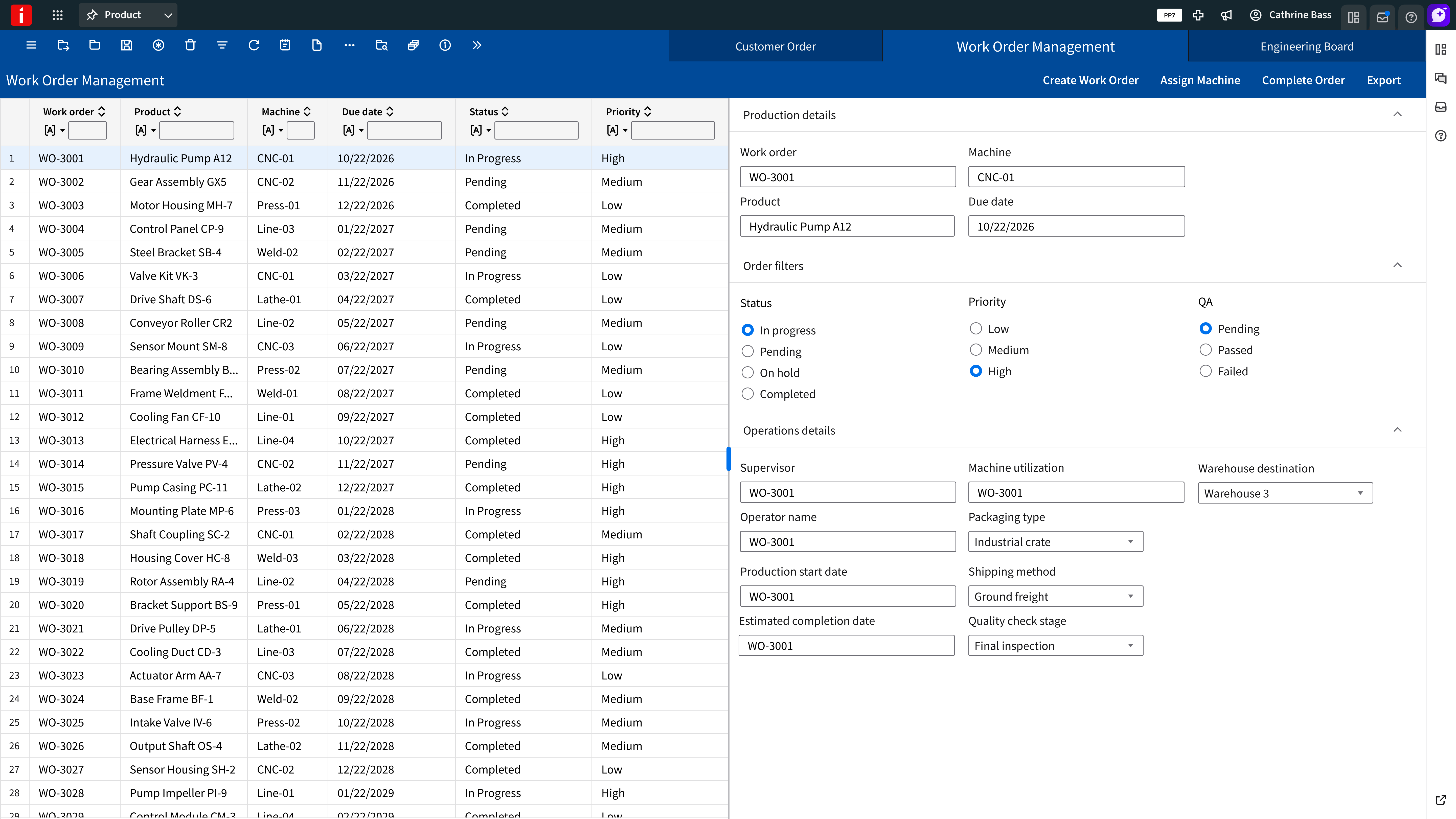
Refer to this library to see examples of split screens that are being used in the CloudSuites today. (For internal reference only. An Infor SAAM request is required for Wiki access. Updated April 2026.)
Responsiveness
XXL
XXL primary panel (12-column grid)
L
Large primary panel (12-column grid)
M
Medium primary panel (8-column grid)
XS
XS primary panel (4-column grid)
Horizontal
A horizontal split screen is not affected by responsive design. Items are pushed down or up via the splitter.