GUIDELINES
Workspaces
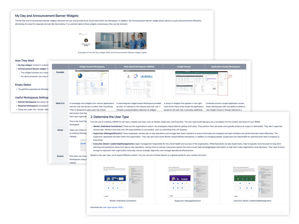
Comprehensive UX guidelines for Workspaces have been updated and moved to the new Infor OS Platform Experience Wiki. (An Infor SAAM request is required for Wiki access.) They include:
- Overview of different Workspace types
- Answers to frequently asked questions
- Content design process for creating role-based Workspaces (RBWS)
- Best practices for testing, demoing, and catalog naming
These resources were previously published on SharePoint and will be removed from there on January 31, 2025. Be sure to update your bookmarks accordingly!
Contact us with questions or to request a content review of your RBWS.
FEATURE RELEASES
UX Enhancement Libraries
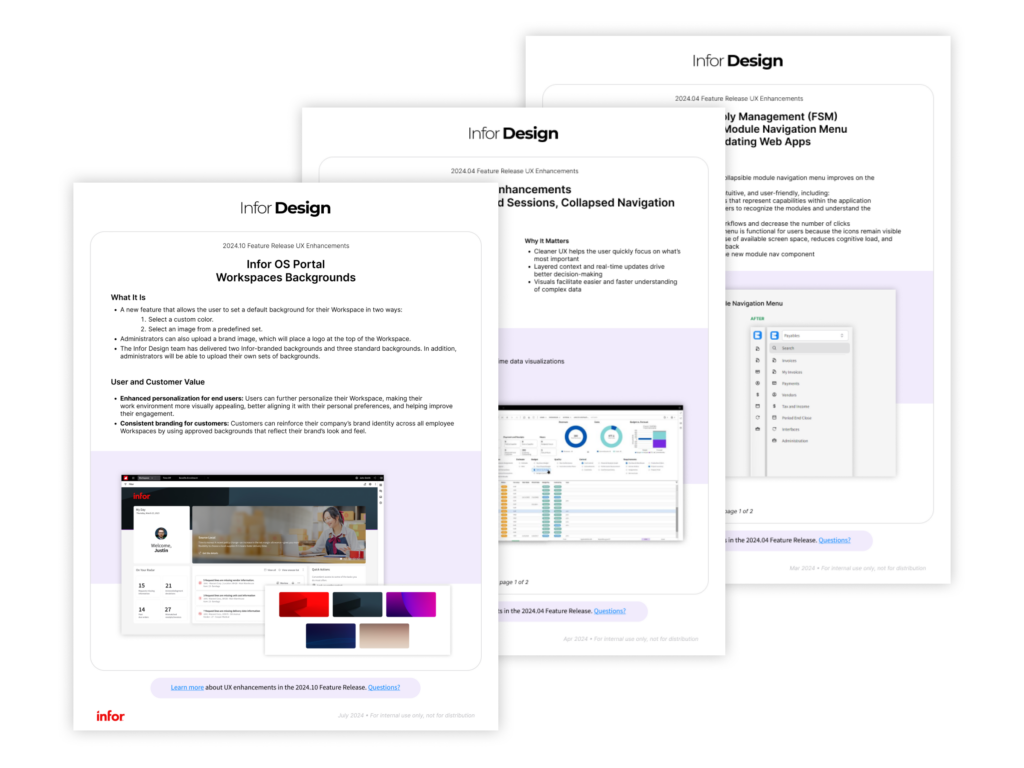
Archives of educational content and visual assets about major UX enhancements included in recent Infor Feature Releases have been updated and moved to the Infor Design Wiki. (An Infor SAAM request is required for Wiki access.) They include:
Email us with questions or feedback.

ADOPTION
Design Tokens: Our Model
The goal of our design tokens work is to promote adoption of the look and feel of the Infor Design System (IDS) for application teams that use non-IDS components.
We accomplish this by defining variables—the design tokens—and structuring them in multiple layers to align our base palettes to their intended use across the components. This creates an inheritance structure that can be extended to components outside of the IDS library.
We organize our components across these categories:
- Core: Our base palettes—such as red or green—are organized in 10-step progressions that provide a variety of shades of each color for the visual identity. These colors would be named things like “red-20” or “green-50” to help differentiate each shade.
- Role: This maps how a token behaves as part of larger design patterns across the UI. For example, all components with a filled background element may be grouped by a role variable just called “color-background,” which can then be filled by a color identified by the designer.
- Component: This is where the role groups are paired with their explicit use in an individual component. Following the background example, our general “color-background” type variable would be used to influence the button by being inherited by the explicit “button-background” variable.
While these variables will be available for teams to review when we launch our identities, we’ll be working with adopting teams mostly at the role and component levels. We can help match component interactions unique to their application to the general usages identified by our system.
More questions about tokens? Ask in the IDS forum in Microsoft Teams.

RESOURCES
Feedback and Team Picks
Have a question? Found a bug? Want to share an idea for the design system? Visit the new Feedback and Requests page to learn how you can contact the IDS team.
Be sure to also check out the Team Picks page, which has been updated with more UX resources endorsed by our team members, including a data visualization library and a guide to refactoring and design patterns.