
May Documentation Updates
Design | May 2026
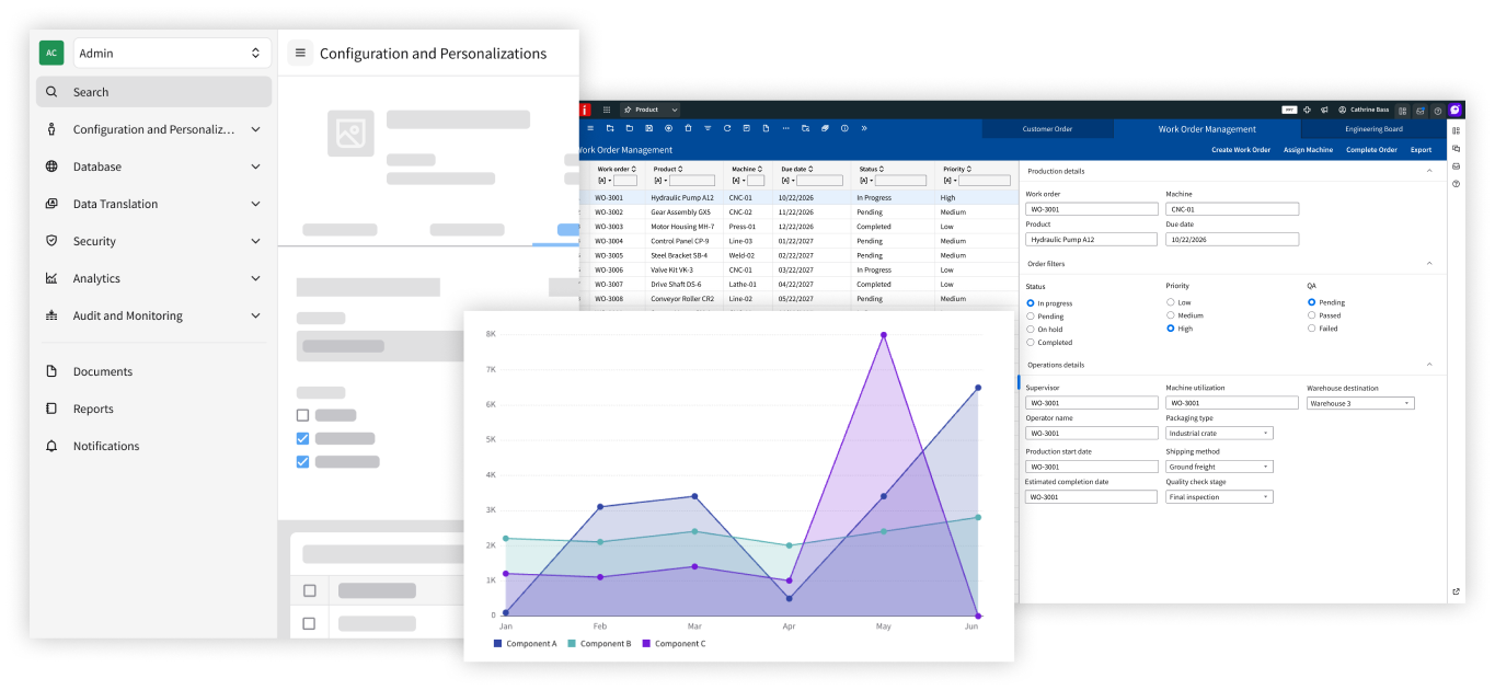
Components
We’re continuing to add more use cases and visual examples to our component guidelines. Overviews of available options and in-depth usability guidance are now available for the accordion, avatar, header, image, KPI, module nav, notification banner, toolbar, and wizard.
Charts
There’s new guidance for common charts in the Web Components library, including the area chart, bar chart, line chart, and pie chart. For applying color to charts, refer to the instructions for two new IDS color palettes: Sequential, a diverse palette for complex data visualizations, and density, a monochromatic palette for distinguishing values.
Page Layouts
The latest addition to the IDS library of page layouts is the split screen, which lets the user separate or compare related content. Use it as a reference for establishing a visual hierarchy and designing an easy-to-follow vertical or horizontal page.
These updates are ongoing—stay tuned as new guidelines are published!