
February Documentation Updates
Design | March 2026
Components
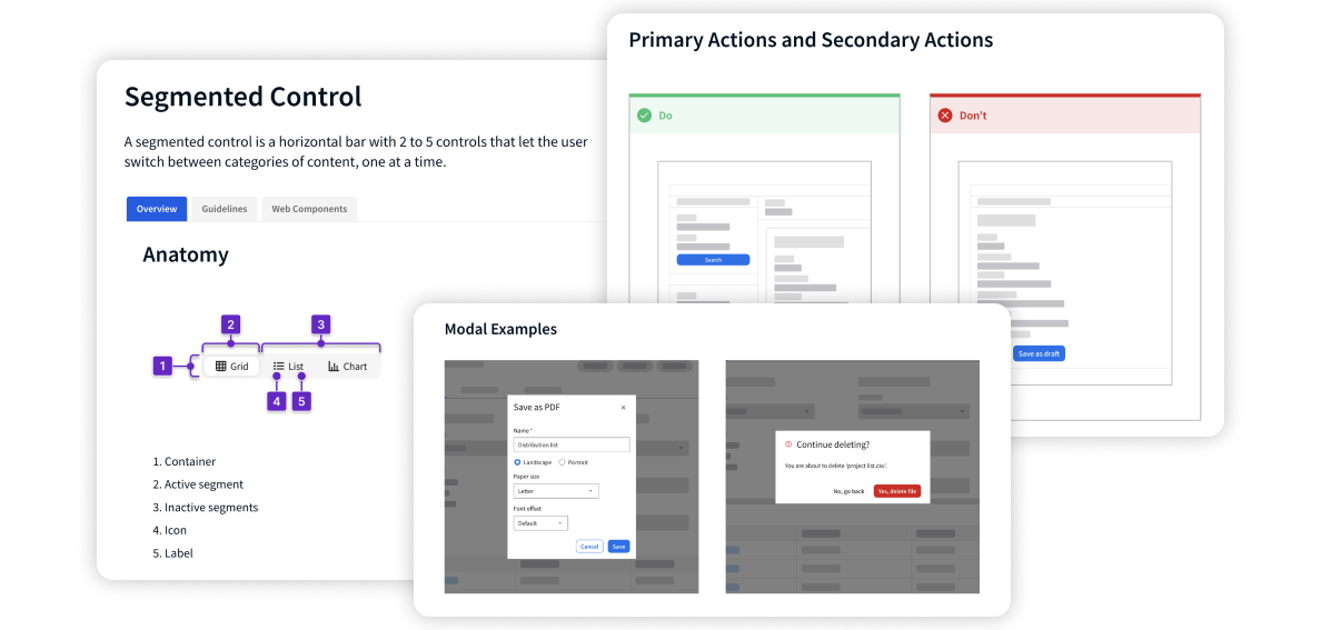
To help you better understand when to use a component and how it should look and function, detailed overviews of the options you have for each component are now available. There are clear use cases, visual examples, and specific instructions. See the updates for breadcrumb, button, listview, and segmented control.
Interactions
We’re also creating a playbook of reusable combinations of components for solving common use cases. Implementing these patterns consistently within the CloudSuites helps build familiarity among users—making it easier for them to learn, adapt to, and use an interface. See the new guidance for button group, dialog, and sign in.
These updates are ongoing—stay tuned as new guidelines are published!