Customizing Mobile Application Icons
Icons for Infor native mobile applications are a key visual representation of our products to customers. To ensure brand consistency and recognizability, follow these guidelines when designing icons as well as splash screens and launch screens for applications on Android™ and iOS platforms.
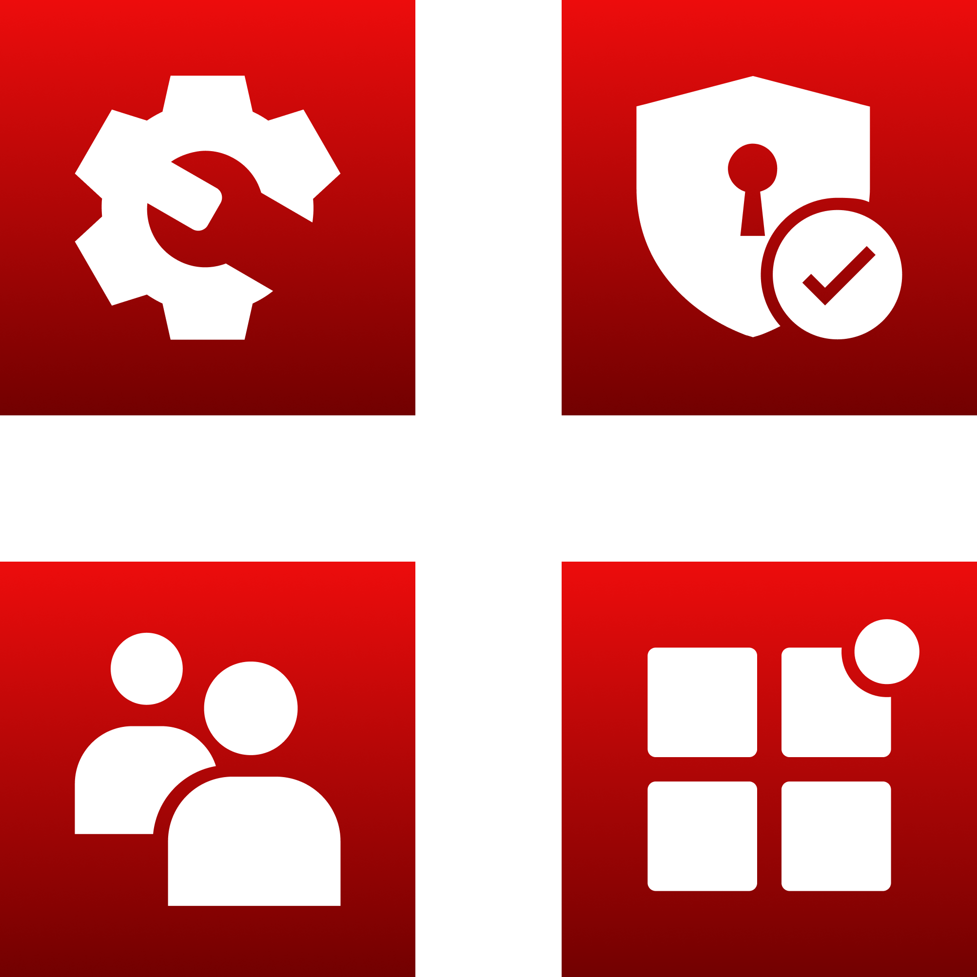
Examples of current icons for Infor mobile applications.
Getting Started
Before creating a new icon, review the icons for the Infor native mobile applications that are currently available at the Google Play™ store (play.google.com) or the App Store® (apple.com/app-store).
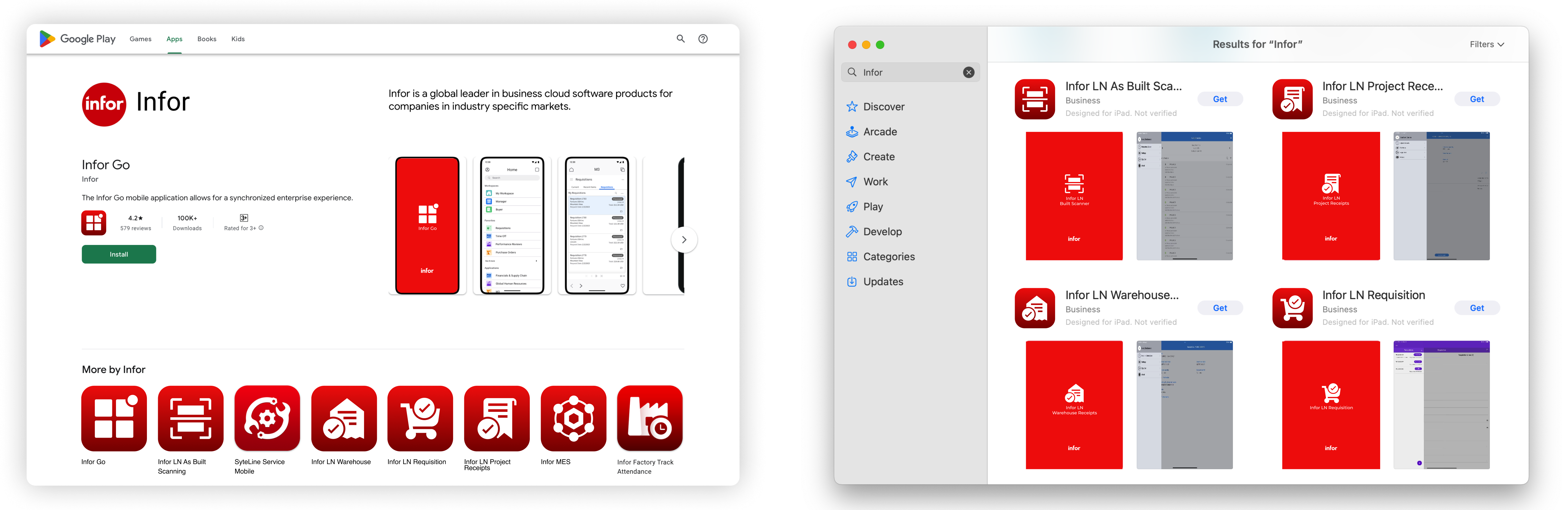
Infor native mobile applications in the Google Play store (left) and App Store (right).
Consistency across the Infor brand ecosystem is important, but each product must also be visually distinct. Avoid creating a new icon that is too similar to, or conflicts with, an existing icon.
These guidelines require a design tool that supports vector editing, layering, and asset exporting. Figma is Infor’s official cloud-based design tool for creating wireframes, prototypes, and pixel-perfect components with real-time collaboration.
IDS templates for icons and splash screens are referenced below and are available in Figma. Learn more or request access at the Figma SharePoint site, supported by the Infor Product Operations team.
Icons
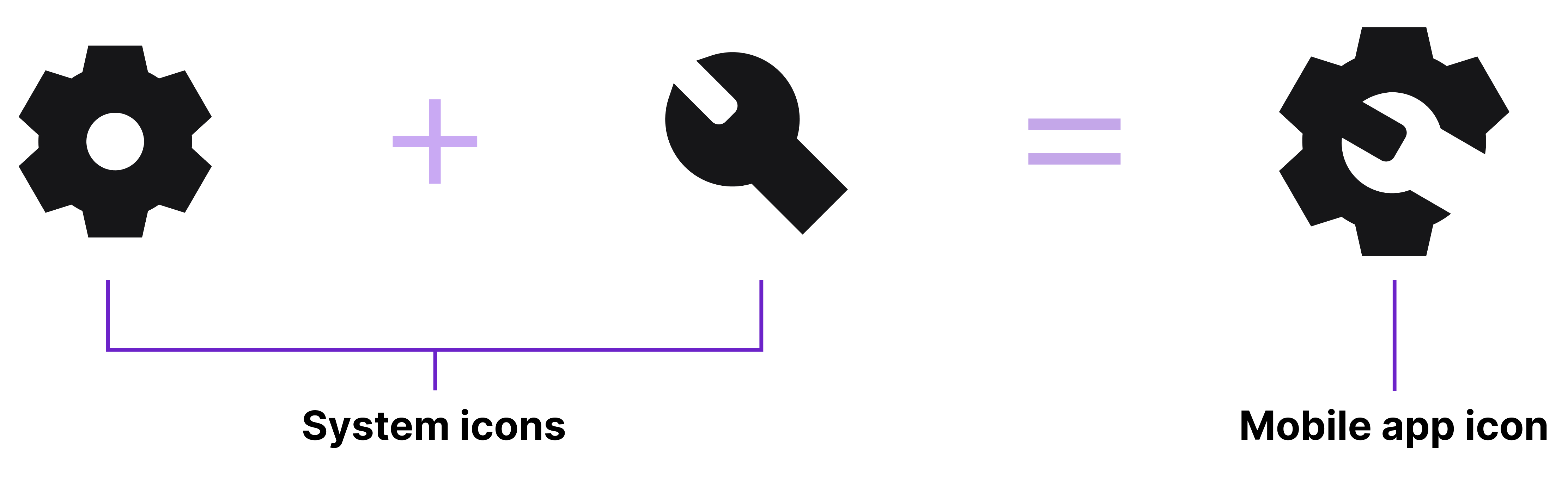
Adapting IDS System Icons
The IDS system icons represent common product actions and objects across several industries. Before creating new icons, we strongly recommend that you select existing icons from the system icons library and adapt them for your application. Convert the system icon to a filled style and then refine the details.
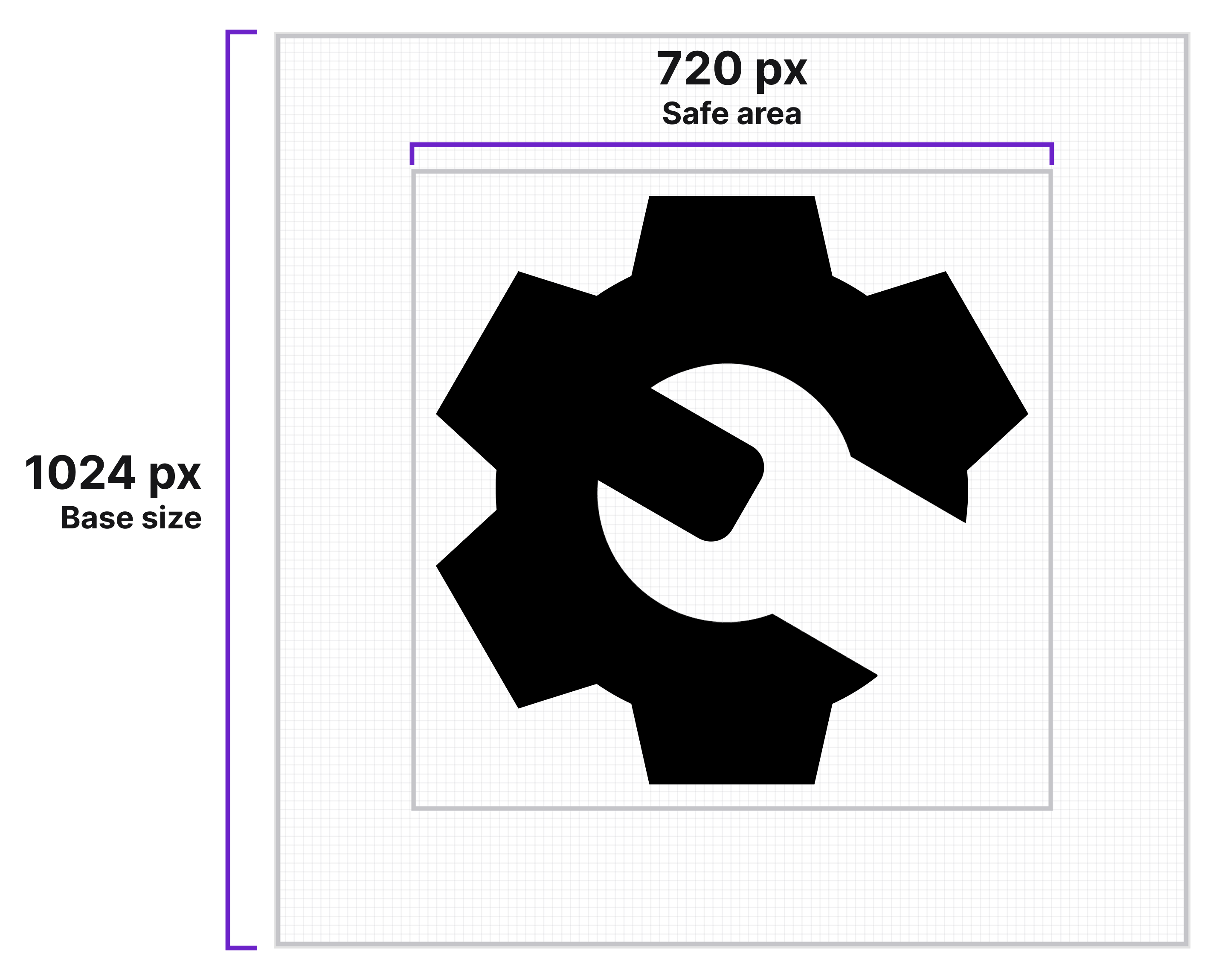
Canvas and Safe Area
For the base art board, use a square canvas, sized at 1024×1024 pixels (px). Keep all essential artwork within the safe area (about 70% of the canvas, approximately 720×720 px).
The safe area is important—Android and iOS platforms each define their own safe areas for app icons. Stay within this boundary to ensure that the icon displays correctly without cropping or distortion.
Keylines
Keylines help maintain consistent weight, optical size, and placement across an icon set by guiding the alignment of basic shapes like circles, squares, and rectangles. While keylines will support most icons, some won’t apply. Examples include:
- Shapes that are balanced unusually, like those that are especially tall or wide.
- Open shapes—like chevrons, pluses, and minuses—that are drawn at a slightly smaller size.
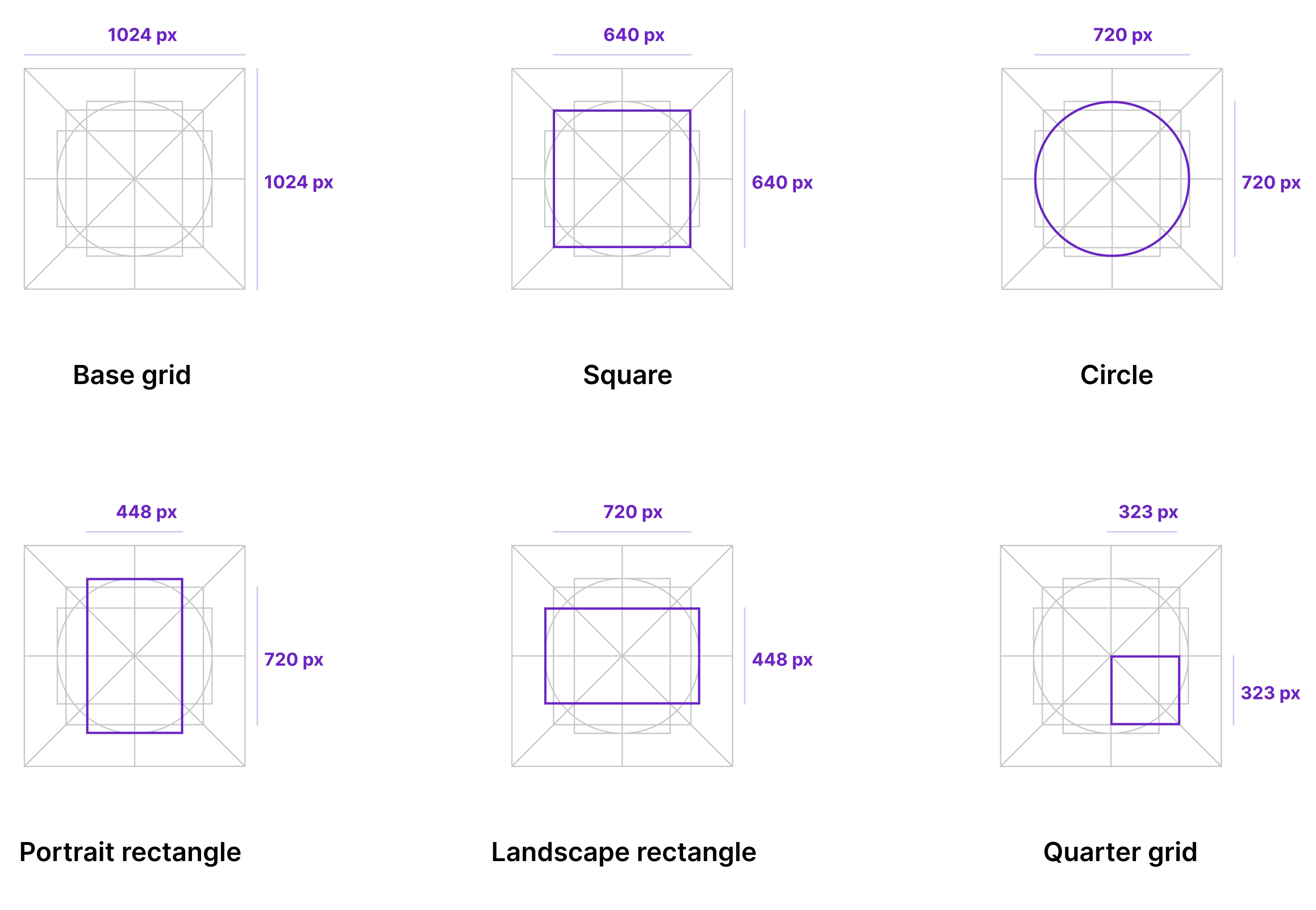
Keyline guides are available in the Icon and Splash Screen Templates for Mobile Applications in Figma. Use the keyline layer in the template to position and scale your symbol correctly and maintain visual consistency across all icons that you create.
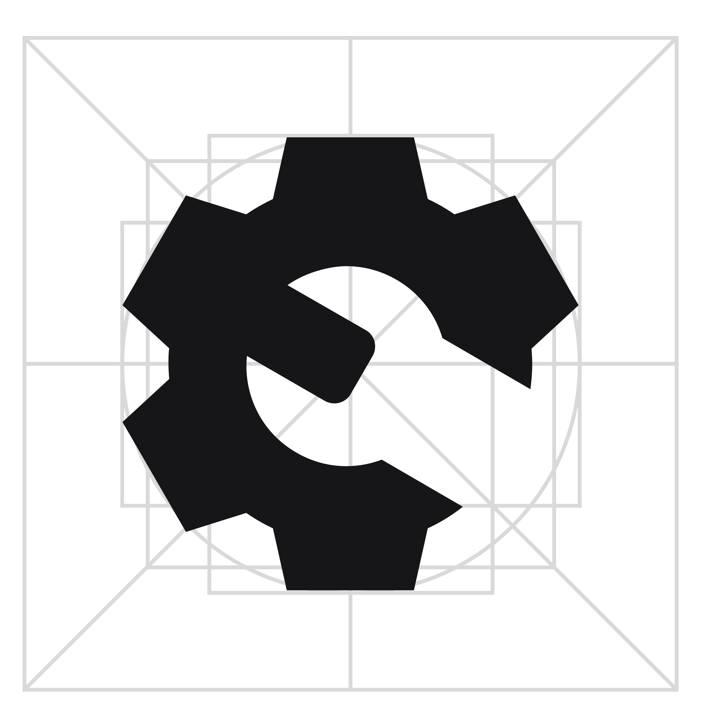
Symbol Placement
- The main symbol should represent the product’s function in a simple and direct way.
- Center the symbol and ensure that it’s optically balanced.
- Use the keylines as visual guides to help you position and align all elements of the artwork accurately.
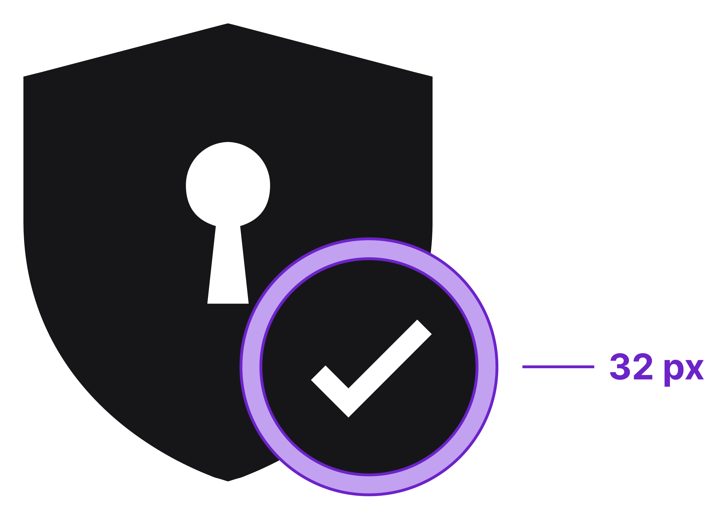
Cutouts for Modifiers
For icons with modifying or overlapping elements, include a 32 px cutout between the primary shape and the secondary shape. This separation prevents the shapes from blending together.
Styling Tips
Dos
- Use filled icons to provide strong definition and ensure readability at small sizes.
- When combining symbols, use negative space or cutouts to keep a unified filled style.
- Keep shapes simple and clear. Avoid complexity.
Do

Don’ts
- Mix different strokes and fills. It’s inconsistent.
- Use thin strokes or light outlines. When scaled down, they disappear.
- Include unnecessary details. Extra decorations add clutter.
Don’t

If you need help or have any questions, send us a message in the UI-UX Design channel in the IDS forum in Microsoft Teams.
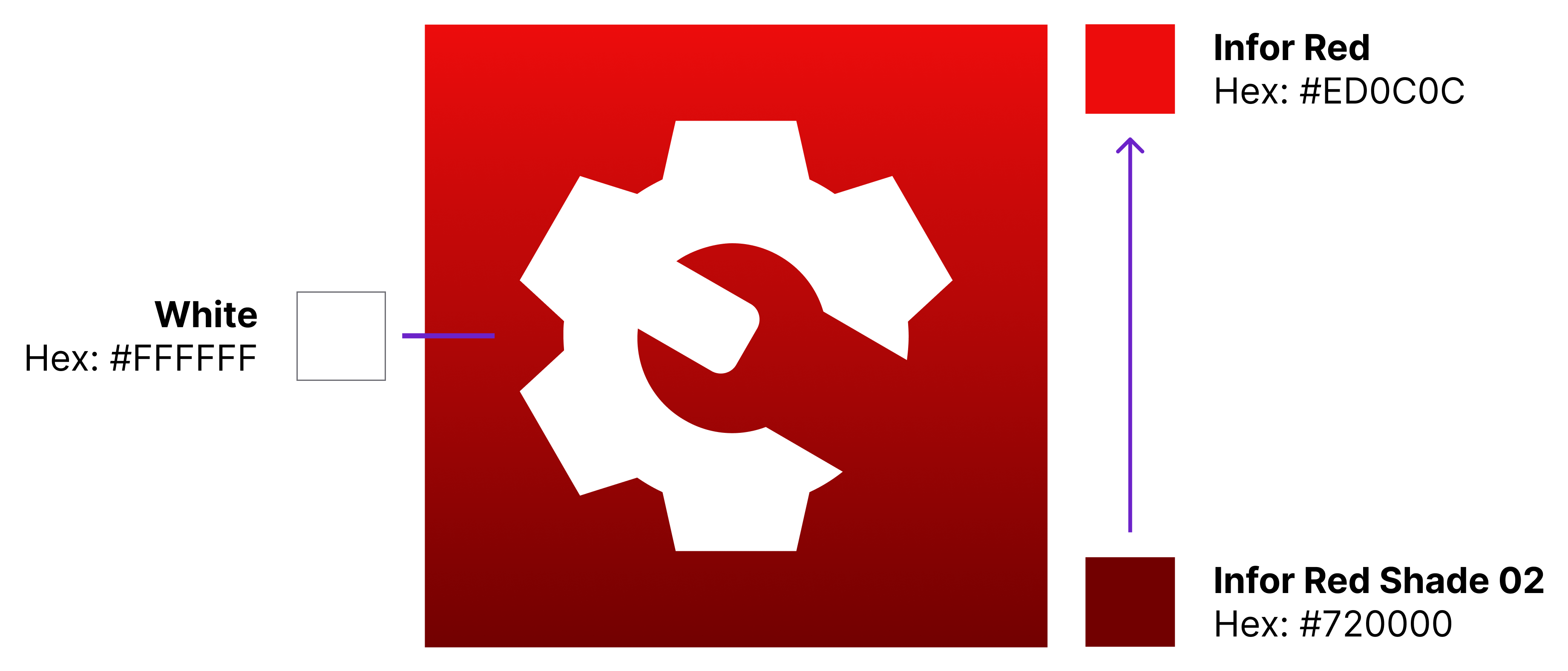
Color
Use the approved Infor brand color palette for red.
- Apply a vertical gradient to the background.
- Top color: Infor Red (hex: #ED0C0C)
- Bottom color: Infor Red Shade 02 (hex: #720000)
- For the central symbol, use only the color White (hex: #FFFFFF).
Exporting
Always work from a 1024×1024 px primary icon. This is your single source of truth. All platform assets must be generated from this file to preserve proportion, sharpness, and visual consistency. For all current requirements, refer to the official documentation and tools provided by Android and iOS.
Infor General Export Rules
Apply Infor’s design rules only to the source assets and export settings.
- Size: 1024×1024 px
- Format: PNG
- Transparency: None (unless explicitly required by the platform tool)
- Size: Square (each platform will apply its own rounding and effects)

Android (left) and iOS (right) apply their own corner rounding and effects.
Android: Image Asset Studio
Use Image Asset Studio, the official tool inside Android Studio, to automatically apply sizing, scaling, and masking that are compliant with the platform.

Adaptive icons for Android require 2 separate files from your primary icon:
- Foreground: Main symbol or artwork
- Background: Gradient background
Infor-specific setup guidance:
- Foreground layer:
- Asset type: Image (use your exported main symbol)
- Enable trim
- Resize to 70% to stay within the safe area
- Background layer:
- Asset type: Image (use your exported gradient background)
- No scaling required
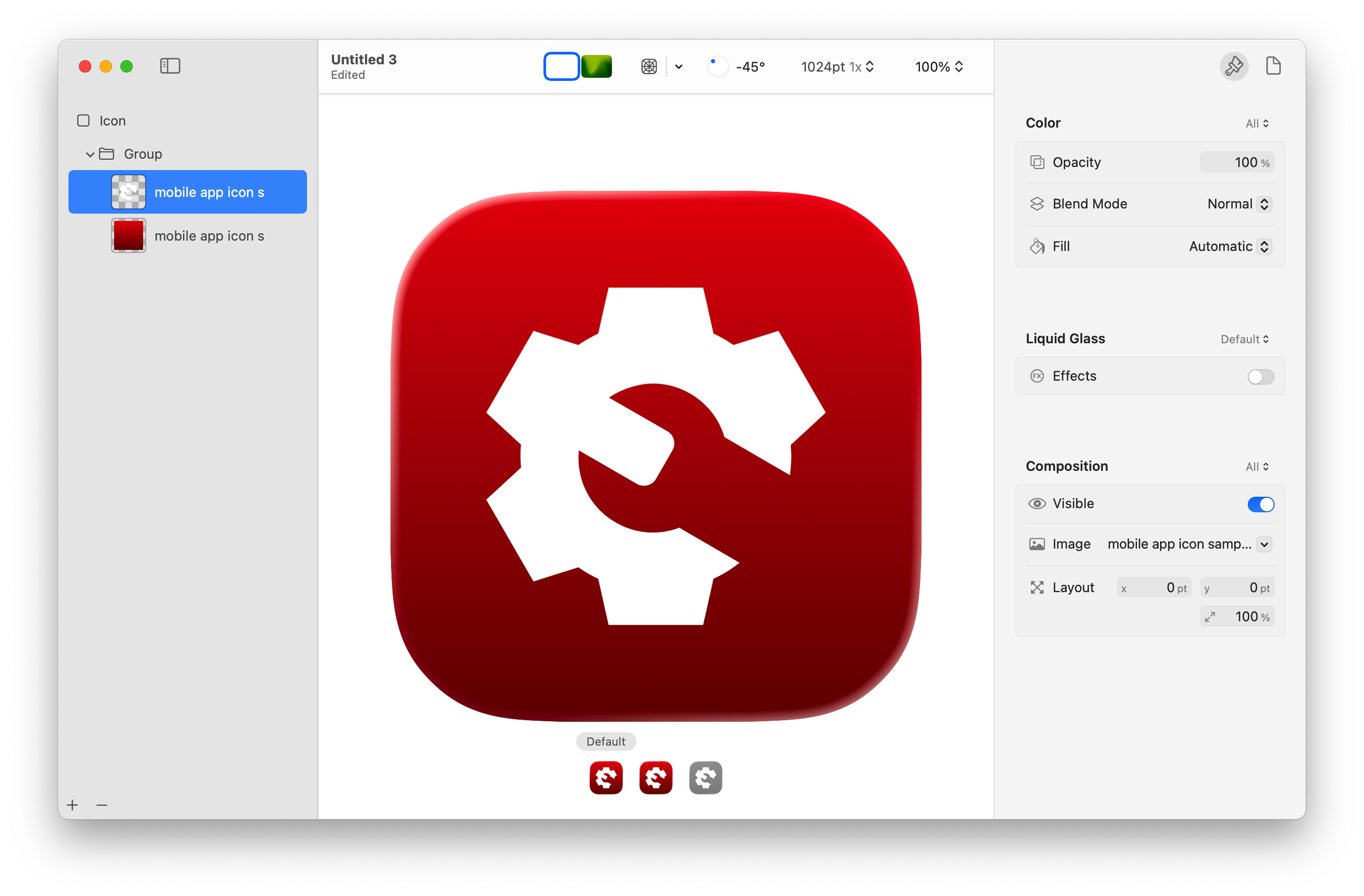
iOS: Icon Composer
Use Icon Composer for iOS to automatically apply rounding, depth, lighting, and export sizes that are compliant with the platform.
Infor-specific setup guidance:
- Use the same foreground and background assets as Android
- Use the default visual look (turn Apple’s Liquid Glass effect off)
- All other settings should remain as default
More documentation from Apple:
- App Icons | Apple Developer Documentation
- Creating Your App Icon Using Icon Composer | Apple Developer Documentation
Splash Screens and Launch Screens
The splash screen (Android) or launch screen (iOS) is a short visual bridge that appears while the application is loading. These guidelines focus on layout and visual design only. For development and implementation information, refer to the Infor Mobile Wiki. (An Infor SAAM request is required for Wiki access.)
Android Splash Screen
Android 12+ use the Android Splash Screen API, which supports only a single centered foreground element. This must be the app icon. For proper sizing and scaling, follow the splash screen icon specifications provided by Android.
Color
- Infor Red (hex: #ED0C0C)
Icon
- Use a high-resolution PNG (1024×1024 px)
Infor Logo
- The Infor logo must always be present
- Download the Infor primary logo in white (PNG) from ContentHub
- Scale to 89×34 density independent pixels (dp)
- Android automatically places the logo at the bottom
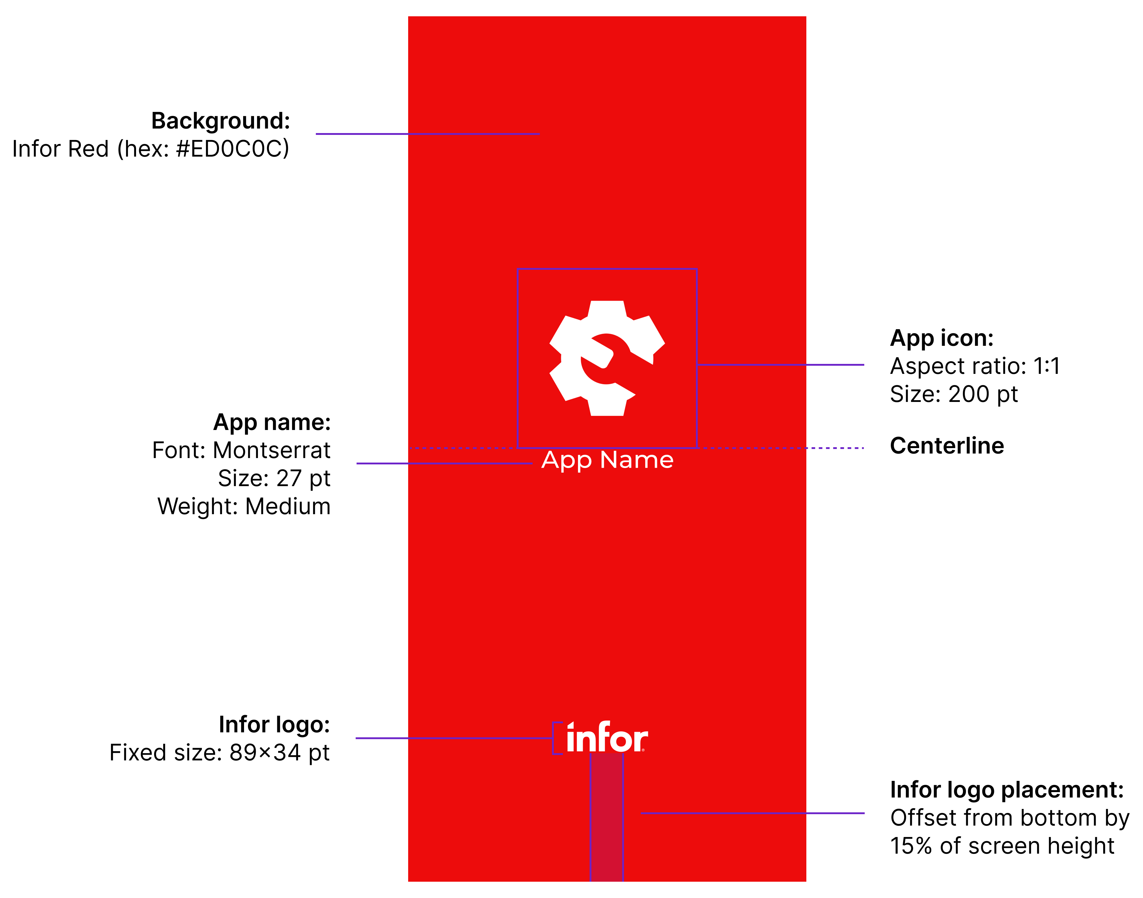
iOS Launch Screen
Base Artboard Size
Use the size of the latest and largest iPhone® model. Currently, this is the iPhone 17 Pro Max, sized at 440×956 points (pt). Designing at this size will help ensure that your layout scales proportionately to all smaller devices. To help finalize your design, refer to the Icon and Splash Screen Templates for Mobile Applications in Figma.
Color
- Infor Red (hex: #ED0C0C)
Icon
- Use a high-resolution PNG (1024×1024 px)
- Keep a 1:1 aspect ratio
- Scale to 200 pt
- Center the icon horizontally and align its bottom edge to the centerline
Application Name (Text)
- Font: Montserrat, medium weight
- Size: 27 pt
- The name of the application goes directly below the application icon
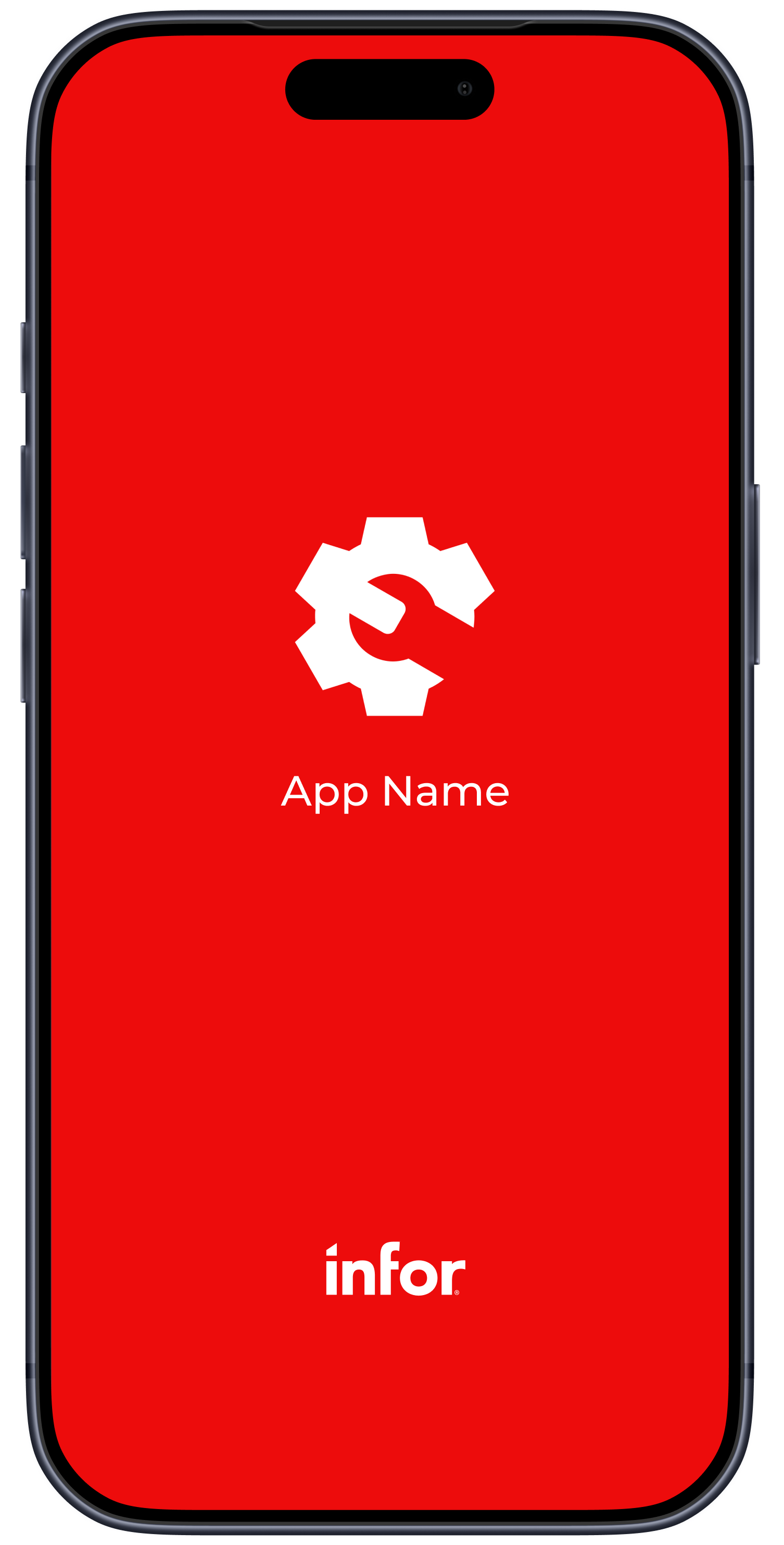
Infor Logo
- The Infor logo must always be present
- Download the Infor primary logo in white (PNG) from ContentHub
- Placement rules:
- Logo size: 89×34 pt
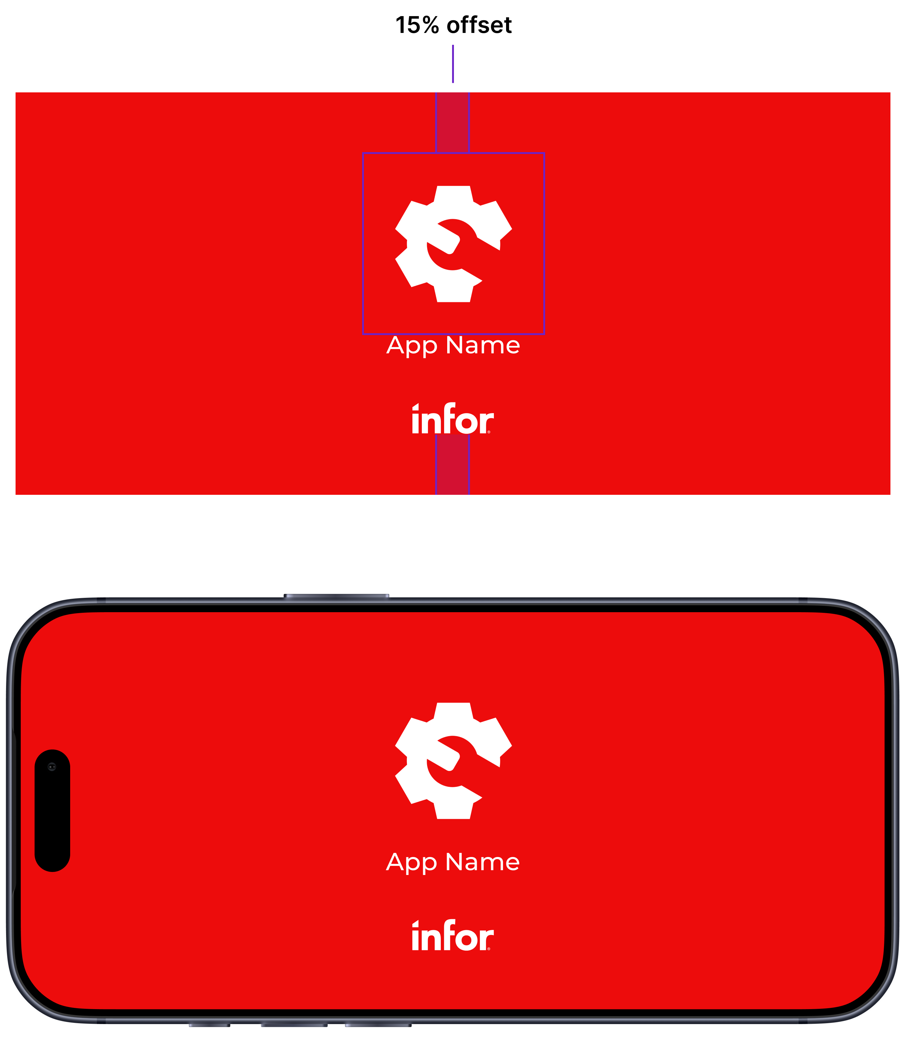
- Center horizontally
- Offset from bottom by 15% of screen height
- Maintain clear space around all sides of the logo
Landscape Orientation (Optional)
Android
- Android Splash Screen API (Android 12+) automatically handles orientation changes
iOS
- App icon and app name:
- Group the app icon and app name as a single unit
- Position this group with a 15% vertical offset from the top edge of the screen
- Center horizontally
- Infor logo:
- Position the Infor logo with a 15% vertical offset from the bottom edge of the screen
- Center horizontally
iOS landscape orientation
Don’ts
In general, avoid the following:
- Adding extra text, slogans, or marketing copy
- Using photos, textures, gradient or patterned backgrounds
- Recoloring the app icon
- Removing, resizing, or repositioning the Infor logo
- Crowding the layout with unnecessary elements
Variants and Effects (Optional)
These are optional additions to the default Infor Red specifications, above, and aren’t intended as replacements. Use them in supported contexts only.
Icons: Dark Theme
If you choose to create a dark theme variant of your icon, follow these guidelines:
- Background gradient:
- Top color: Infor Charcoal (hex: #15262E)
- Bottom color: Black (hex: #000000)
- Central symbol color:
- White (hex: #FFFFFF)

Splash Screens and Launch Screens: Dark Theme
If you choose to adapt the dark theme for a splash screen or a launch screen, follow these guidelines:
- Only change the background color to Infor Charcoal (hex: #15262E)
- All other elements remain the same
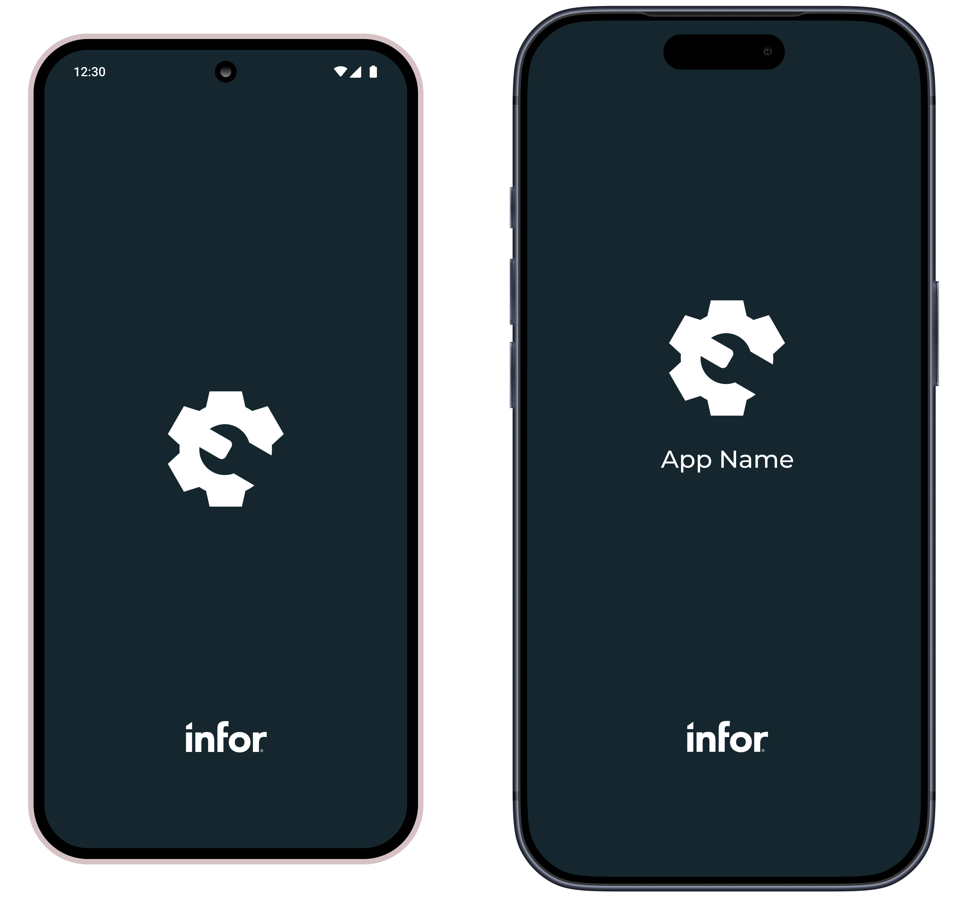
Dark theme examples for Android (left) and iOS (right).
Liquid Glass
Apple’s Liquid Glass design language effect can be applied to your icon only using Icon Composer. If you choose to apply Liquid Glass, follow these guidelines:
- Mode: Combined
- Specular: Off
- Blur: Off
- Translucency: On at 25%
- Shadow: Neutral at 50%

Examples of Liquid Glass applied to a default icon and a dark theme variant icon.
Android and Google Play are trademarks of Google LLC.
IOS is a trademark or registered trademark of Cisco in the U.S. and other countries and is used under license. Apple, App Store, and iPhone are trademarks of Apple Inc., registered in the U.S. and other countries and regions.