3 Ways to Improve Affordance in Design
UX Tip | Affordance
Affordance—the visual cues that suggest how an object should be used—is fundamental to intuitive design. When a user can instantly understand how to interact with an interactive element just by looking at it, you’ve achieved good affordance. Here’s how to ensure that your UI elements clearly communicate their function.
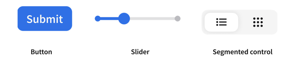
- Match the control to the action. A button should look tappable with raised edges. A slider should appear draggable with a visible track or handle. These visual cues clearly suggest the interaction behavior.

- Rely on familiar shapes, locations, and metaphors. Users expect a trash bin to delete, a floppy disk to save, or a “burger” (three-line icon) to open a menu. Follow established conventions to reduce learning curves.
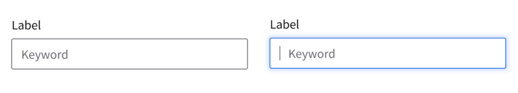
- Use textures, shadows, and motion. Flat objects look static; shadowed ones feel clickable. Depth and animation will signal interactivity. Subtle hover effects and transitions tell users that an element is interactive.
Ultimately, effective affordance removes guesswork, guiding users to interact with your design more confidently and efficiently.