COMPLIANCE UPDATE
Google Fonts (IDS 4.95+)
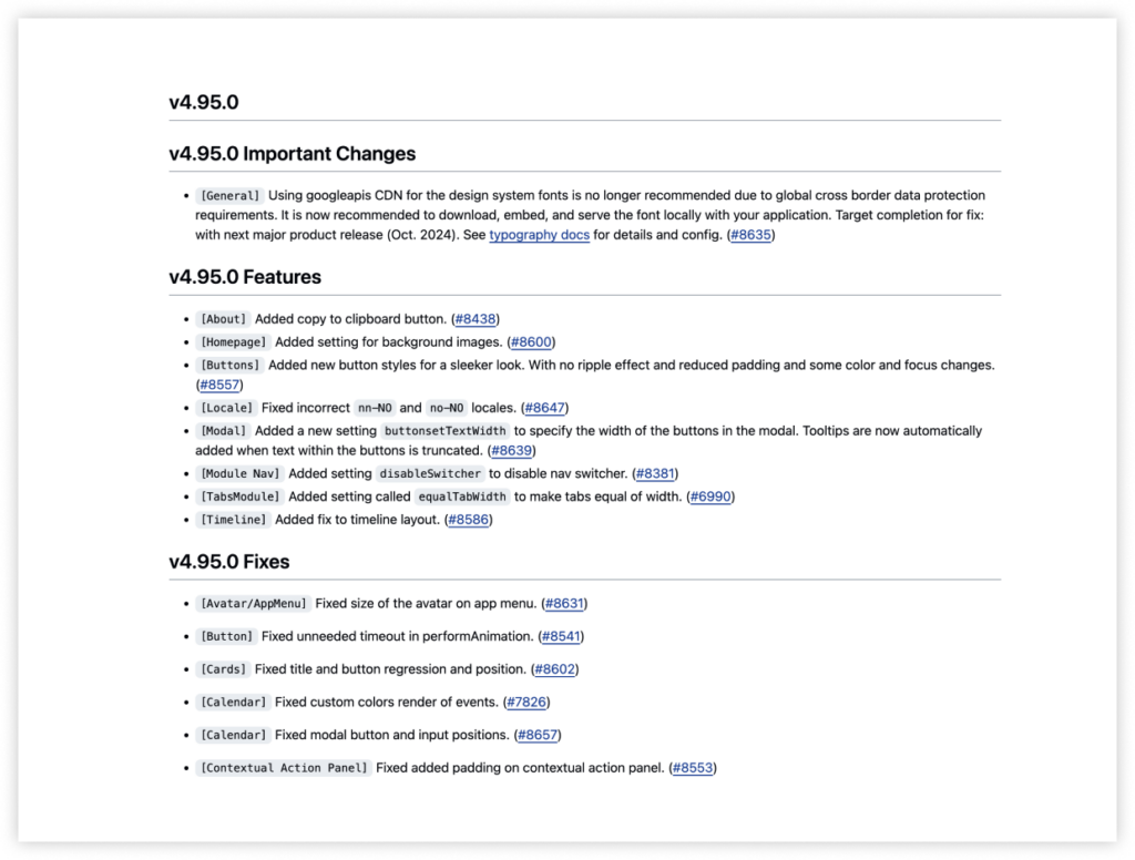
Per the Infor Compliance team, using Google APIs CDN for fonts in the design system is no longer recommended due to global cross-border data protection requirements. It’s now recommended to download, embed, and serve the font locally within your application.
Applications should download and embed the font files locally, allowing them to be served from within the application. All required font files are available in the design system repo. More detailed information about the recommended fix can be found in the IDS 4.95 changelog.
Teams must prioritize this update for the next release period: October 2024. If you encounter any issues making these changes, contact us for additional support.

COMPONENT LIBRARIES
Update: Web Components and jQuery Components Libraries
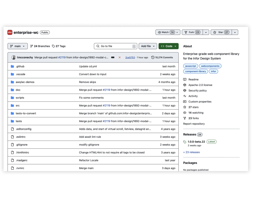
Our Web Components library for the Infor Design System (IDS) is now generally available. The previously announced plans to deprecate the jQuery components have been paused indefinitely. Maintaining both the Web Components and jQuery components libraries lets us strategically and effectively support all Infor solutions on their unique paths forward to better user experiences.

FOUNDATIONS
Design Tokens
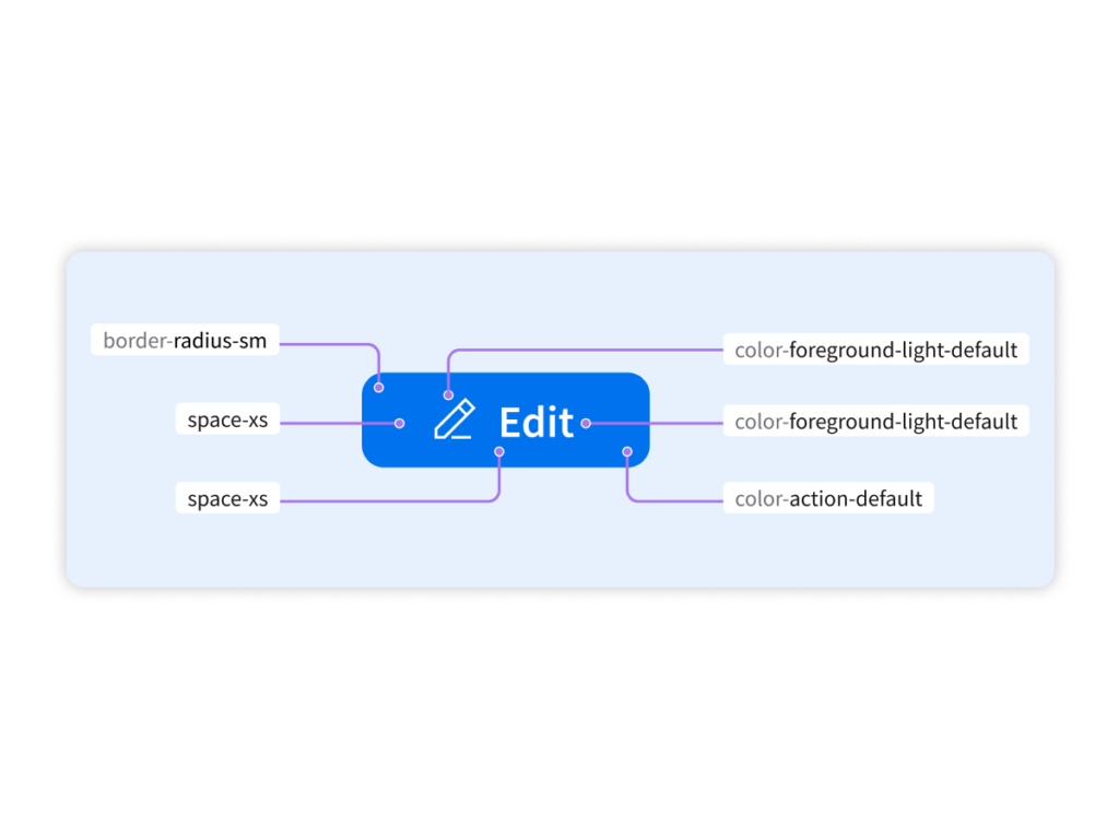
Standalone design tokens are now available for teams who want to use IDS styles in their solutions but can’t use the IDS components. These design tokens represent foundational design language styles, like colors and font sizes, and are currently powering our recently released Web Components. Design tokens make it easier for designers and developers to apply the right values in the right scenarios. Going forward, they will be extended to more aspects of the component styles, including shape, shadow, and font family.

RESOURCES
Team Picks
We’re passionate about user experience and finding ways to improve ours. Check out the updates to Team Picks, with some new UX resources recommended by our team members, including a podcast with interviews with product leaders and experts, helpful Figma tutorials and livestreams on YouTube, and a book about all things content strategy.
